BLACK KISS II #1
What did the
iFanboy
community think?
Pulls

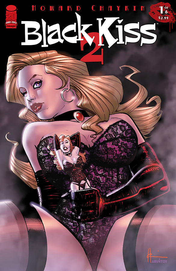
Art by Howard Chaykin
Cover by Howard Chaykin
Size: 20 pages
Price: 2.99
I got Black Kiss 2 #1 because of the history of the writer and his impact on comics. I’ve never read anything by Chaykin before and the book sounded interesting. I was told by my friend at my LCS when I picked up my hold that it was a VERY dirty book and that it was POTW on iFanboy so it made its way to the top of my stack. After flipping through the pages it went to the middle of my stack (for more than one reason).
On initial glance, the book has very explicit with regard to story and art. It earns its M (mature) rating and then some. I hid the book down a bit knowing that I’d rather not have everyone think I was reading smut and also knowing that I needed to give this book some time with a calculated read through.
It’s too full of content to read casually and, at first, I didn’t quite get what I was looking at. Now, after having read it slowly and completely, I found some interesting themes developing. The story begins in 1906 in front of a Nickelodeon. It uses that stage to express Ideas on entertainment and pleasure as well as escapism and how separate demographics are corrupted just the same are only the tip of this large iceberg. Of course, after those scenes the story continues set in 1912 on the Titanic.
I read the Wikipedia plot synopsis of the OG Black Kiss and it sounds like there will be some nod’s to it but that this book is a self-contained story. I’m going to need to give it another read through but I’m not sure it’d be my POTW even though I did enjoy it.
It’s a deep thought kind of book that has done its job and left me thinking about it a full day after having read through it. The art is spectacular. Chaykin is certainly a master at his trade and even though his art isn’t for everyone it maintains a cartoony feel without being the clean super-hero kind of art we’re all used to. The art fits the tone of the story and, while looking modern in execution, looks timeless in form.
It’s the minor detail that amazes me, not so much the character’s but even those are, in my opinion, very strong and unique. I’m looking forward to book 2 but I hope the story gets a bit easier and becomes less dense soon; if it doesn’t my wife isn’t going to like the idea of my continued reading of the book. Explaining the themes, will to her, sound like I’m reading it “just for the articles”.
Art: 5 - Excellent


Leave a Comment
Login or Register to get involved and leave a comment