Comic Books
IMAGE COMICS > ROBERTS > 2-of-2
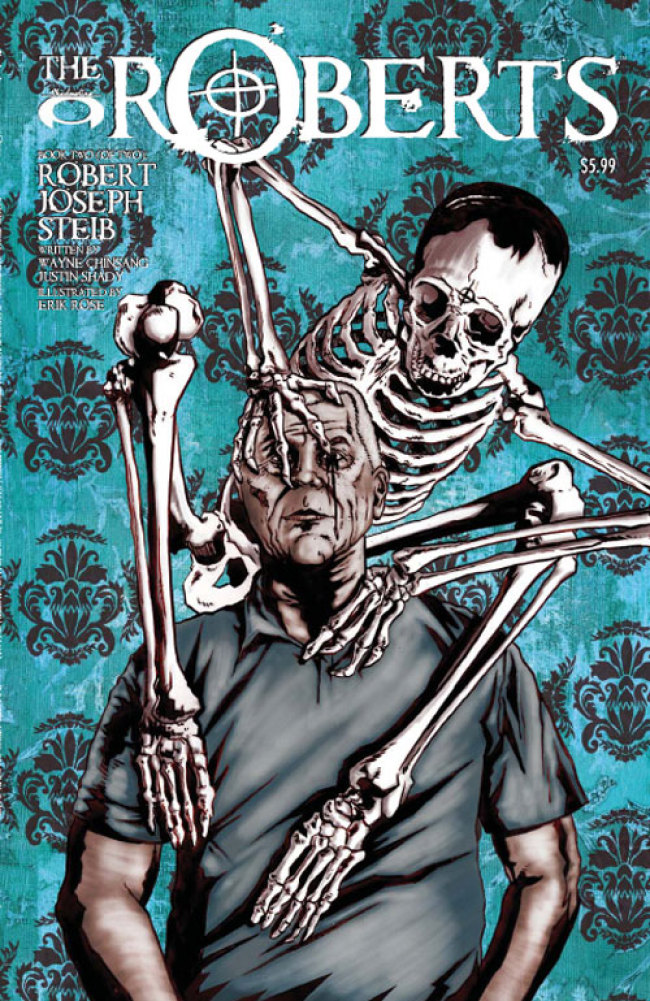
ROBERTS #2 (OF 2)
Price: $5.99
iFanboy Community Pick of the Week Percentage: 6.4%
181
Pulls
Pulls

Avg Rating: 4.4
Users who pulled this comic:
- acbg
- ActualButt
- adrianhosseini
- Agent005
- ainsophaur
- Anson17
- ApesRus
- apoptosis81
- astoriajohnstons
- astyak
- atma
- babaoriley
- bakakaba
- bakerskater
- Barnabas
- bc108
- bearnhart
- bird
- bobdoad
- bobstable
- brainhound
- BrianPereira
- BritishNightwing
- broderboy
- CammyKnoxville
- Canyonwalker
- Cartographer
- cav
- cenquist
- cheech794
- chelsea
- ChrisB
- ChrisNeseman
- ComicBookGuy37
- comicdork37
- CongoPepper
- conor
- Cooper
- cormano
- COWoDOOM
- Dan
- davegraham
- DavidB
- davidd
- deadspace
- djgarciarx
- Dmark
- doddzilla
- Doski
- dredscott33
- dustin
- Eazyse7en
- edward
- ElectricShoes
- ender1979
- esophagus
- esuarez27
- Eyun
- fredsolo
- geekmonkey
- ghostwriter
- Gimpace
- gobo
- gothamcentral79
- GrendelRK
- GungaDin
- Hawkboy
- HBD
- Hellblazer
- Hellhound
- Hezzy
- hickchilli
- hidefjohn
- Holzauge666
- hunkiechan
- Ipitythefool
- jag2004
- jakov42
- JD
- jedidave24
- jguerra
- jimmybund
- jing7wei
- JKExar
- jman911
- JonfromTx
- jonwithana
- josh
- jpete214
- JRS
- jsylvest
- jwlanglois
- k5blazer
- kdumont
- kendra
- Kenspiracy
- Kerrizor
- KevinAB
- kevmann16
- kevrum
- KreiderDesigns
- kwisdumb
- LadyTartan
- LanceTX
- lantern4life
- Lawless
- LeviticusPrime
- Lewis
- lobo
- Marbles
- MarkBiz
- MattyBoy1127
- micktootle
- Midness
- mikeromo
- mistersizzle
- MoniBolis
- mp
- mrglass23
- mrSlate
- mulletpeep
- Myrlyn314
- Neb
- Nerabene
- nroa
- OccultPanda
- OddsBodkins
- Orykayd
- Paradiddle
- PaulAllor
- PeteSandusky
- pinksage
- piscespaul
- projektidiot
- PymSlap
- RadConsv
- Raph
- rayclark
- Reckers
- Roblaw
- RoiVampire
- ron
- ryu156
- s1lentslayer
- Sammy
- ScottB
- Sean66
- Seba
- shenanigans
- sonicattack
- spicyness
- spongebat
- Spooks
- Spooky
- SunnyvaleTrash
- surfer419
- the8thsign
- TheApeThatEscaped
- TheCheat
- TheFlyingJEW
- TheFutureMadScientist
- TheSecondBatgirl
- thisisegan
- tigermojoe
- turaho
- Unoob
- uvayankee1
- viewaskew117
- Viewt
- Viktorr
- Vocaltic
- WadeWilson
- Webhead
- weddleb
- WetWork
- WildSeven
- wingsfan757
- Wolfdog
- xebix
- YoSoyJu
- ZackConstantine
All users who pulled this comic
Hide users
%7B%22comicdate%22%3A%222008-10-15%22%2C%22comicid%22%3A36552%7D


Absolutely cannot wait for this. God bless Ron for making #1 his POW, or I doubt I’d have picked it up, and damn it was fantastic!
And I want that cover as a t-shirt!
Agreed, I passed issue #1 around my friends (who don’t really read comics) and we can’t WAIT for #2
My wife (who doesn’t read comics) read #1 over my shoulder as I read it and we both really enjoyed it. She was disappointed to find out after finishing that we would have to wait a month or so until issue #2.
If you didn’t pick up #1 it shouldn’t be too hard to find to catch up or at least check it out in trade (assuming they do a trade). Just don’t expect something funny, cuz this is more realistic than it sounds (although, some of the nursing home moment are rather humorous if you have been around old people enough).
This book is a great combo of art that fits the story.
did anyone else notice in the first issue that the speak bubbles for the roberts square?
i suppose thats to show they speak without emotions. Clever touch
@Edward: Interesting. Didn’t notice it at the time but I will look for it in issue #2 (I borrowed my #1 to my uncle to read otherwise I would check right now). Thanks for the insight.
This is one of the reasons I’ll miss the mini episodes – never would have read the 1’st. issue had it not been for Ron. Ditto on most everyone’s remarks – passed this around at work to friends who don’t read comics and they’re all siked to see what happens. Most were disappointed to learn that comics come out once a month – it’s a harsh lesson I didn’t have the heart to say that sometimes they get pushed back (ahem. . .Wolverine #69).
Number one was written well and what a great concept. It was enough for me to pull this. But what shockingly bad art: no sense of a light source so the chirascuro didn’t work, just looked like a mess. And the modelling looked like it started from photos but in different poses (possibly when the photo references ran out) changed style into bad sub-Simsonsesque drawing. Backgrounds looked like cheap photocopies without any sense of depth or atmosphere. What a pity!
It just goes to show how beautifully subjective art is. I love the art in this book.
I think issue one of this was just amazing but can’t find issue 2 ANYWHERE