 Friday means many things to many people. For some, Friday means it’s the last work day before a well deserved weekend. For others, Friday is the day you have to check in with your parole officer because if not… well, you know to where you’re going back.
At iFanboy, Friday means it’s letter column time.
You write. We answer. Very simple.
As always, if you want to have your e-mail read on the any of our shows or answered here, keep them coming — contact@ifanboy.com
I just got done watching Justice League Unlimited and would like to know what’s a good Martian Manhunter story.
Kevin from San Diego, CA
Well, if the rumors are to be believed, you’ll definitely want to read Final Crisis. I don’t know how good it will be for ol’ J’onn J’onzz, The Martian Manhunter. But if it’s true it’ll be important.
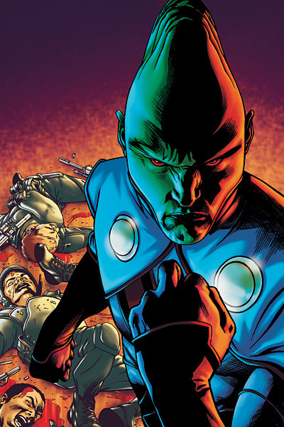 I love J’onn J’onzz — he’s one of my favorite characters. He’s probably in my top ten all time. He lends a certain intangible sense of experience, history and gravitas to any situation. One of my favorite series ever is Giffen/DeMatteis’ run on Justice League and J’onn is around for pretty much all of it. I will never forget the scene in #1 when, in the midst of all the jokes and in-fighting over who was going to get to be JLA chairman, he silently walked into the room, moved through the crowd of bickering superheroes (which shut them all up), and walked over to the bank of monitors that showed the previous team line up and turned off the pictures of those who had just died. It is a stunningly powerful scene that gave me chills at 10 years old when I first read it and still gives me chills today. If you want great J’onn J’onzz stories check out this month’s Book of the Month and volume two which is out later this year.
Another great series for J’onn J’onzz is Grant Morrison’s JLA. He is fantastic in that and pretty much leads the team throughout, even when it’s not official. Even the likes of Superman and Batman would defer to J’onn’s wisdom in that book.
The thing about J’onn J’onzz is that he’s a tough solo character, and tends to flourish only in the pages of Justice League books.
Conor Kilpatrick
I have a question for you guys that seems to be really bothering me. The character Superman is one that has been in many fights over the years but to the best of my knowledge I have never really seen him fight with any style. I have never seen him pull a ninja move like Batman or give a bad guy a kung fu kick like Iron Fist. Does the guy really only rely on his brute strength? I guess my question is if Superman got his powers taken away would he even be remotely able to protect himself in the real world?
Aaron from Texas
 According to the scene in Superman II, no. He’d get beat up by every asshole trucker in every dive diner in the country.
But in the comics, I can only speculate. This is a guy who can do anything without breaking a sweat. He moves faster than you’d ever see, so for the most part, the actual fighting is probably rather plain. Stand there and punch. But if it comes down it it, like with Darkseid or Doomsday, I’m thinking it’s just a slugfest. I mean, he doesn’t really need to dodge, because he can’t be hurt. So I would think he’s just a brawler really, with maybe a bit of wrestling. Why learn an intricate art you’ll never need?
 That being said, he’s a smart cookie, so he’s probably picked up some tricks when he needs them. I don’t know what your day to day life is like, but I don’t tend to get into fights that often (and I live in Queens, where offense is easily given to fragile posturing egos). If Clark was left without the delicious powers afforded him by our yellow sun, I’m sure he’d probably find some way to not get killed. Plus, Batman’s got his back.
Then, the question is, without powers, what would he do? He’d find some way to contribute I’m sure. Look at Oracle. She gets stuff done, and can’t walk.
This is making want to read a good Superman story….
Josh Flanagan
I’ve noticed a trend lately that, you guys being the nit-pickers you are sometimes, might feel the same way about. I’ve noticed a great deal of my favorite books having bad logo design, or in a lot of cases, going from a dynamic logo to a lame one. Nightwing springs to mind, as they went from the cool Nightwing symbol, to lame distressed white text. Other books with previously cool logos that now have lame ones include Uncanny X-Men, Captain America, and Noble Causes. Any spring to mind for you?
Jason M.
I love how we’re branded as the nit-pickers, which by the way, I don’t think is terribly wrong. I nit-pick because I care, but that’s besides the point. You bring up a topic that’s near and dear to my heart. Not only do I enjoy these fantastic comic books, but I also very much enjoy the design aspects of them. You’ve heard me complain about trade dress on trade paperbacks and things like that, but I haven’t weighed in on logos in a while, so thanks for bringing it up.
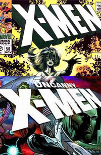 I’ve kept my mouth shut on the Uncanny X-Men logo for a while now, but I have to say, I am not a fan of the logos that have been used on the Uncanny X-Men for years. I may be nostalgic for the comics of my youth, but you can’t argue that the thick logo, designed in the late 60s that carried through into the 200s wasn’t the utmost of perfection. And yet, they’ve gone with a flatter, less dynamic logo for the past few years. Now, I’m ok with variations and having fun with a logo once in a while, like in this week’s issue of Uncanny X-Men #497, if it serves the story and it can be fun to mix things up. But if you have a classic logo, then use it! You don’t see DC changing the Superman logo, why not? Because it works, it has recognition and it’s the book’s identity.
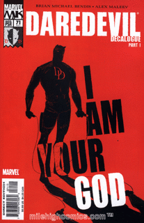
I remember a few years ago when they started playing with the Daredevil logo, moving away from the sweeping logo that we’ve seen for years and using that distressed block type logo, I just hated it. I know it served the storyline and was a design approach for that story arc, but every issue, I winced.
 That said, you mentioned Captain America and Noble Causes and I have to disagree with you in that I really like what they’re doing with the Captain America logo, by using the old 60s logo with the block type they have an effective approach that is both retro but also true to the characters spirit. Noble Causes on the other hand, if you ask me, got an upgrade with their new logo. I never really connected with the the previous logos they have used and I have to admit, I really liked the new issue’s cover treatment.
As far as other books, I really like what 2000AD has done with their new cover treatment, by building on their classic brand but having a modern feel. And not surprisingly, I’m not a fan of what they’re currently doing on Fantastic Four, taking a way more modern and different approach, rather than the classic look that we’ve know for 40+ years (with a font that I’m particularly fond of). But I understand why they’re doing it. That’s the great thing about logos and the designs of covers, is that they can make changes and while it provides tons of fodder for us to nit-pick over, it doesn’t really change the contents inside the comic and usually, like most status quo changing story arcs, the logos and designs will go back to the originals sooner or later.
Ron Richards


I love Martian Manhunter, but it is pretty dissapointing to see that he hasn’t had any succesful solo arcs. He’s a good adhesive to a team, but he’s just stale when on his own.
I gotta agree on the logo point. Nightwing in particular, especially as it usually really interesting, dynamic covers, is the most bland and boring logo I can think of. The book deserves better. The white, distressed font works perfectly for something like DMZ, but on Nightwing? Nope, it’s being short-changed in my opinion.
I do love the cover layout for Noble Causes though, font and all.
Great topic Jason. We don’t talk about the design aspects of comics enough.
I’m in marketing and I work with designers, so in my opinion the main purpose of a cover is to catch your eye and get you to pick up the book.
Now generally comics aren’t displayed in spinner racks or on magazine stands anymore, so you can move the logo or masthead around (Scalped has been doing this really well lately). But in generally the logo needs to be at the top of the page and really simple. A great example of this is the HACK/SLASH logo.
The HACK/SLASH logo is simple block letters with a knife for the slash mark. This logo is awesome because you can do anything with it. Play with its colors, add gradients or shadows, distress it, or splatter it with blood – any artist can easily design a cool cover with that logo.
Now some logos you can’t do any of that stuff with – first example that comes to mind is the JSA logo. This logo looked great for the first ten issues with the Alex Ross covers. The covers where entirely black with only one character as the focus – and the logo really caught your eye. Now they’re trying to use the same logo on covers that don’t have black backgrounds and feature a ton of characters, and your eye is able to easily blend the book in with the rest.
The JSA logo is too big and the font is too thin to stand out the way it’s being used now. So from a my point of view it sucks and needs to be redesigned now that Ross is off the covers.
I look at J’onn J’onzz like cinammon. Tastes delicious when combine correctly and totally makes a dish work. But try to eat it on its own? Yech.
Josh: agreed.
Darwyn Cooke wrote a pretty good J’onn J’onzz in New Frontier.
Did no one read the Ostrander/Mandrake Martian Manhunter series in the late 90’s? No? nobody? It’s a great story arc that mixes a little of the hard-boiled detective John Jones type stories with some big space stories that take J’onn back to Mars and Saturn. Also it has the oreo cookie story. If you haven’t read any of these, look for them.
The good Martian plays an awesome role in Dixon’s first story of Batman and The Outsiders. If you really think about it, J’onn and Batman have a real good dynamic that I think is pretty underused.
I love Martian Manhunters new look. Inevitably, of course, it’s not long for this world.
I’m now imagining eating a spoonfull of dry cinammon. Oh god that’s horrible.
The logo design question was really good. I think 5 years ago, DC had Chip Kidd design New Mast heads for all of the Batman books, and got a horrible response among the fans. I’m not a big fan of the All-Star line title treatments either (which I think he did as well).
I didn’t mind the Daredevil run in blocky type with the bold colors. It was cool.
@jstump: Ive actually had a spoonfull of dry cinnamon, but its impossible to swallow. It feels like putting good smelling dirt in your mouth. Which is really the only plus, you’ll definitely have some good breath.
The only reason I did it is because you can get pretty bored at an ice cream store during the winter time.
I’m with Patio, the Ostrander/Mandrake Martian Manhunter series was a gem. We learned about JJ’s many secret identities, details of his past, met such fascinating characters as Bette Noir (she’s better than the name, honest) and more.
As for Superman, in the Silver Age he was familiar with Klurkor, which was a Kryptonian Karate or somesuch. I bet he still has the chops.
I also love logo talk, which is why I love legendary letter artist Todd Klein’s blog, in which he regularly looks at how logos of a particular series have changed down the years.
http://kleinletters.com/Blog/
And he’s even done the X-Men. Here’s part one, there’s a link to the rest at the bottom of the page:
http://kleinletters.com/Blog/?p=342
And of course the oft-mentioned "New Frontier" has some great J’onn J’onzz characterization
jason, I love the logo topic.
i just finished a grphic design degree in australia so i always pay attention to logo design and cover dresses. In my opinion the finest designer doing covers today is james Jean of Fables fame. He started playing with logo design in the early part of the Fables run, some really cool some.
i also think brian wood has a great design sense. Vasilis Lolos’ work on Pirates of Coney was nice too.
I DID READ THE NEW FRONTIER WHICH LEAD TO THE MARTIAN MANHUNTER WITH THE ORIOS AND I SPOKE TO A CUSTOMER, HE METIONED THAT JJ WENT AS A CAT WHEN HE WANTED TO GET AWAY WHICH WAS INTRIGING. DID THAT HAPPEN IN THE OSTRANDER RUN?