Covers are vengeance. Covers are the night.

Manhattan Projects #5
By Jonathan Hickman
Deceptively simple. But dig in. Is the central circle a cross-section of an eye?

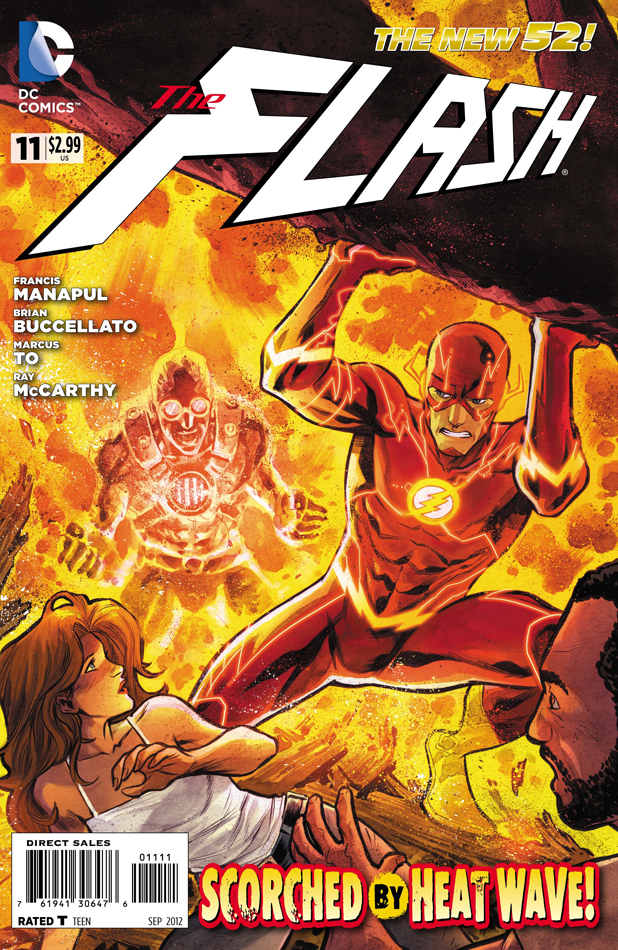
The Flash #11
By Francis Manapul
Can’t go wrong with a fiery act of heroism. Something quite pure about the three layer depth of this composition, with the viewer positioned along with those being rescued by the Flash. But we know what Barry might not, that Heat Wave remains an immediate threat!

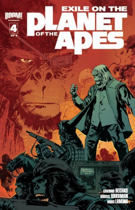
Exile on the Planet of the Apes #4
By Gabriel Hardman
Gorilla warfare at its finest. I will never get tired of these theatrical compositions. Tons of gravity.

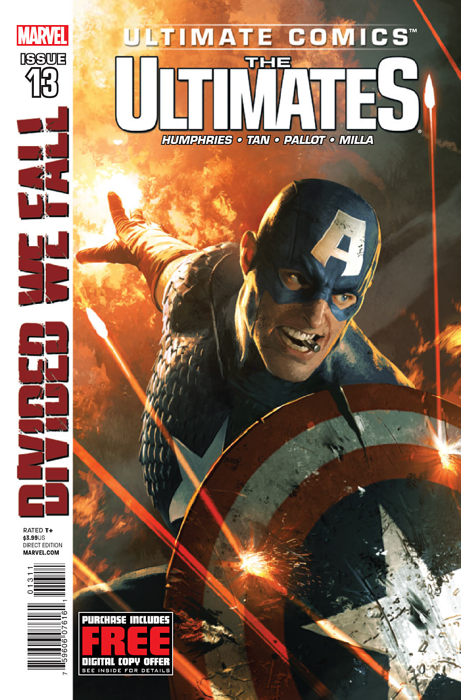
Ultimate Comics The Ultimates #13
By Michael Komarck & Adi Granov
Stirring and patriotic, but delightfully irreverent. Wait a minute. That’s not a cigar…


I’m waiting for the MP covers to actually mean something. Design for the sake of design is one thing, but they should have some kind of function. They should add up…
Those covers are so hip that it’s becoming a health concern.
They’re just a little more subtle than the frying-pan-to-the-head imagery we’ve come to expect from comic covers. I like that. Variations on a theme wherein each variation hints at some element of that month’s chapter.
There is a meaning in the MP covers. I see this varying colors and shades on this one as a representation of the shades of what is good and evil. The interiors have shown blue juxtaposed with red in interesting ways – such as when it was Albert vs Albert.
The first cover speaks to a duality.
So on and so on.
Still think these are the best on the stands.
I’m a big fan of all the MP covers. The meanings are subtle, but the design is striking, they really stand out on the shelves.
zlbenson, good call on good v. evil. I thought it might have something to do with time because of the coloring in the flashback scenes, but now I think your assessment makes more sense.
there is stuff in the MP covers that actually relate to the inside of the book. Its not obvious, but its there. Design doesn’t mean you have to treat the viewer like a baby and spoon feed them a 1+1=2 kinda imagery. Sometimes things are beautiful in their abstraction and ambiguity. Sometimes it can just be information.
Also, i really don’t think everything needs to “mean something”. They stand out on the shelf, they are a coherent system that works as a body of work, and they deliver information. They don’t need parables or symbolism, or jokes to be good. In a way its an anti-cover.
Does it get your attention everytime? Yes.
Is there anything else on the shelves that looks like this? No
its doing its job.
Not to mention that red and blue could also be hinting at the photochemistry phenomenons known as redshift and blueshift, which I would assume Mr. Big Science Hickman is intentionally doing. He could have picked any other two colors to reflect duality, but red and blue do have their place in science as well.
I rather like Jim Mahfood’s “Everybody Loves Tank Girl” cover this week.
Green Lantern and All Star Western get my co-covers of the week.
That All Star Western cover got my vote as well.
I love the Captain America & Iron Man cover this week.
really expected to see GL on the list this week.
it’s cool.
it’s on my imaginary list.
I was expecting to see it too, I haven’t read GL in the New52 but bought this issue just cause I liked the cover and Black Hand is one of my favorite villains in the GL books, I don’t think we’ve seen him since Blackest Night? Anyway, the colors especially the emerald green just looked amazing glowing in HD on the computer. I buy in print but look at everything before it comes out.
I’m really diggin that Flash cover. Quality work from Manapul.
Are we to assume Ol’ Cap caught that bullet in his choppers?
I like to think that cap was interrupted during breakfast.
I think best week in covers should have 5 covers on the list, there’s just so many comix and they’re just fun to look at and comment on.
The Ultimates cover has been my phone wallpaper for months (until Batman in honor of TDKR). Next month’s Iron Man cover also looks like a potential pick for COTW.
You picked MP but not GL?!?!?! The cover for GL was downright devious. Its the wallpaper on my phone right now and every time I see it it creeps me out a little. Just an astonishing cover.