Covers. So many great covers each week, it's always difficult picking out just a few. I've never been very decisive. When I pick out my socks in the morning I tend to feel guilty about leaving the others behind. But that's silly, because socks aren't sentient. And if they were, they'd probably prefer staying in the drawer anyway, because who wants to be walked on, really? This is why I generally wear mismatched socks. There's a kind of logic going there, I think. I hope.
Here are some covers I liked:
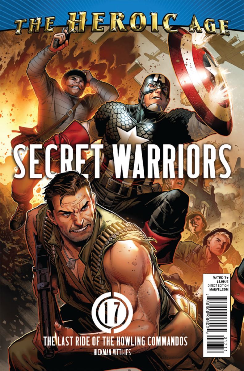
Secret Warriors #17
cover by Jimmy Cheung
This scintilating pinup is more American than an exploding apple pie. Cheung's operating at absolute top form. The composition is phenomenal, perfectly fraiming the Commandos and even revealing the rubble, explosions, and aircraft around them, without feeling jumbled. Now. Can we please do soemthing about the glimmer glamour Dollar Tree Heroic Age banner? With the tickets you win at one rusty round of ski ball, you could afford this, a Chinese finger trap, and some green apple Air Heads. This banner has destroyed more fine art than WWII.
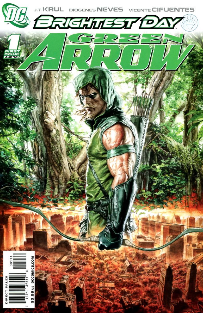
Green Arrow #1
cover by Mauro Cascioli
This lush cover from Cascioli almost makes up for the dire state of Star City and the heroes and titles associated with it. Ollie is literally waist deep in the rubble of his beloved city, but he's also returned to his Longbow Hunter days, prowling through the woods like some kind of mustachioed jungle cat. But clearly, it all goes beyond the terrific concept and into a pretty flawless execution. Cascioli's working almost photoreal, from the musculature of Ollie's arm, to the attention to detail and texture in his costume. And the landscape itself is the kind of stuff Swamp Thing bookmarks in the folder "not_porn." I can only assume this took twelve years to draw.
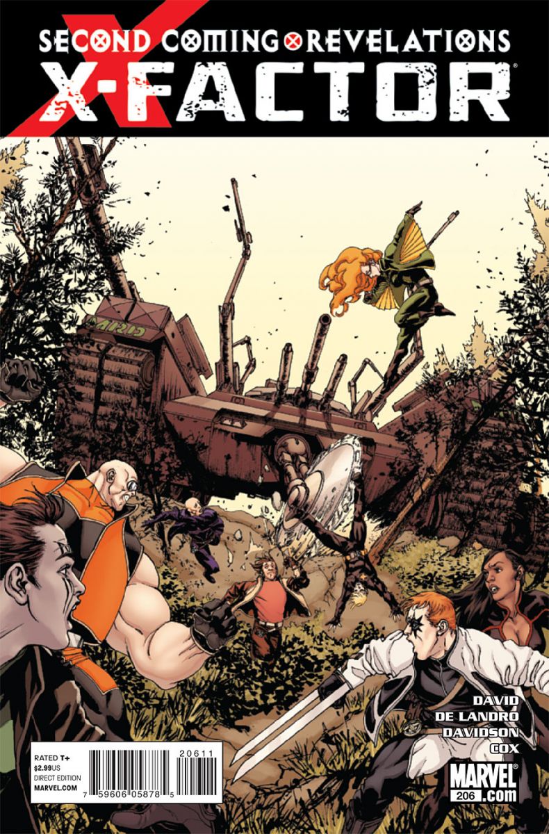
X-Factor #206
cover by David Yardin with Nathan Fairbairn
Remember those levels from Crash Bandicoot when you were being chased by the polar bear? This is like that, but with a circular saw. While the Second Coming banner isn't really the belle of the ball, it's at least clean and unintrusive. It actually accentuates the starkness of that great cream-colored sky. It's a strong composition overall, but what I really like is the depth of it. Action in the foreground and well into the background. Like the Secret Warriors cover, it also makes use of a canted angle for the horizon and, in turn, the angle of the tank, to give it a hand held filmic quality. That ratchets up the tension and movement. It also makes the composition that much more asymmetrical and compelling. Simply put, it's just a totally dynamic snapshot. There's something downright creepy about those tank arms too, and the shaggy grass and debris from the trees makes it kind of itchy and frantic. Also, cartwheeling and the always hilarious chin forward, arm pumping death run at center.
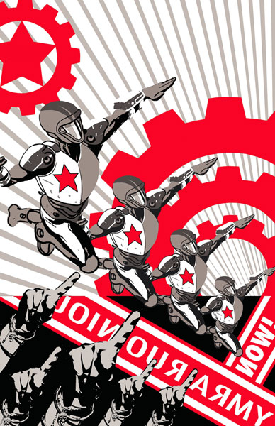
Justice League: Generation Lost #4
cover by Tony Harris
I've been thinking about it, and I've decided to join the revolution. Total Warholian POPaganda. Dig it to pieces.
Ok, what'd I miss?


Ok how is Green Arrow a Brightest Day Tie-In?
That Secret Warriors Cover and the preview paragraph sold me on repicking up this series (stopped when all the Siege stuff and The List stuff started pouring on).
The same can be said for Green Arrow, awesome cover and really nice preview art. (Still waiting to read the two though :/)
@SpiderTitan
White Lantern Deadman arrived at the devestated portion of Star City and the white ring made a forrest in its place.
Damn, that Tony Harris one is gorgeous.
Warhol was a hack.
@WeaklyRoll Oh yea I forgot about that, thanks!
Take that Warhol! You have been served.
the gen lost cover is so beautiful that I am thinking about framing my issue. Also, did I just read a Crash Bandicoot 2 comparison?
Fuckin’ Heroic Age banner.
I think the Justice League cover is more Socialist Realism than Warhol. Socialist Realism was the style used by artists in the former Soviet Block for posters, etc.
By the way, I do think the Justice League cover looks great.
If you look at the end of Green Arrow 1, you’ll see how it’s a Brightest Day Tie In
I like Yardin’s line work…and the receations on their faces..
@NawidA:
Totally agree. That banner just stands out and kills all the covers its on fer me!
It’s such a poorly Photoshop filter’d amateur style.
Who the hell gave that the go ahead in editorial?