Covers aren’t just cute like everybody supposes, They’ve got them hoppy legs and twitchy little noses.

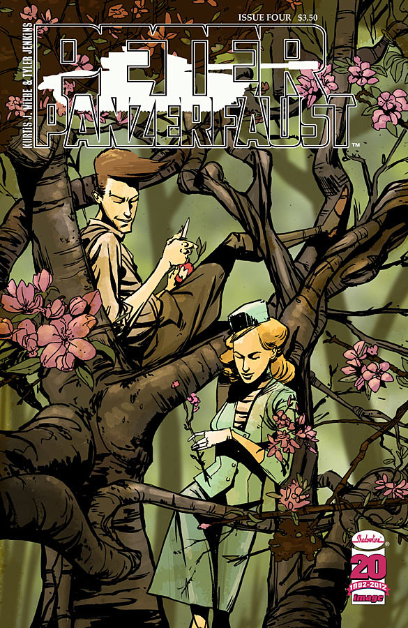
Peter Panzerfaust #4
By Tyler Jenkins
How often do we see a war comic with such an elegant cover image, but Peter Panzerfaust is no ordinary war comic. Love the complicated tangle of branches, how it isolates these two characters from each other, much like time and circumstance.

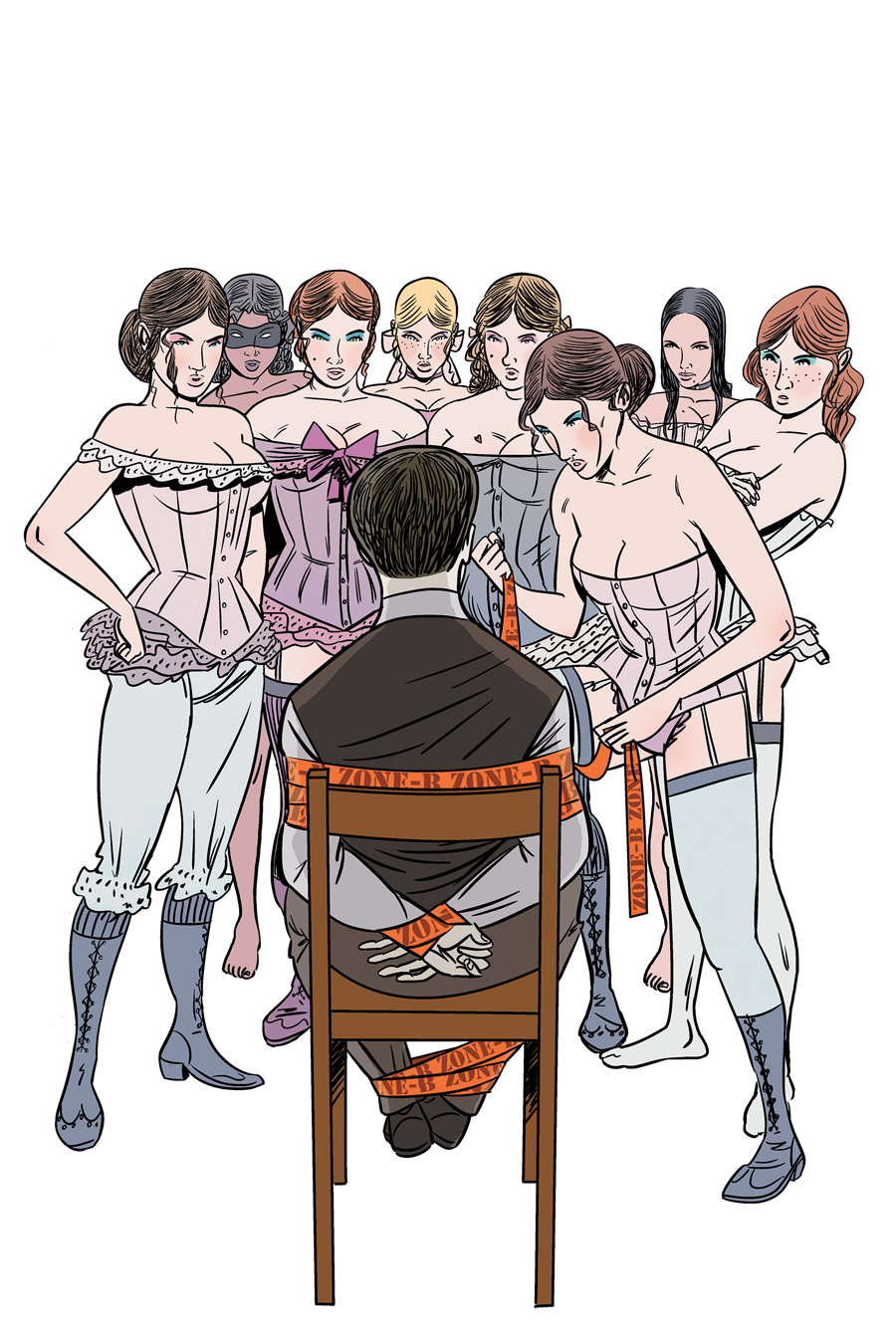
The New Deadwardians #3
By Ian Culbard
Speaking of cover images atypical to their genre, would you believe this is a zombie/vampire jam? That the man in the chair is the vampire? Here’s an image that raises a dozen questions, both to those unfamiliar with the series and to dedicated readers alike.

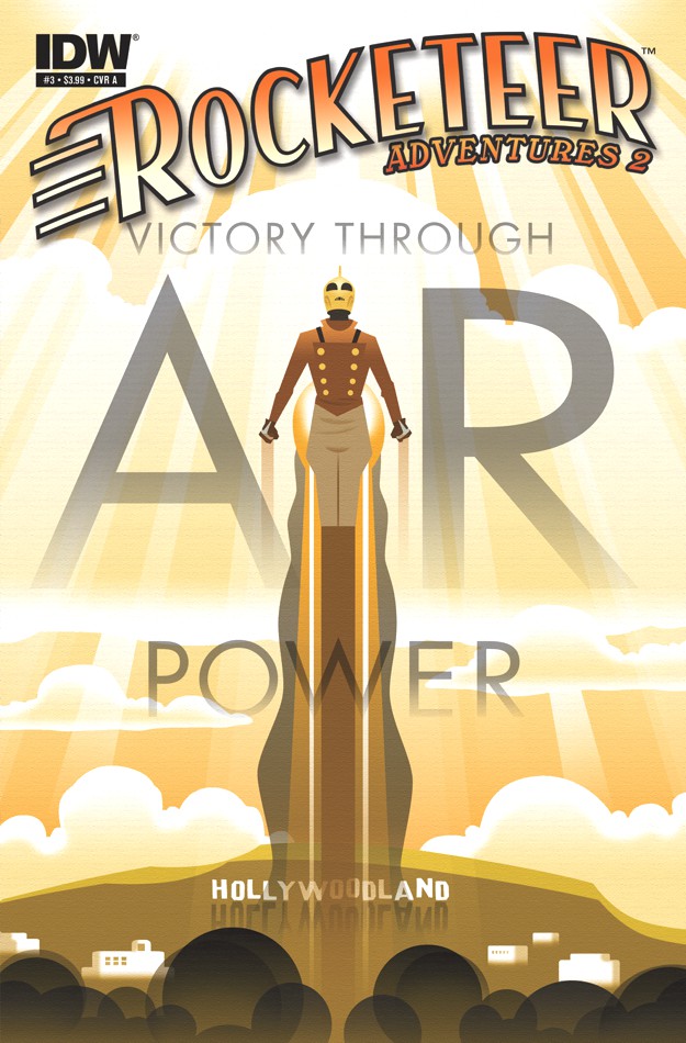
Rocketeer Adventures 2 #3
By Darwyn Cooke and Dave Stevens
Though the title logo kinda of gets in the way a smidgeon, this works as a glorious period poster, a futurist vision from a time long gone. It wouldn’t be out of place in the next Bioshock game, especially given its skyward setting. The gold color scheme is practically decadent.

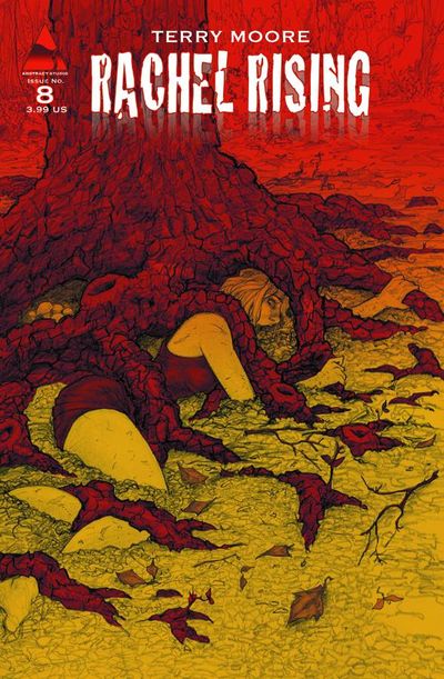
Rachel Rising #8
By Terry Moore
Again, the red and yellow motif in this second arc is such a profound improvement over the anti-freeze green of the first. I’d say it was easier on the eyes, but that doesn’t account for just how deeply disturbing this image is. It’s not just the concept of a woman trapped in the roots of an old tree. It’s that look of desperation, her grip on the roots. And the texture and color too, I think. The aggressive red, the sickly yellow. You can feel the gnarled wood and the sandy soil, every dried leaf and bit of kindling. It’s uncomfortable and it should be.

Exile on the Planet of the Apes #3
By Gabriel Hardman
I will never ever get tired of Gabe Hardman drawing clothed apes with projectile weapons. Or Dr. Zaius’ ominous visage as a background element. A stunning battle cry. I’d be thrilled to see this hanging outside a multiplex.


America’s Got Powers had the best cover this week.
Loved the TMNT cover this week.
Good Collection. I also liked Grim Leaper, TMNT and Supercrooks. The overall design of America’s got Powers is nice (as always at Image) but the face of the guy… Hitch was so much better.
What’s the appeal to the America’s Got Powers cover? It’s a square action image and a garrish logo perched sort of thoughtlessly on a white background.
I’m not sure of the merits of the TMNT cover either. It’s an unadorned pinup of the Shredder walking towards the viewer. Is it just that it’s the Shredder?
Not trying to be a bully here. But if you want to bring in an alternative, you gotta defend it.
For Americas got Power its that they got the look of Americas got Talent and if thats what the book is about (which i assume, didn’t read it) and i like the white space. The drawing is bad, like is said, Hitch was so good but sadly doesn’t live up to the hype anymore.
And for the TMNT Cover, its Shredder. Not a well crafted argument, but ist all i got 😉
Thanks for bringing something to the table. I think that’s a valid point about the AGP cover glossing with the presentation of similar reality shows. If I’m not drawn the cover objectively, it’s at least tonally appropriate to its content. There’s merit in that.
i agree with Paul on the purely formal design issues on AGP. The problem with doing a homage/parody of something that’s inherently kitschy like a TV reality/Game Show logo, is that your end product winds up being just as cheesy as the original. That aesthetic personally turns me off, but i do think its very well done for what its trying to do.
I loved the Chris Samnee cover of Wolverine this week
That Rachel Rising cover is amazingly creepy. The colors really do some magical things. I keep being drawn to that image every time i see it.
I love the idea of the Rocketeer cover, but it feels way to “vector art” for me. Its so perfect and clean that all of its retro art deco-ness gets lost for me. Perhaps another top “layer” of some textures and little detail things that make it feel more like a retro deco poster and less like a computer graphic would have sealed the deal for me.
Totally agree with this. The idea and layout of the cover are fantastic, but that style just screams out for texture. Without it, it feels like 90s computer art rather than 40s poster art.
And what’s with all the panels? What do they need such good pageflow for anywaaaaaaay?
Covers!
COVERS!
IT MUST BE COVEEEEERS!
…
… or maybe gatefolds?
Screw the multiplex, I want those Ape covers poster sized and in my living room. But also at the multiplex, actually.
I second that emotion….I REALLY hope they remake/reboot the rest of the POTA stories.
I really like the Peter Panzerfaust cover. Once I get my budget back on track I’ll pick up these last two issues I missed.
As for the Rocketeer cover, that is just amazing art, right there. I’d like to see a version of that cover without the words/logos though.
Simpsons ruined Plante of the Apes for me:
http://www.youtube.com/watch?v=gMnG3gOqigE
Every time it’s on TV, my head goes ‘Dr. Zaius, Dr. Zaius…’
That Rachel Rising cover is beautiful, makes me wanna catch up with the story and Rocketeer and Darwynn Cooke we’re made for vintage pop poster art like this.
Monocyte cover was beautiful & moody!
This has nothing to do with covers, I just wanted to voice my appreciation of the Once More With Feeling quote at the top of the page.
Seconded!