While some websites showcase the median of the week’s covers, here at iFanboy, we only serve up the premium, grade A BEST. Because you’re worth it. Girl.
Man, York Peppermint Patties are great.

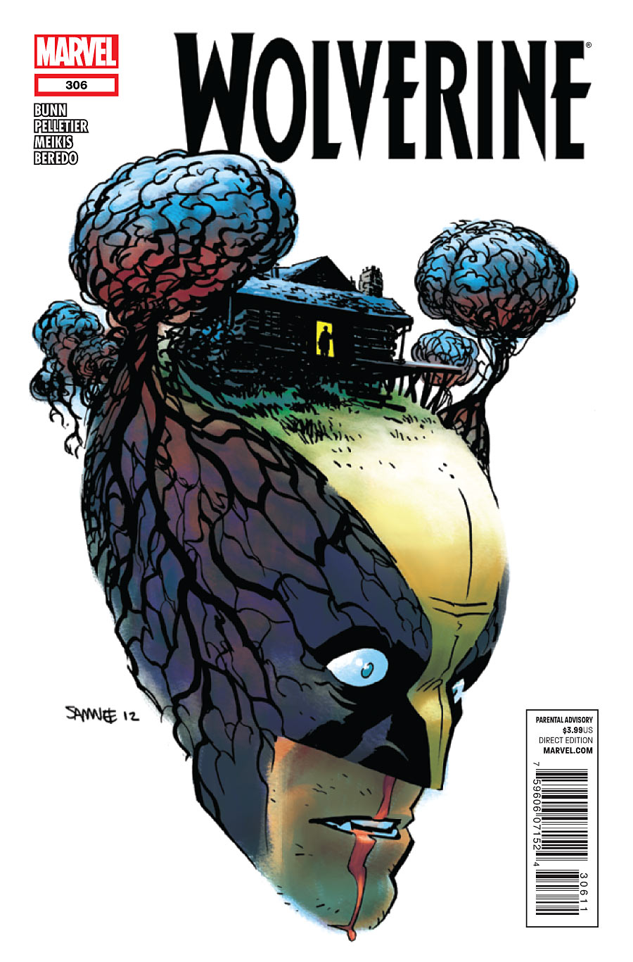
Wolverine #306
By Chris Samnee
Ron specifically requested I include this last night, though it was on my list anyway. We so rarely find depictions of the light from our parietal log cabin, or the figure silhouetted at its door. So rare to see the fullness of the cortexes where they loom like sentinel trees. The mind is a terrible thing to waste, but it won’t think twice before wasting you.

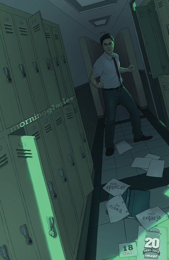
Morning Glories #18
By Rodin Esquejo
Terrific placement of all the stuff here. On scattered looseleaf and all that. But that vanishing point will kill ya if you focus too long on the physics. It’s like Wonka’s forced perspective room. Only a little Rachmaninoff can save you now.

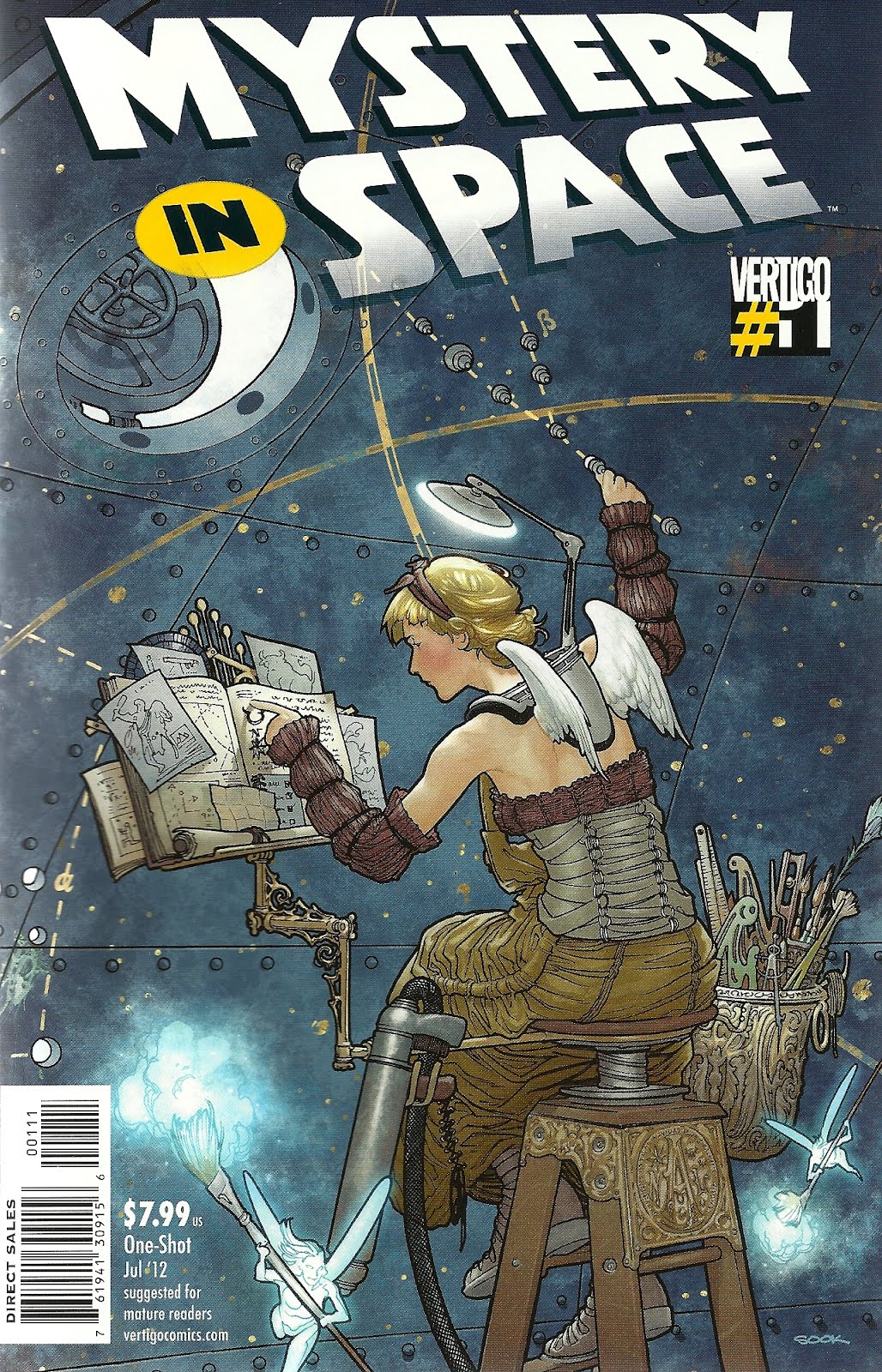
Mystery in Space #1
By Ryan Sook
It takes more than precision to draft constellations. Call it magic. Call it the fury of countless suns. The detail in this latest Sook portrait is, by all accounts, angelic. But what make it truly shine are this rivets in the boundaries of the cosmos and that open hatch with the stark light beyond. Do you dare venture out from the chamber of the known world and touch the face of Ed Harris?


Wowowow! I hadn’t seen that Wolverine cover, and it’s stellar.
love samnee’s work.
Holy crap! What a selection. We’re so lucky to have these guys.
Fairest #3 takes the cake. Look at those breasts!!
Easy does it.
ha! you should have said “look at those york peppermint patties!!”
but, seriously. there’s nothing to get excited about there.
I agree Fairest is the best cover of the week. Wolverine is VERY cool but Fairest is just the tits, I mean tops!
All jokes aside (please), what’s great about it is that it is a sexy looking lady but it’s still very tastefully done.
I didn’t mean to get carried away, fellas. Okay, she has nice eyes too…
In all seriousness, I just truly love Adam Hughes’s style.
I really love that Mystery In Space cover. Like you mentioned about the dual meaning of the rivets and the hatch (i see a crescent moon) really makes this cover for me. Also the color is really strong in this piece. Often times color only gets discussed when its bright and vibrant, but i think its really singing in this piece despite it being so subdued.
Morning Glories always does a cool job with integrating their masthead into the art, but you never have a problem identifying the book.
The Morning Glories cover would be awesome, if not for the fact that the floor tiles are all out of whack with the rest of the room, and that’s accounting for perspective.
Full disclosure: I work for a flooring company. that sort of this bothers me.
I have a feeling that it’s intentional. If you look farther back into the hallway, it seems that no person would be able to fit, as it squeezes together.
I think the imbalance suggests the state of the school and the emotions of the character. But that’s just me.
Chris Samnee’s cover is great, love the expression!
I love the roots in the Wolverine cover. So much detail there in general.
My LCS must have already been out of those issues ’cause I’d remember those covers! Wow!
Wow! So many great covers this week, and all special in their own ways. The Morning Glories stands out as the weakest to me, but maybe if I read the books it would have more impact. The hallway he’s in is very narrow though. I would hate to use those lockers!
If I could time travel, I’d take that Wolverine cover back to the nineties, at the height of nineties-dom and show the Marvel staff how awesome it is. Then of course, they’d be all like “that’s not badass enough, check this out: http://www.ebay.com/itm/WOLVERINE-100-cgc-9-8-ANNIVERSARY-ISSUE-Hologram-Cover-/400190286141 ”
And then I would weep.
I have an uncut version of that hologram somewhere. It was pretty cool from memory. Shame the issue sucked
That Fairest cover is COOL!
I think Deadpool #54 deserved a mention. I mean, it was freakin’ hilarious!
While it was very similar to another and it had the huge banner at the top, Wolverine and the X-Men had a great lookingl cover this week too!