Raindrops on Covers and whiskers on Covers; Bright copper Covers and warm woolen Covers; Brown paper Covers tied up with Covers; These are a few of my favorite things. Cream-colored Covers and crisp apple Covers; Doorbells and sleigh Covers and Covers with Covers; Wild geese that fly with the Covers on their wings; These are a few of my favorite things.
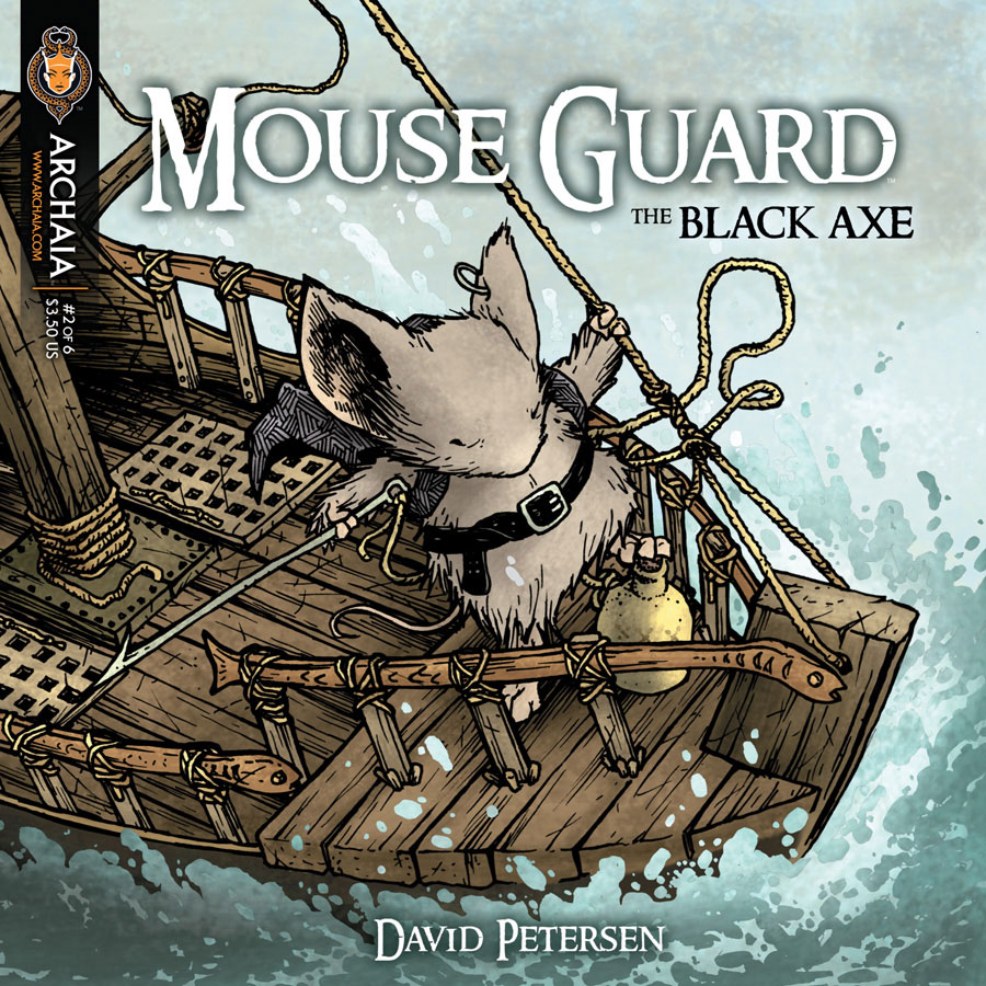
Mouse Guard: The Black Axe
Cover by David Petersen
If we all pretended this was going on in the sewers directly beneath our feet–really and truly believed it–the world would reclaim a great deal of its magic. So that's your homework for today.

Gladstone's School for World Conquerors
Cover by Armand Villavert
There's a sparseness here that might not have worked had the colors not been so strong. Just drawn in by the dramatic lighting from the central explosion. And the hot pink logo is really striking. There's a tremendous popsicle color scheme to this book all the way through, and it makes for a very appealing visual style.

Witchfinder: Lost and Gone Forever #4
Cover by Mike Mignola
The signature Mignola/Stewart orange eyes never cease to spook. I've made apologies for the tried and true Mignola cover composition before. It's difficult to pin down, but whether you look at it as a crack in the earth or a wisp of smoke over a neutral background, it's become a familiar treatment. It's almost a creative drafting exercise for Mignola, fitting characters into the same old layout in compelling ways, and some examples are stronger than others. This is one of the stronger ones. An eery and elegant take on the traditional town of shambling dead. I think it's that horizontal strip of…runes? Lettered cards that pull it all together.

The Walking Dead Weekly #18
Cover by Tony Moore
This one's a slam dunk. For real though, what a creepy image. The dangling legs of the foreground are a complete mystery until you note the basketball hoop in the background, which informs a truly horrific sight. We fill in the blanks. The best kind of narrative image.


The Gladstone’s School for World Conquerors is wonderful. I hadn’t seen it. Thank you for bringing it to my attention.
@stuclach Here’s the Talksplode I did with Gladstone’s writer Mark Andrew Smith.
@PaulMontgomery Thank you again.
NO sweet Tooth
@drdeeeznutz I don’t know what that means.
I sure do love me some David Petersen art. Mouse Guard is fantastic stuff. Love that series.
The Walking Dead cover would work loads better were the logo not covering so much of the body.
I loved Freedom Fighters (a great take on a classic composition, beautifully coloured); Doom Patrol (magnificently moody); and Superboy (intensely iconic)
Wait, you mean I’m the only one who has been believing Mouse Guard are running about under our feet all this time?
Peterson’s art has consistently been some of the best out there. Most artists couldn’t pull this kind of cover off. A unique creator; real charm. And he’s getting better!