Wouldn't mind being trapped on an elevator with these covers. If you catch our meaning.
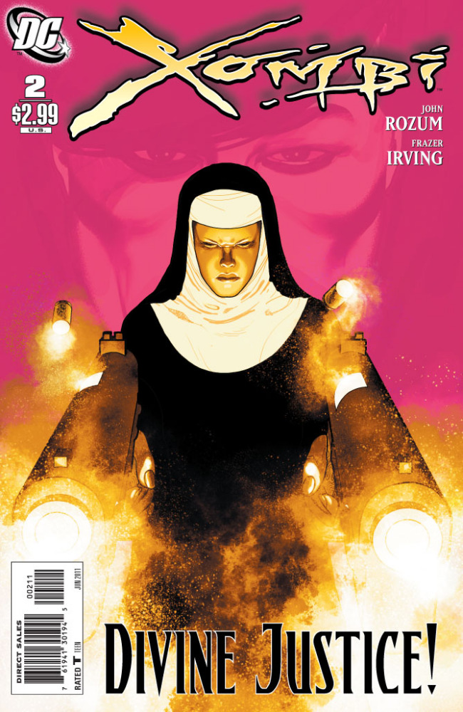
Xombi #2
Cover by Frazer Irving
I went to Roman Catholic elementary and high schools. It was like this. Constantly. When I graduated and went on to a secular university, I was at first perplexed why no one else was anxious or wearing kevlar in the moments before my first Physics for Design lecture. Oh, I whispered, processing the image of the kindly old man handing out syllabi in the front of the room. It doesn't have to be that way. Rulers are for other things. Fear is not a constant. Merely a variable. I like the pink too!
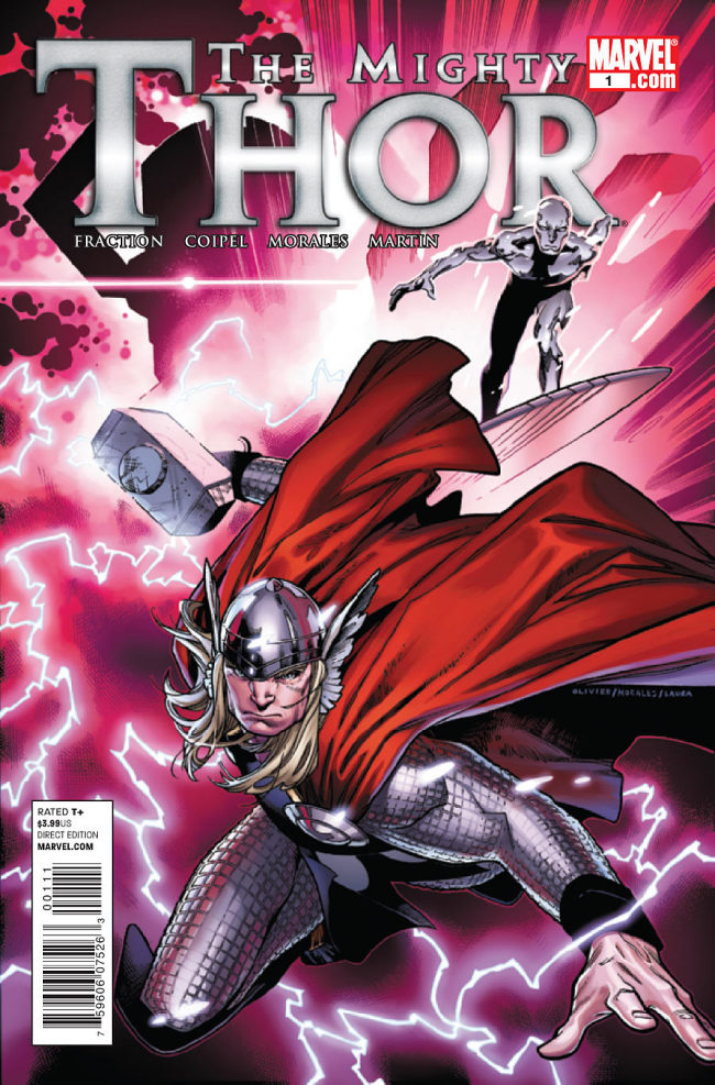

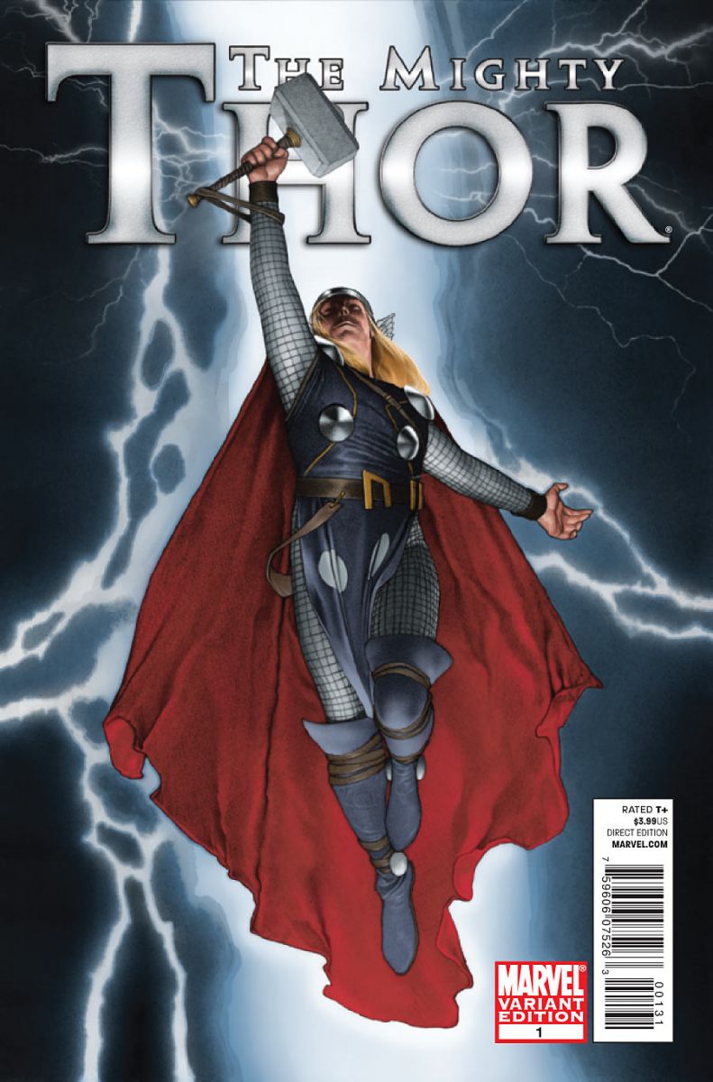
The Mighty Thor #1
Cover by Olivier Coipel, Variant covers by Walter Simonson and Travis Charest
Three very exciting covers for one very satisfying book. Simonson's variant (center), recycled from a drawing produced during the time of his quintessential run in the 80s, might've been a landslide favorite had the lackluster logo not dominated the composition. Still, it's a Thor to be reckoned with, and in terms of the drawing itself, a slam dunk. The standard cover at left heralds (heh) the return of Simonson's modern successor, the sensational Olivier Coipel. The color and dynamism help to overpower that unsightly logo. Finally, Charest's variant is just a stunning pinup, extremely elegant with exceptional texture and details.
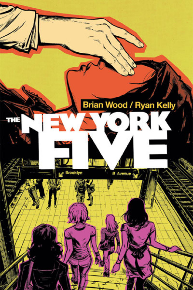
The New York Four #4
Cover by Brian Wood & Ryan Kelly
There is nothing that's not strikingly beautiful about this cover. There were skirts in the 60s trying to be this cover and they're just rotting away on a rack in a thrift shop. Puke green, Pepto pink and tangerine have never looked so good together. I love how the logo serves as a kind of cinematic transition between the top and bottom compositions, how the perspective of the bottom composition is an almost ominous invitation to descend down into a multiple choice question. Remind me of this one when I ask for best covers of 2011 come December.
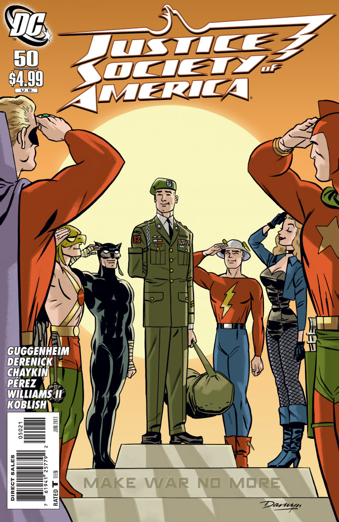
Justice Society of America #50
Variant cover by Darwyn Cooke
There's some so uncommon about this composition, about the circular grouping and how we're viewing it. I think the major thing is the asymmetry, with Alan Scott and Starman both saluting with their right hands from what we want to be mirror positions. Anatomically, that doesn't work, so we end up with this curious pose for Starman on the right. I don't know if the position entirely works, but the fact that it break symmetry makes for a bit of visual interest. It's just a really charming concept and final image, and the warm tone and "Aw, shucks" smiles keep it from miring itself in melodrama.


Really like that Xombi cover! I have no idea what that comic is, but it’s a striking image
I loved the Generation Lost homage to JLI
I really liked this week’s Amazing Spider-Man Cover. It doesn’t get much better than that.
It’s a shame that the large publishers won’t move their barcodes to, say, the inside cover.
Is it sick that Xombi reminds me of Lindsy Lohan in Machete?
@HailScott I go to a shop where they scan those barcodes, and that would A) slow things down a lot and B) piss off the weirdos who spend all that time searching for the perfect copy. All magazines have barcodes on the front. These are magazines. The challenge is making them work despite that.
Love that Xombi cover. Incredible.
And, of course, Darwyn Cooke’s cover is amazing.
I misread & had to do a double take on the closing phrase at the end of the Xombi cover review. I thought it was a sudden, revealing non-sequitur, but no. It is an exclamation point, not an “L.”
I am loving Copiel on Thor, i think hes bringing his A game to covers and interiors. I agree with Hail also – the barcodes are ugly, id like to see them on the back of my comics rather than the cover.
Agreed the Coipel Thor cover is absolutely amazing!!!
Great week for covers. In my mind Batman Inc. and Detective had the best covers and Xombi right behind them. I wonder which Action Comics cover people liked the best. I had a hard time deciding at my shop since they were all cover price. I went with the garish Alex Ross one…
I love the Xombi cover close second was the Planet of the apes cover
Why wasn’t Black Dynamite featured on this last week? That cover was awesome!
I agree with the Mighty Thor observations.
Coipel’s work on Thor has been astoundingly good. For years, Walt Simonson’s Thor was what I pictured in my head when I heard the name Thor. Now it’s Coipel’s version.
The Darwyn Cooke cover is also great… as is to be expected.
Scalped! What a cover
@Funcrusher, I’d have much preferred the cheery yellow Action cover over the gloomy, blurry one, but our shop never had it.
I also liked the jigsaw design for Wonder Woman, and joyously scrappy Thunderstrike concept.