Covers are often the first part of a book you see. If they're awful, they're probably also the last part you see. If there's a naked person on it, grappling with tentacles, you're probably in the adult section. I'm telling.
Here are some of the better covers from this very week.
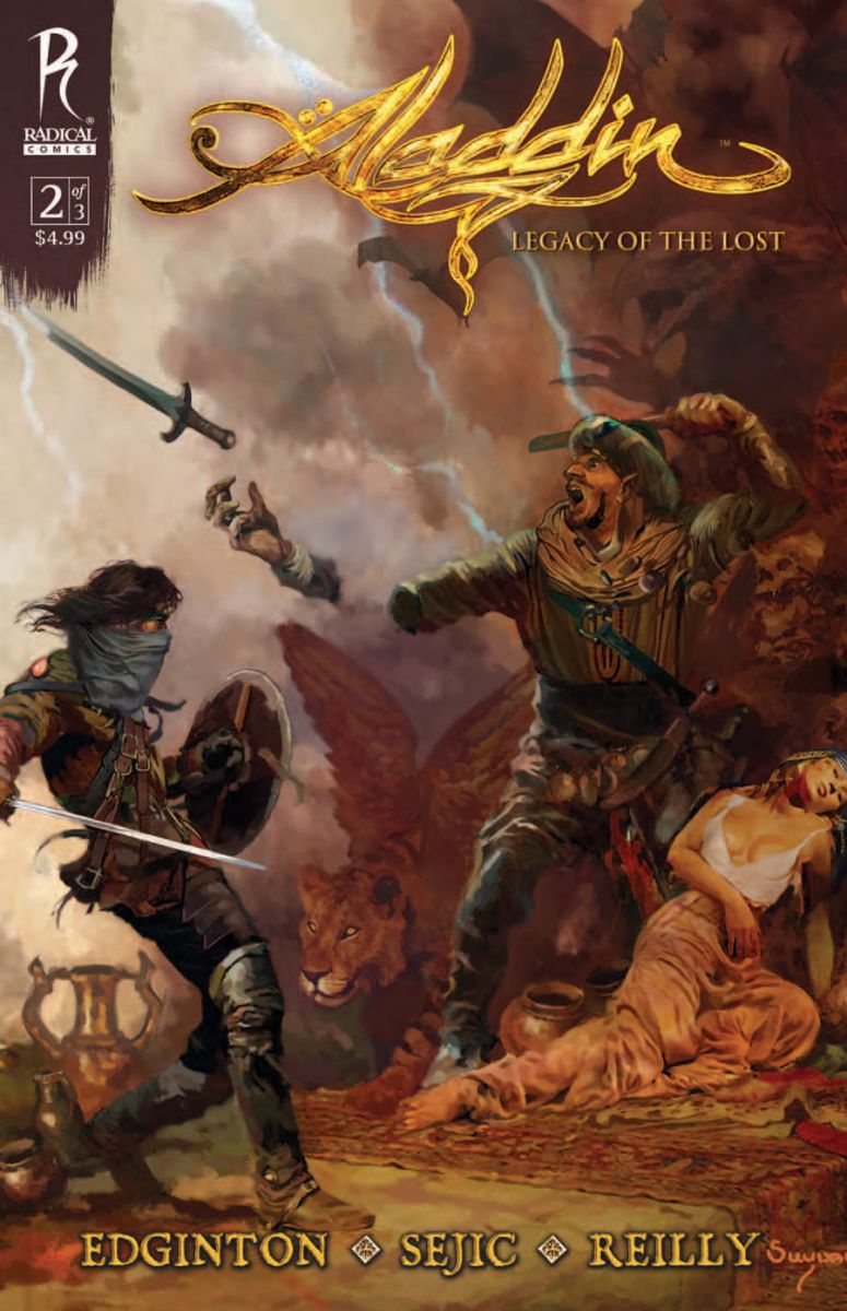
Aladdin: Legacy of the Lost #2
cover by Arthur Suydam
Would you give up your right hand to have a winged lioness, an eagle thing, and some sweet pottery in your posse? You know you would. I'm a sucker for swashbuckling sword and sandal imagery, so this cover totally rubbed me the right way. Great classical design with rich, luxurious colors and a genuinely exciting subject. Hands Hats off to Arthur Suydam for leaving the zombies at the door and channeling some Frazetta.
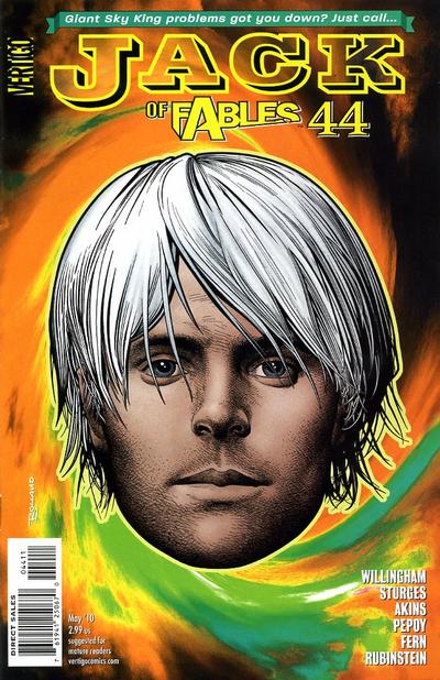
Jack of Fables #44
cover by Brian Bolland
Incoming message from the Big Giant Head! Brian Bolland unleashes a psychedelic Jack Frost by way of Andy Warhol with this striking headshot. When you're as good as Bolland, sometimes a big ol' face is enough to seal the deal. Seriously, shimmy to the left of the right in your ergonomic office chair. Those steely grays will follow you around the room. Between the fine detail in the hair and the totally sublime shading and modeling on the jaw, this is easily the best head in comics this week and probably the next five or six.
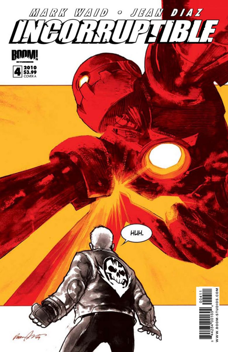
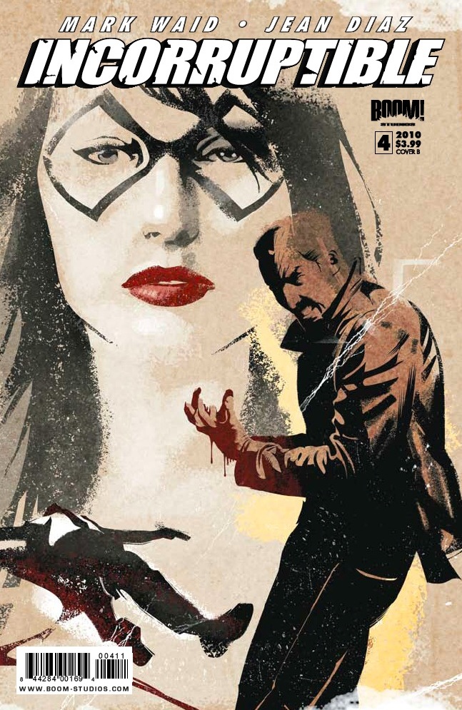
Incorruptible #4
cover A by Raphael Albuquerque
cover B by Dennis Calero
This month, two stunning covers to convey the split personality of Boom!s Incorruptible. Albuquerque's cover features the series' regular color scheme of black, white, red and orange and includes a classic big-jawed automaton. Totally vibrant with tons of impact. Dig that composition with the central orange square and both Max and the robot breaking the frame. Nice use of negative space with the white power cell in his chest. It practically glows. On the right, Calero offers more of a crime theme with a distressed woodcut feel. Can't go wrong with a looming femme fatale or a downed suit splayed out in the gutter (Now we know who murdered Don Draper in the opening credits of Mad Men). Love the shift to red for Max's bleeding hand. Two very different looks for a very cool series.
Aight, troops. What'd I miss?


I’d have to vote for the Cloak and Dagger One Shot.
ASM!
That Aladdin cover is amazing. I hadn’t seen it. Thanks for highlighting it.
No offense, but I’m not fond of the Jack cover. It makes me want to go to sleep (just like the actual issue).
@stuclach – Offended? Try OUTRAGED! How dare you!? Seriously though, everything’s subjective, but I think there’s something alluring about that image. I find it really interesting.
Paul, keep writing these articles, would you? You’re killing them. And why were you looking at me when I was checking out the adult section!? That’s my alone time!
I also loved the cover to DETECTIVE COMICS #863 simply because it’s JH Williams III drawing Batwoman and we’re just not going to see that too much more in the future. Gorgeous colors and the way he draws her gloves, hair and mask? So, so awesome.
@Paul – I don’t think I have the technical vocabulary to explain what I don’t like about it. It just doesn’t work for me. Perhaps because it represents what I feel has been the downfall of the series: SPOILER FOR TRADE READERS Abandoning the original Jack character for his (much less interesting) son. I know that shouldn’t color my opinion of the art, but I’m shallow like that.
That’s valid. I’m coming at this as an outsider who’s never read a single issue of the series. Some of these I evaluate comprehensively. I’m thinking about what it means for the series or how it represents the interior pages. Others, though, it’s just a reaction to a single image. That’s what this particular cover is for me, for better or worse.
why does jack frost look Jared Leto?
@Paul – I can respect that.
@bigyanks – Because Jared Leto is sexy and they want people to buy the comic (just a guess).
I loved, LOVED the cover for Gotham City Sirens!
@bigyanks I had the exact same thought
I’ll second ASM #627.
That logo fo Aladdin is pretty bad ass. As is the cover itself.
I like Suydam’s art. It’s a shame he’s been painted (no pun intended) into a corner for the zombie stuff. He certainly has a Frazetta influence in there some where, no matter what piece of his you are looking at. He’s truly a great artist.
Almost every week I disagree with the covers shown as "Best of the Week", but still one of my favourite features on iFanboy. The explanations make it worth looking at every time.
It’s awesome to see Arthur Suydam not do a zombie related cover. He’s very talented, and I know those zombie covers made him a mint, it’s just nice to see what else he can do.
I’m really enjoying this step away from Jack. Not forever mind you, but this Jack Frost story has been a lot of fun.
@Bendrix – I’ll take it! What’d you like this week?
@josh – I like the idea of following his son, but I’m not fond of the execution. The thing that drew me to (and kept me reading) Jack was the fact that it was funny and that the humor seemed to flow naturally from the story. I don’t find the current arc particularly funny and every attempt at humor feels somewhat forced. However, my wife loved it and I’m glad to hear that you enjoyed it. I wish I had.
I loved the ASM cover this week. Totally awesome.
Here’s why the ASM cover didn’t make the cut this week. I get the sense that it wants to be the cover to Criminal vol. 2 #2 (the deluxe edition cover) but falls short. Also, I have a totally subjective, visceral reaction to red violet. It’s probably my least favorite hue on the spectrum. And it’s all over that image.
Never justify to the rabble, Paul! Never!
@Paul Okay, choosing 3 I’d day:
Unknown Soldier #18: Which I am fully aware is a boring choice because the covers for that series, or all Johnson covers, are mostly heads above most covers these days. But the black and white juxtapose makes it jump out immediately, and without reading it yet, I’d say it reflects the lead character very well.
Godland #31: Strong image, even if it’s an homage. And all the space below the logo and the vibrant colors make it pop out for me.
Betty #185: Something I wouldn’t expect from a Archie cover (not that I am some kind of expert), and still, it fit’s perfectly. Again, great colors.
And it’s important to me to point out that I didn’t wanna come of as being snarky or something. First of all, those are not bad covers. It’s just like I said, I really like the feature, but it always features covers I wouldn’t have chosen (what might make it even more interesting to me). The explanation gives some inside in another point of view, which I really enjoy.
The Jack cover is truly trippy, but I’d have to opt for the black and white Unknown Soldier, it was certainly the one that leapt at me the most…
@Paul~ So much for the red-violet shirt sporting "Paul is the awesomest mother*%&$ eva!" that I was going to send you. You know, the wife and I did need a new dusting rag…
Unknown Soldier and Detective Comics are my favorite covers for the week.
Like the choices and love the words.