Goodness grapefruits! Cover me, i'm going in!

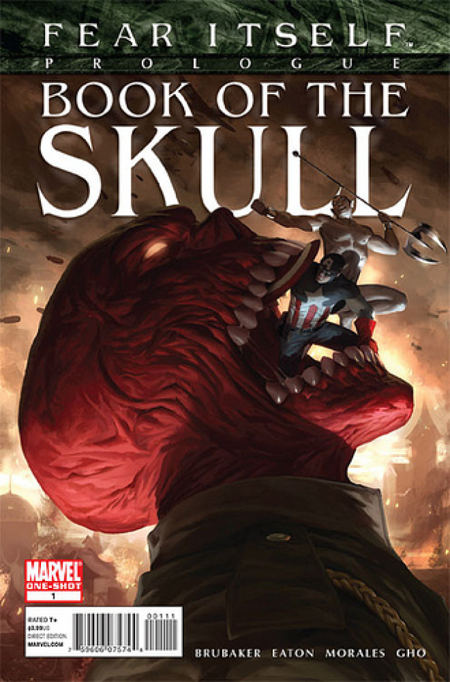
Fear Itself Prologue: Book of the Skull
Cover by Marko Djurdjevic
This cover is the best thing about the book, save a throwaway reference to Baron Zemo's totally ambiguous moral allegiances in a caption box on the first page. There are no giant Red Skull monsters rampaging through Easter Europe. It's all purely metaphorical. I love it as a piece of surrealism and as always, Djurdjevic delivers the goods in terms of dramatic lighting. My favorite cover for the week, bar none. I just wish the rest of the book lived up to this image.

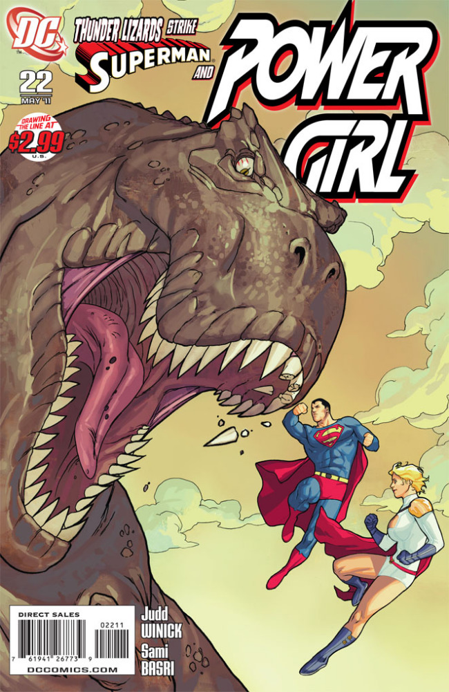
Cover by Sami Basri
Paul: Hey, resident biologist Ryan Haupt!
Ryan: Hey, Paul!
Paul: Talk to me about the cover for Power Girl #22.
Ryan: Sure thing!
While I think it's a bit of a short shrift being sidelined on your own cover, who can help being excited by Superman knocking loose a few Tyrannosaur teeth? I'm not sure if it's a conscious homage, but Superman is one of the first characters to ever take down a T-Rex on screen which gives this a nice mixture of badass, nostalgia and whimsy. Ron always complains if an issue's cover is divorced from the story, but if PG 22 contains this scene there's no way it could disappoint.

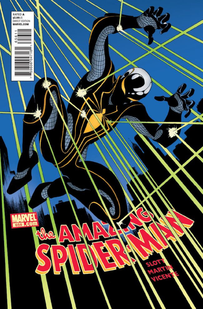
Cover by Marcos Martin
This is a polarizing costume design–and let's face it, that's one of the main draws of this piece–but I really dig it, personally. Dig the piping. Dig the shiny head. Dig the jazz shoes and all the netting. I don't know if any artist outside of Marcos Martin would do the design this kind of justice, but we're looking at a few more costume changes ahead, so who knows if anyone else will ever get the opportunity?

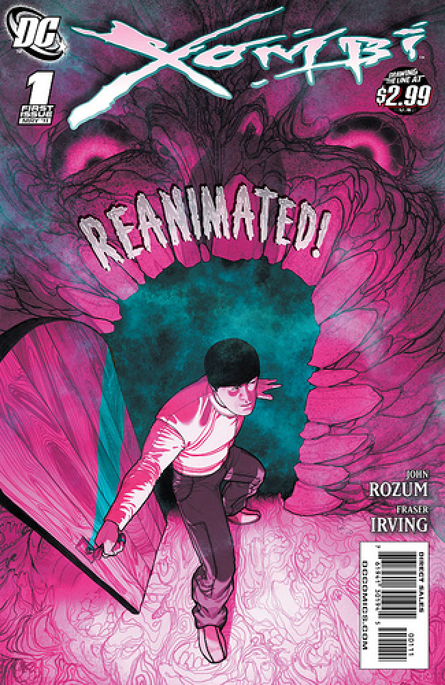
Cover by Frazer Irving
Nope, I'm not done yammering about how impressive a book this is. And I can guarantee this won't be the last of Xombi in the Best of the Week in Covers feature. Stay tuned for some nuns with guns. But this one makes the grade for big, big color. Irving's color palate is unlike any other, and I commend him for the bold choices. Electric bubblegum, kids! Oh, and as a child of the 80s, I'm looking at this and flashing back to my Castle Grayskull playset. So thanks for the memories!


I almost bought that Spider-Man book based solely on how cool that cover looked (and I really don’t like Spider-Man). I like the uniform.
Also, if I were to draw a cover for Spider-Man I would try to sneak through a little change to the heading. I’d change it from “Spider-Man” to “Spider, Man” just to make people pause.
Loved that Red Skull cover. Loved Scott Eaton’s art too, and the issue started off well, but seemed to accomplish nothing at the end.
I loved the cover to THUNDER Agents #5, good little throback with the caption, plus it’s Manapul and i’d sadly do anything for that man…’s art. that man’s art.
I have things I like and things I dislike about that Power Girl cover. I like the concept and the shot composition. I like the art style, as far as how the characters are drawn. I dislike the VERY bold black outlines of the three figures and I dislike that the star of the book is looking on passively while Superman seems to be doing all the work.
Xombi was sold out at my store! So at least people are buying it.
That is no Spider-Armor! Give me that Web of Spider-Man armor. It’ll kick this pretender’s ass….
More Great Covers: The Spirit #12 (Ladronn has done amazing covers for twelve straight issues now. But I love this one because a doll Spirit is about to kill the Commissioner)
Best Trade: Krazy & Ignatz: Benevolent Brick (1919-1921) (Just an amazing showcase of Geroge Herriman’s art. Crazy to think this was printing in a newspaper given out bold this image stands out. Great use of minimal space and you can really sense the size difference from the characters to the flower petal.)
Worst Cover: Loki #4 (While not bad per say, there is just too much going on to fully appreciate it. Foreman has some interesting ideas, but the bright backgrounds take away from the menacing Loki on the cover. Going on with the coloring, it’s way to bright and it kinda gives me a headache.)
No love for the X-Force .1 cover?
@RobotZombie –it was well done, but it was kind of an expected and generic superhero team layout don’t you think? I feel like i see that cover 10x every single week.
My favorite covers this week: ASM, 5 Ronin, Batman, Loki, and Hulk.
Thunder agents wins for having word balloons on the cover
Is it Frazer, or Fraser?
Either way, bad ass cover!
@brattyben It’s Frazer. The spelling on the book and in the credits is incorrect.