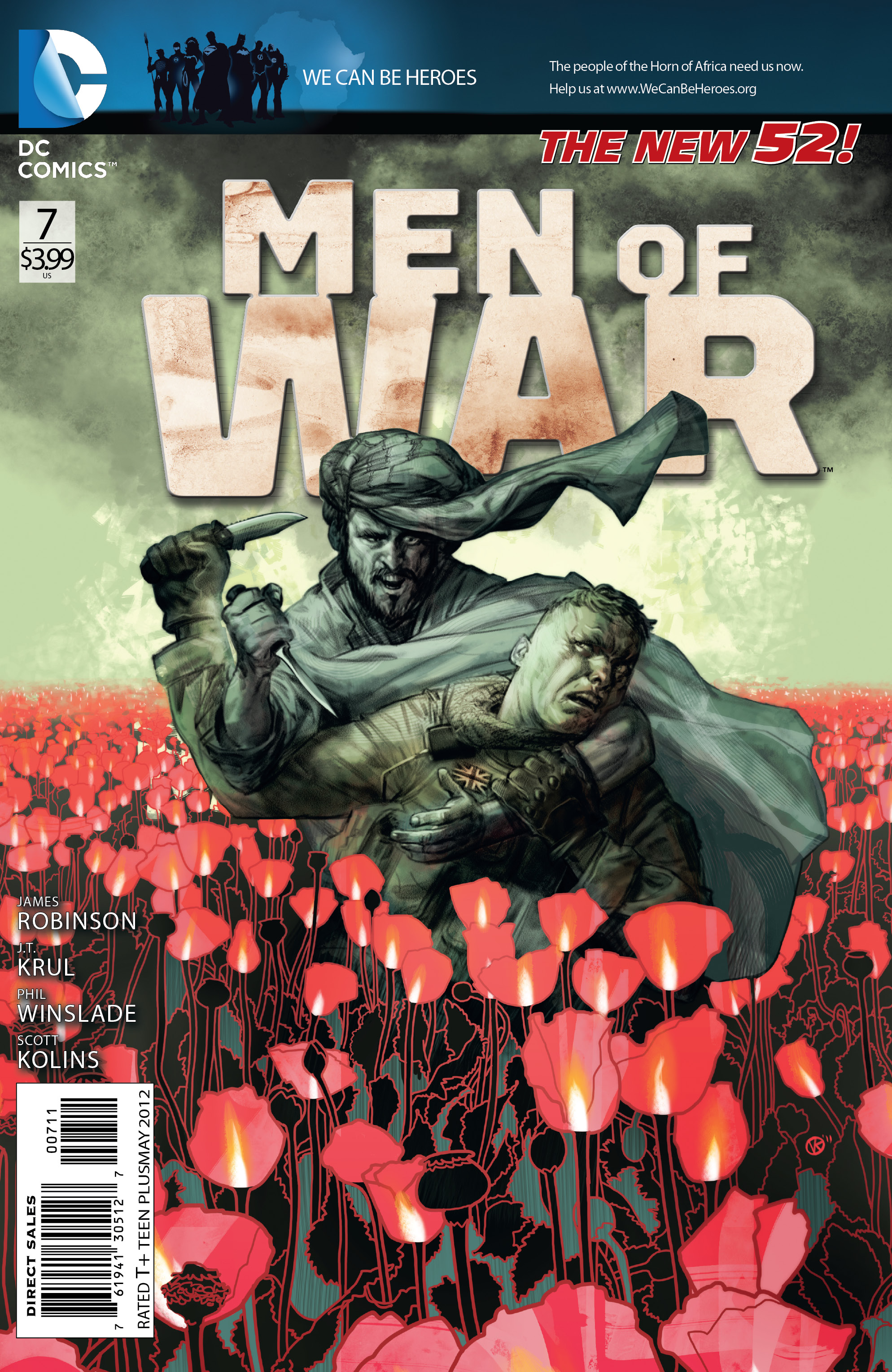
Next week the fields run red. Not merely with blood, but with dense patches of poppies. The vibrant flowers symbolize fallen soldiers, vitality shed unto the earth and born again with the seasons. New blossoms. New battalions.
Of course poppies represent far more than all that. Seed and oil for foodstuffs, sure. In the south of Afghanistan though, the cultivation of the poppy has furnished the war chests of Taliban chiefs. This is the storied tale of opium and its duality as pain reliever and death crop.
Like Dorothy in Oz, George Saint and the Men of War have stumbled into a red, red field. The fog of war turns to haze.
MEN OF WAR #7
Written by JAMES ROBINSON and J.T. KRUL
Art by SCOTT KOLINS and PHIL WINSLADE
Cover by VIKTOR KALVACHEVIt’s not the War on Drugs, but these SAS soldiers find themselves battling for control of a poppy field. Can they knock out this Taliban cell’s money source in order to win the bigger battle? Plus: It might have been battle skill or luck that helped Blake survive the crash of his patrol helicopter in Iraq – but which will get him through returning to civilian life?
DC Comics presents an exclusive preview of Men of War #7 with art by Phil Winslade and story by James Robinson:




I really wish DC would stop putting those banners at the top of their books. It ruins some great looking covers.
Eh,
I am a little more forgiving when the banner is for a humanitarian effort, as opposed to advertising for a movie or event. Also for some reason this banner seems a little less jarring, although that may just be because it’s the same shade of blue as the new logo.
The worst thing about it is that the banner never disappears, even on digital copies. It looks really ridiculous to have a crappy green banner for the Green Lantern movie along the top of a single issue of Xombi, when it could be so easily replaced with the original cover.
This looks really promising, especially with Robinson involved. Shame the book is being cancelled, but a bigger shame they didn’t put an A-list writer on it to begin with.
I like the coloring. It looks like it was done by hand. It has a Heavy Metal vibe to it.
Anyone know if this is relying on previous issues? Doesn’t seem like it and I really dig the art on this one, so I might pick it up.