My Friends,
Over the years, many of you have come to know and venerate me in my role as that guy who posts articles at iFanboy on Mondays. Some of you have come to know me as that guy you always briefly think is Josh but actually isn't. A few of you even know me in my other role as that guy who posts on Twitter so much that you blocked him. Today, however, I come to you in an entirely different capacity, not as an iFanboy columnist but rather as spokesman, the face of a group that has remained silent and ashamed for all too long. For you see, patient reader, even as I have lived here among you like a regular person I have suffered from a rare condition that people in our society are loath to discuss, much less highlight.
It is time you all knew: I, Jim Mroczkowski, am cover blind.
I first began noticing my symptoms a year or so after returning to comics readership in the early 2000s. I would go into my local shop each Wednesday with a list of books I wanted to buy– books I knew were coming out that day– only to find that I was completely unable to locate any of them on the shelves. I would ask the clerk if they had sold out, only to be shown that the books were literally right in front of me. I would then run home embarrassed and eat a pint of tear-soaked Chunky Monkey.
 "What is happening to me?" I would ask the mirror. It was as if I was looking right past the covers, no matter how hard I tried, as if my brain was permanently stuck looking for those "Magic Eye" autostereogram things every time I entered a comic shop. Only too late did I learn the truth: it was pin-up saturation.
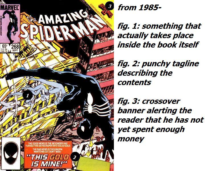
Just as hearing can be damaged by overexposure to loud music, my perception was damaged by years of static "pin-up" covers that communicated nothing about the contents of the books within them. The front of every issue of Ultimate Spider-Man featured him just sorta standing there, or swinging for unknown reasons past some New York City landmark again. It was the same everywhere you looked; the X-Men just standing there, the Avengers just standing there. Everyone gazing off into the middle distance, like they were gussied up in capes to pose for the cover of Italian Vogue. Over time, these harmful covers damaged my mind. They trained my brain that the only thing I needed to look for was a title near the top, and now no matter how hard I try that is all I ever seem to be able to notice.
A few months ago, there was an issue of Invincible with a cover featuring the hero bathed in his own blood. His eye was swollen shut; his broken arm bone was jutting out through his skin. It is unbelievable that someone would approve putting such an image on the front of a thing to promote its sale. If you were holding it where a kid could see it, you might get in trouble. The image leaps off the page and kicks you in the chest. I had to ask someone at the shop if Invincible had come out that week.
"Yes," he replied. "It is over there, eighteen inches from your face."
I took it all the way home, read it, and never noticed the arm bone until someone online mentioned it.
These are the challenges that the cover blind face every day, or at least every Wednesday. Luckily, the manager of my local store is well aware of my condition and does not judge. But not everyone is so lucky. There are a lot of people accidentally going home without that issue of Fables. That is why I am here today to raise awareness and implore publishers to be sensitive to the needs of people like me.
Take for example the most recent book I almost missed, Vertigo's Unwritten. No two consecutive Unwritten covers resemble one another in any way, but that is not necessarily a problem; once you notice them, they are distinct in a way that makes you say, "I've never seen it before, but it looks like Unwritten." See if you can spot the problem that the most recent issue would present to people like me:
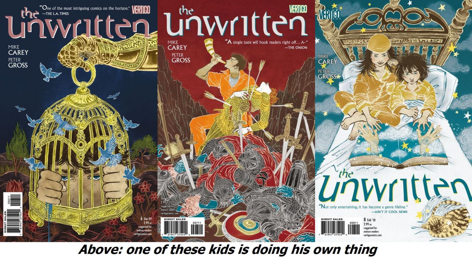
The designer has made the creative decision to put the title of the book in a new, exciting location. Given the way nearly all periodicals are shelved everywhere, he or she has as a bonus chosen a location that the shopper will not be able to see in the store, turning a routine purchase into a game of hide and seek. This time, at least, the book was not actually at eye level in my shop when I asked for it, allowing me to leave with some dignity. Nevertheless, publishers, I implore you: do not treat the logo like an Easter egg. Don't paint it a different color and stick it in new nooks and crannies every month. Learn from the success stories. I don't know if anyone ever found a Twilight book by its cover, but if they wanted to, they could have.
And I know what you in the cover seeing community are thinking: "Aren't the books alphabetized on the shelves, you incredible simpleton?" I am telling you: it does not help. It makes no difference at all. If I could only tell you how many times I've stood at that shelf, saying, "Now, dammit, these are the 'J's. It has to be here."
In some cases, I can hardly be blamed. When bringing excitement to a cover, one dynamic choice is to place some of the action in front of the title, as if it is bursting out of the confines of the book and coming right at the reader. This is a very effective device when used occasionally. Occasionally. Its overuse is just as insidious as the pin-up, however, in contributing to cover blindness. Depending on how nitpicky one wishes to be, one can make the charge that over 25 of The Mighty Avengers' 31 covers have had something obscuring the title of the book.
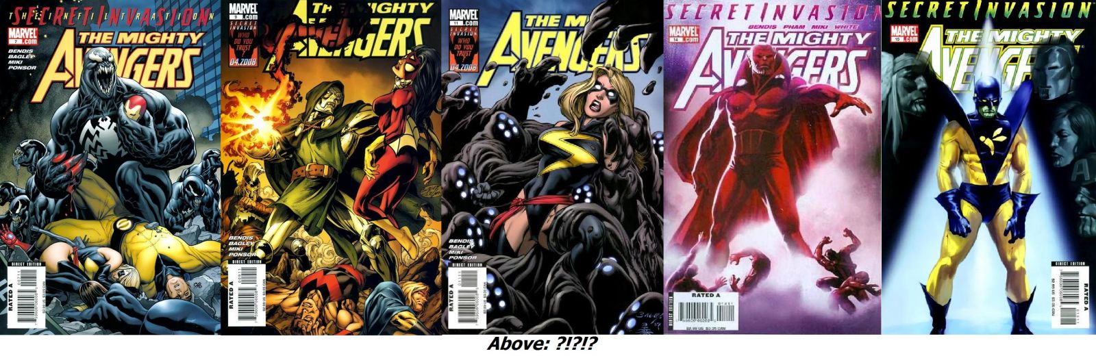
Look at that last one. "Do you guys have the latest issue of The Mightv Ve Ge?" At least most of them show the buyer what's going on inside.
The way comic books are sold has evolved radically in the last couple of decades, and so has the way we shop for them. The cover no longer serves the purpose it once did. For many of us, the impulse buy is a thing of the past; we go into the shop with a list of exactly what we plan to buy rather than browsing and having something catch our eye. Even if it did, we are often too sensitive about "good jumping-on points" to take the chance. Stand-alone stories that can be summarized in one iconic image are tougher to come by now. People wait for collected editions now rather than rifling through bins of back issues. I discovered a lot of books going through those bins and having a cover catch my eye. Imagine being a kid, having to go through a bin of old Ultimate Spider-Man issues. "This one looks… like that one."
Still, I believe that with your help we can eliminate cover blindness in our lifetime. If you are a publisher or artist, keep the concerns of people like me in mind. If you are a comic shop manager or clerk, alphabetize those books and keep a nice, big white board near the shelves where you list what's sold out. And if you're just an average comic book shopper, lend a hand to the next cover blind person you encounter. After all, he'll just keep standing there blocking the aisle until you do.
Jim Mroczkowski feels like an idiot more often than he doesn't. For further examples, see also Twitter.


I started reading ‘Daredevil’ in issues during the Brubaker/Lark run, where I think Marko Djurdjevic did the covers. I love that run but I kept missing issues because every single one of them was a dark, painted picture of Daredevil, crouching.
Also, Magic Eye pictures are such a scam.
Keep preachin’ it!
Maybe it’s just something you get used to – this doesn’t seem to bother me. Then again, I’m not usually looking at recent back issues where the issues are stacked on top of one another. Plus, in addition to having a pull list there, my shop does full-cover stacking (is that the word?) of all that week’s new comics, so even something like the Unwritten this past week was in full view for anyone looking for it.
Unwritten is doing a lot of things right. When I bring an issue home my wife always asks what it is. She tells me it looks "cool". I generally respond, "How the hell would you know what cool looks like?" Then we yell a bit. Then our children start to cry.
I plan on buying her a copy of the first trade for her birthday (It comes out January 12th and it’s $9.99).
Don’t really think about it. My local shop sorts everything alphabetically, so it’s easy to keep track of what’s new. (He also puts a big sign behind the new issues for the week just to add to the ease of use!)
omg… he IS doing his own thing 🙁
Wow that article hit home man.
I walk in the door and get handed a lovely stack of books by my trusty LCS proprietor. I do then walk the aisle to grab my few additional titles that I selected when doing my pulls on iFanboy but never bothered subscribing to…and yeah, that’s a challenge! Even with the books in alphabetical order (theoretically–the way the store chooses to treat alphabetical order can be a little whimsical when it comes to tie-ins, arranging some books by title, others by character, others still by storyline), I get a little lost. You can only see the top third of each cover beyond the front row on the shelves, and so many books seem to be putting the title in weird places, I wind up reaching in and lifting out half the new books to see whether they’re the ones I’m looking for.
the covers are bad for new business, too. whenever i venture into a comic shop (to buy gifts for jimski or toys for my all-things-japanese-loving friends) i’m pulled to the wall of new releases by all the pretties. the covers that have little to do with what’s going on inside (i mean, the arwork doesn’t even match!) twart me and i end up walking away in frustration.
I confess it. I am also cover blind. That is half the reason I maintain an active pull list. It forces someone else to do most of my searching for me.
@Kelly, the "cover artist is different from the interior artist" discussion could rage for weeks on end. It’s Exhibit AA for the case that they’re not even trying to bring new people into comic shops.
I don’t know. I feel like Unwritten has a defined look. They’re all ornate with deep color. And they all look like a negative image. I find my eyes are drawn to those covers. If the logo isn’t on the top, that can stand out. My eye moves down out of curiosity. And that last one actually seems ideal. The perspective lines of the bed, from the perimeter to the beams on the headboard, all point to the logo. Then again none of the stores I shop at have slotted shelving where the cover would be blocked by anything. My regular shop has every book facing outward, so it’s a wall of covers.
I do agree that the title/logo shouldn’t be blocked to the extent of those Avengers covers.
I think the blocking of the title is forgiven if the cover image features enough of the regular cast of characters of that book. For example, even if you were to take the entire logo off of X-Factor every month, I’d still never miss it on the shelf.
I’m going to print out a copy of this article and had it to my boss, and the owner of this comicbook chain. I was constantly yelled for the first year and a half I worked here because I put comics up alphabetically. I allowed for some variations, all Avengers titles were together, even though, technically some were mighty, some were new, and some were Civil War House of Mavengers; I grouped Spider-Man titles together back in the golden days of Amazing, Spectacular, Friendly-Neighborhood, and Peter Parker, but otherwise, put the titles up A – Z. They thought customers would be confused by this, as they were used to the current arrangement: by publisher and what sells best, with intermittent specials and reprints. Because, everyone who walks off the street into the comic book store knows that the Wildstorm Authority issues are just below Dark Horses’s Buffy The Vampire Slayer, and to the left of Image’s Savage Dragon, right? I mean, that just makes sense.
Ahem. I mean, thanks for the article.
I especially agree with your problem with the Mighty Avengers title. The only one of the issues you’ve shown here that I think works is the Venom cover. The rest seem to obscure the logo for the sake of obscuring it.
Great piece, I’m always missing stuff. Or worse, buying things twice when a comic is reprinted a few weeks later with a slightly tweaked cover.
One thing that could help would be the return of classic Marvel-style corner boxes showing the heroes inside.
"By publisher and what sells best"?? @akamuu, I would lose my goddamned marbles in that nightmare factory. I have to know the sales charts to find the book? Why not make me answer a trivia question before letting me in the door, while they’re at it? What are people more likely to know: the publishers, or the ALPHABET? (Hint: they came to get something to READ.)
Couldn’t you just print out your pull list from iFanboy and that would guarantee you didn’t miss or overlook a book? And you would know what the cover of each issue looked like before heading into the shop, thus being able to spot it on the shelf.
In Chicago the two stores I go to have separate areas for companies: DC/Marvel/Independents and then alphabetize within each company.
I miss those action covers. I wonder if perhaps the rise of the painted cover or stylized cover by someone other than the interior artist is to blame for cover blindness? I think a lot of the time those covers are created before the script to the issue is actually done. Add to that editorial’s request for pin-up covers, and yeah.
For a while now I haven’t been jarred by a cover save for X-force and a few specific Blackest Night tie-in variants. Someone who knows color and style can grab my attention. The many cover geniuses out there like Tim Seeley or Chris Bachalo really are underpaid.
On a side note:
Those twilight books… let’s just say when I first heard about the series, I ALREADY knew what kind of person had written them prior to ever knowing the author’s name, or googling for an image.
I don’t mind if the cover artist is different than the interior artist. What I do want is for the cover to be representative of the issue inside. I don’t care how beautiful Alex Ross paints, a picture of Hawkman standing alone against a black background doesn’t tell me I need to buy this issue. It certainly doesn’t teasing me to make me want to look inside the book to see what;s going on.
People make fun of the silver age DC covers, but dammit, they made you want to pick up the issue and see WHY Jimmy Olson was a werewolf this month!
Great piece! Everytime I hear the phrase “great jumping on point” I want to cringe, it’s such an overused term in the field. I don’t mind the image obscuring the cover, but the avengers doing it 25 out of 31 issues is too much and takes the effect out of the cover being obscured.
I suffer to Jim! I suffer too! I thought I was the only one! Thank you for brining my plight into the light and letting people know its a disability, just like watching X-Factor/American Idol or finding gossip magazines interesting.
I nearly always end up laughing out loud when I read your column Jim, thank you for making me embarrass myself at work every Tuesday morning. "What’s so funny?" they say, to which I respond, "Oh im just reading this funny article about comics" They then walk away and don’t speak to me for the rest of the day. But y’know what? Its worth it.
Jim…just get a pull list and be done with it, you miserable bastard. 🙂
I have a pull list! I bring it with me on my phone every single week. I go in knowing exactly what I’m looking for. That’s what makes it so maddening.
@Jimski: I am 100% on your side. You have to keep in mind our store is srun by someone who hasn’t actually worked in one of his stores in ten years, and who started the company as one of those closet sized stores that would have made Mr. Wing* seize up at how cluttered it was. Now that we have a tremendous amount of space, and employees who can spell, you’d think he’d take advantage, but, no he wants to continue to use the quadratic equation to determine what comic gets shelved where.
*- the old Chinese guy from Gremlins
I usually take a list with my when I go to the shop but I also experience temporary blidness. Thanks for sharing this as I usually blame this on buying my comics on my lunch break when I’m short on browsing time. That said, as mentioned above, my weekly hunt would be made easier if the shop had a list of stuff that was sold out, indies they didn’t order or NRDF (Not Received due to Diamond Fuck-up). Variant covers don’t help as the one DC put up on the website arn’t allways the ones that they put out on the normal issue. And don’t get me started on the people who can’t put things back where they found them.
I totally see what you’re saying here, Jim. The only time I go to the comic book shop is first thing Wednesday morning when the owner is still unpacking all of the comics. I get ’em fresh from the boxes, still smelling of shipping trucks, and into my hot little hands. My knowledge of what is coming out each week tends to be better than his, thanks exclusively to this site.
Also, he tends to put last week’s comics out in the fashion that Akamuu is talking about and it is annoying. It really keeps me from browsing and I just get the things on my pull list.
*sigh*
Clearly, DCBS was made for you.
So far many of the stores in NYC that I have been in don’t put the books in alphabetical order. It is maddening.
LCS GUY: all the new books are on the first two shelfs
this is new and it’s way at the bottom.
LCS: Well all but that one
and this book is two weeks old this doesn’t make any damn sense
thats when they ask me to leave
@jimski & @drakedangerz: I know exactly what your talking about. I use the iFanboy pull list on my phone in the shop every week. Before that it was a Post-it pull list in my wallet. I still miss isues time to time, either because I don’t spot them or because the shop is out of copies. One thing my LCS does right is have tabs underneath the comics labeled "New This Week" and "Last Week’s Comic" .
@JesTr: My shop does the same thing. Really helps when they put out Variant covers a week or two after the original issue.