We talk a lot about comic books here, obviously. We talk about story. We talk about art. We talk about continuity and character motivations. But one thing we hardly ever dwell on are comic book covers, which is funny because when you think about it the comic book cover is one of its most important elements. Or at least it was, before the age of the internet, the advanced solicitations, Previews, and every other tool the modern comic book reader has at their disposal used to figure out what they are going to buy before they go into the store. Before all this stuff all you had to go on was the cover on the racks – was it eye catching? Was it exciting? Was it dynamic? These days I’ll still let a good comic book cover sway me. Sometimes if it’s a light week (ha!) or if I’m just itching for something new, I’ll let a new cover catch my eye like a pretty girl at a bar, and I’ll saunter on over to investigate.
I was thinking about the comic book cover because last week saw the release of one of the best comic book covers to come out in a long while, in my opinion. I thought that this week I would take a look at that cover, and by contrast I’d grab a few more to see how effect they are in beckoning the reader inside. So what I did was I stood in front of my bookcase and stared at the shelf with the last few months’ worth of comic books on it. I then grabbed four random books without seeing anything but their thin spines. I grabbed them from the right side which means they are all from last week (or possibly the week before).
On to the covers.
 Dock Walloper #5
Cover by Jonathan Hickman
This is the cover that caused this whole thing. I actually walked right past it at the comic store, not recognizing it as the book I was looking for because it flaunts the comic book convention of having the title appear across the top of the cover. If you didn’t know what you were looking at, you’d think this was the latest issue of West Side or perhaps West Side Dry. You might think it was the story of an intrepid dry cleaner on the West Side of a city. In fact, this is the final issue of Dock Walloper, a pretty good series that capped things off with a fantastic cover.
This cover is impressive on many levels. First, it’s very visually arresting. Hickman’s graphic design sense is very strong and it shows here. The black and white fist against the mostly red background with the almost Broadway-esque titles across the bottom of the cover create a very striking image.
The most impressive thing that this cover does is that it tells you the story of the issue in a way that isn’t hit-you-over-the-head DC Comics Silver Age style. Dock Walloper is about a war between Irish and Italian gangsters over control of bootlegging in New York City. This issue features a massive fight between two armies of thugs down on the docks. ll of these elements are alluded to on the cover — “West Side” referring to the docks, “Dry” referring to Prohibition, and the clenched fist indicates the massive fight that takes place. This cover would almost be too on the nose if it weren’t so subtle.
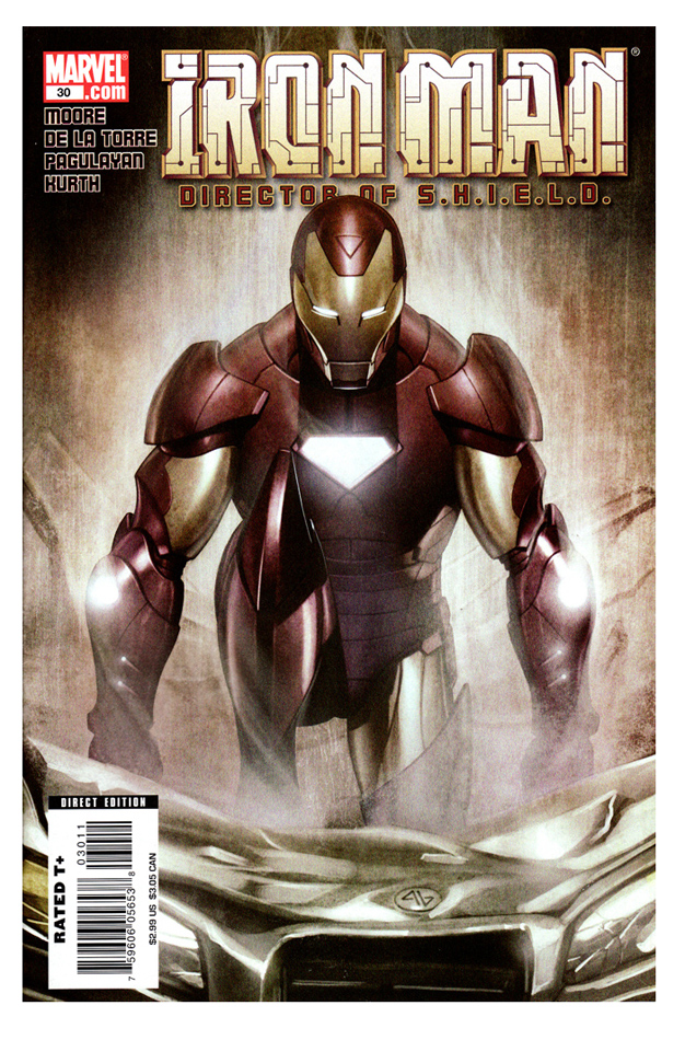 Iron Man: Director of S.H.I.E.L.D. #30
Cover by Adi Granov
This cover represents to a “T” a cover philosophy at Marvel that I just don’t respond to at all. Or if I did at any point, it’s been beaten out of me after years and years and years of pin-ups.
Too many Marvel covers these days just feature a pin-up shot of the main character. There’s no personality to them. Most times there isn’t even context. What is Iron Man doing? I don’t know — apparently he is very angry at that car?
This is nothing against the artist Adi Granov — he paints a fine looking Iron Man — it’s more an indictment of a company philosophy that I have had enough of. How many of the Ultimate Spider-Man covers were just shots of Spider-Man climbing a wall or swinging or something? 100? How bored must Bagley have been after the 70th cover of Spider-Man swinging through Manhattan?
These kinds of covers are okay once in a while, but the thing is, if I’m at the comic book store and I’m itching to try something new, I’m going to pass this one right by and grab…
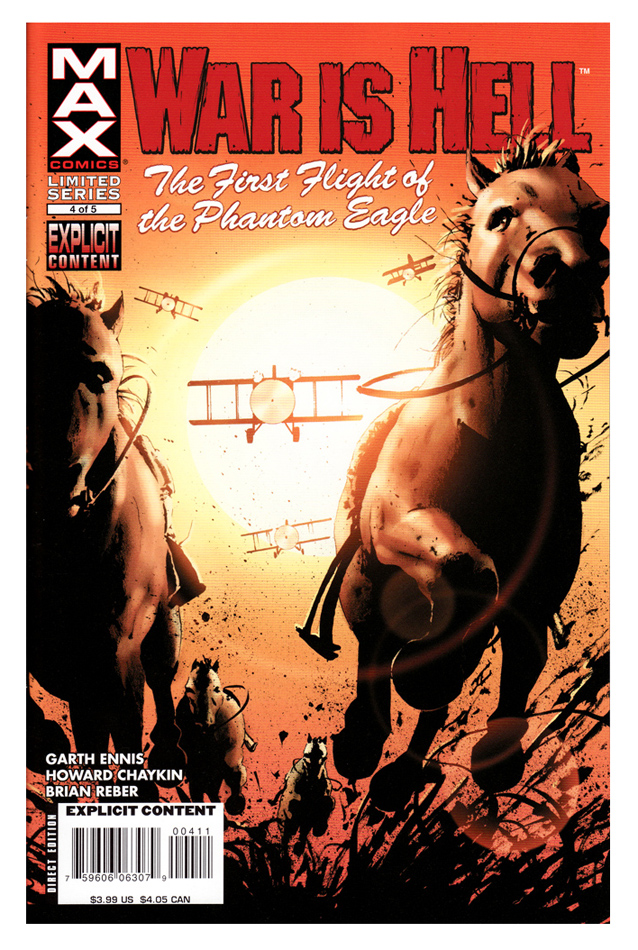 War is Hell: The First Flight of the Phantom Eagle #4
Cover by John Cassaday
Look out!
That’s what this cover screams to me. There’s a whole of of good stuff in this cover, there’s so much that Cassaday does right.
Let’s start with the point of view. It’s a low angle shot looking straight up into the stampeding horses and approaching planes. That angle is chosen for a reason — it’s the most dramatic, putting us right in the thick of the action and in the most dangerous position. We’re at risk of being trampled by the horses and shot up by the planes. There is no safe place to hide and our anxiety level is high.
This is as close as you can get to the action flying off the page in a static piece of art as you can get. If I concentrate really hard and block out the rest of the world I can see the horses galloping past me and the planes buzzing by, low to the ground, their engines whining and their propellers way too close for comfort. The tension level in this cover is so high that I find myself clenching my fists if I lose myself in it for too long. That’s the power of art and a great cover.
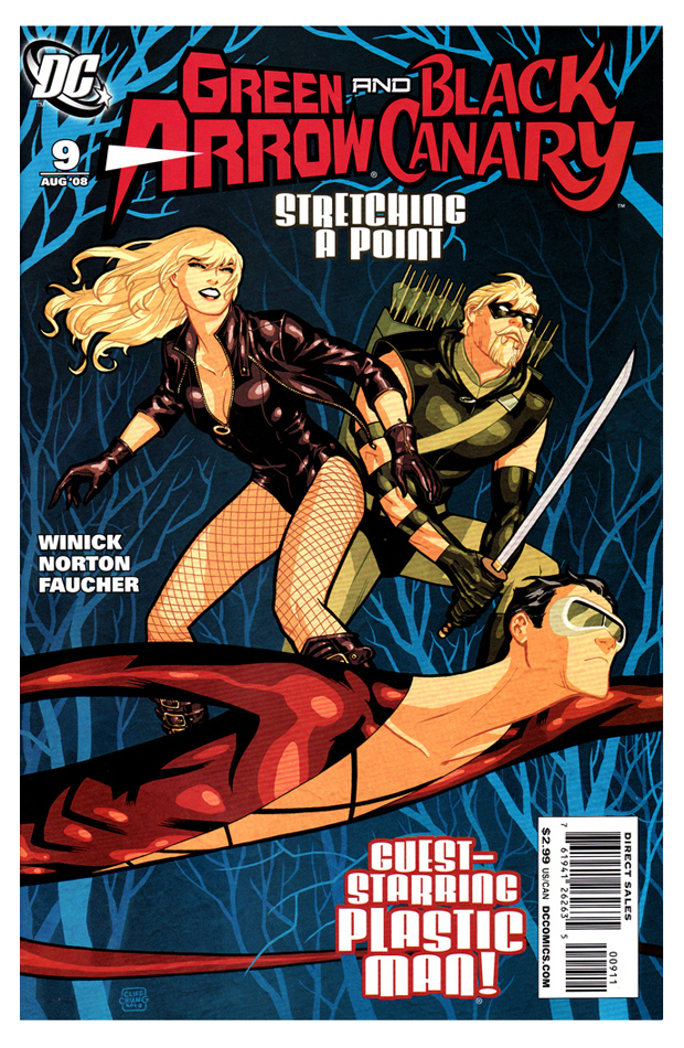 Green Arrow & Black Canary #9
Cover by Cliff Chiang
This cover makes me sad. Really.
I love these Chiang covers so, so much but I almost wish he’d stop doing them, if only so I wouldn’t have to be reminded of how special the book was when he was drawing it. I like Mike Norton. He’s a great guy and a fantastic artist, but his “almost Cliff Chiang” style that he is doing on this book is not helping me get over the loss of Chiang.
I’m sorry, that was a bit of a tangent. Back to the cover.
This is, essentially, a pin-up cover, but unlike the one used for Iron Man, it tells us a bit more of what to expect inside. We know that whatever it is that is going on with Green Arrow and Black Canary (and gang), we’ve just added Plastic Man to the mix. If you had each character just on their own it would be a much different story, and it wouldn’t tell us nearly as much as this image does.
For my money, the best characterization on this cover belongs to Plastic Man — he is looking unusually serious and determined which is a far cry from the constantly wise-cracking character I’ve come to know over the years. In fact, you would expect the smile to be on his face, and the serious look of determination to be on Black Canary’s. But in fact, the serious look on Plastic Man reflects a scene in this issue — the best of this issue, and the best scene in this book in a while — in which Plastic Man learns about everything that has happened to Green Arrow’s son and he instantly stops joking and goes into serious mode.
Also, does anyone draw as well as Cliff Chaing does? I mean, really — just look at that cover! His Black Canary is stunning! Man, that retro-modern style of his just hits me where I live. He has ruined me for all other superhero artists, he has.


I was just lamenting the loss of Cliff Chiang on this book in the shower this morning. Yes, I know, I’m very weird.
Great post Conor. I actually would enjoy reading a weekly cover round up, or something of that nature because I mostly miss some of the better covers of the weeks (I had never seen the Doc Walloper and War is Hell covers at the store.)
If Cliff put out a little print each month, essentialy just a cover without any pages behind it, I’d pay top dollar for it. Not to put down the book itself, but anything pales in comparison to those covers. Chiang is really doing some spectacular work. And as I’ve said before, one of the nicest, most unassuming guys in the business.
Wow! That War Is Hell cover reminds me so much of the final shot in the Firefly credits, one of my favourite TV or movie shots ever. I’d have bought this book for the cover alone.
That Doc Walloper cover made me stop and take a look at it last week in the shop. Just an awesome piece of art. Granted, I didn’t buy the book (I read comics, and this was issue 5 of 5 – not a good time to buy a new title), but I do distincly remember thinking, "That there is one mighty powerful cover."
And the Cassaday cover is just spectacular – not at all what I was expecting to see on a war comic.
Pin-up covers usually don’t bother me so much – by the time I get to the shop, I’ve usually forgotten what was supposed to be under the cover anyway. I do wish there was more of a story-related trend with Marvel covers, though. It seems Ms. Marvel (even though I’m not reading it) is tending to do the pin-up/story cover mix pretty well – it seems like every issue has a Skrull on the cover somewhere these days.
I recently slammed Norton’s work in a review last week. Maybe the fact that Cliff’s art is on the cover doesnt help Mr Norton.
It’s like seeing a big fat juicy Kobe steak on a menu, and then when you get the meal it’s hamburger instead.
I cared a lot about covers when I was a kid, ’cause it was one my primary ways of choosing comics. Now, honestly, I don’t give a damn because I’m buying for the story…except when it’s actively misleading. Pin-up covers, as uninteresting as they can be, usually aren’t misleading.
Cliff is the Man! Look at how Chiang makes Black Canary look strong but also very sexy, without showing us her chest AND her ass cheeks at the same time, (*cough*) Ed Benes!
I almost never even see covers at this point. After years of nearly identical pin-up covers, my eye seeks the logo on the racks and that’s all that registers. I have completely missed books that I was actively looking for after having glanced right through them more than once in the last few years. (I’m trying to retrain my brain.)
Just out of curiosity, I went to my pull list this week and gave a little more attention to the covers than usual. A surprising number of them seem to actually communicate what’s in the issue and why I should buy it: hey, this issue of She-Hulk features Hercules. Hey, this Avengers book is about Hank Pym. Even Ultimate Spider-Man has come a long way; the last two or three issues have all straddled the line between the old pin-up standard and actually conveying information to the reader. And if that Captain America cover doesn’t make a buyer out of you, you should think about getting into baseball cards.
ALL STAR SUPERMAN – great covers there
Yeah, that Iron Man cover is indicative of the entire Ultimate line of books. I think about 90% of the Ultimates had covers with the team just standing there.
The War is Hell cover reminds me: Cassaday is God. That’s all.
Good call on Hickman’s cover. His covers make my designer heart flutter.
Indeed. Chiang is on the level with Cassaday, Jones, Williams III or Maguire in modern day comics.