There’s no escaping it. They keep warning us. Avengers vs. X-Men is very real, as evidenced by this exclusive debut of the cover of Wolverine and the X-Men #10, featuring art by Chris Bachalo:
Regardless of the event crossover, the events of this issue sound like a must read for X-Men fans as Cyclops finally comes back to Westchester to visit the Jean Grey School. And it sounds like there’s a fight brewin’. And it’s all topped off with this excellent, minimalist cover from Chris Bachalo using Cyclops’ visor to great effect.
Here’s the full solicit info for the issues:
WOLVERINE & THE X-MEN #10 & 11
Story by JASON AARON
Art & Cover by CHRIS BACHALO• AVX TIE-INS!
• Cyclops comes to the Jean Grey School!
• Will Wolverine’s X-Men join Cyclops against the Avengers?
• ICEMAN vs RED HULK!32PGS./Rated T …$3.99 (EACH)
UPDATE
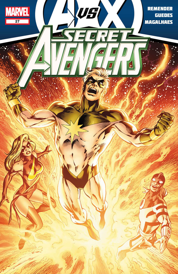
Marvel released two more Avengers Vs. X-Men covers, Secret Avengers #27 by Alan Davis and the variant to Avengers Vs. X-Men #3 by Sara Pichelli


I always preferred the yellow visor with the skullcap, myself. He ditched he skullcap in the 90s and that heralded a dark (er, I mean EXTREME) era for Marvel comics. Now that I think about it, I’m really thinking that was the turning point. He ditched the skull cap, got some pouches and bam! Everyone in the world had pouches. And chains. Kids love chains.
I also preferred the gold/yellow visor, but the effect on the cover here wouldn’t be as cool with it.
What were we talking about again?
I too prefer the skullcap.
I must also show my love for the skullcap. It makes his visor stand out more.
I think the skullcap works really well with current cyclops. Showing his hair humanizes him just a tad bit more and right now, Scott definitely doesn’t want to appear Human.
It’s a sweet cover. From looking at the style, I wouldn’t have guessed it was Bachalo.
I’ve been re-reading the early issues of Generation X lately, and Bachalo’s style underwent a fairly dramatic change in 1995 (right during Age of Apocalypse, incidentally). He’s more versatile than many people think.
And compare that to his work on the Death mini-series! The guy has been changing styles his entire career and I’ve enjoyed every evolution he has gone through. I know he’s not for everyone, but I recommend every go back and at least check out some of his earlier projects (Shade the Changing Man for instance) to at least judge him for whis whole body of work.
@max His Shade the Changing Man run ws brilliant
I think the first time I ever saw Cyclops was in Not Brand Ecchh, because that is the version of him that persists in my mind.
I prefer the version’s of all the characters that are presented on the multiple covers of X-Men #1.
Sorry everyone, but…BRING BACK ROGUE’S HALF JACKET AND HEADBAND!
I dunno, that Storm outfit was pretty uninspired. But I’d be lying if I said that I didn’t totally want one of those leather aviator Xavier School jackets that Cyke used to rock.
It’s a cool cover but doesn’t this get a bit cliché now? I mean… How many characters are reflected into a metallic/mirror type of object.
Same goes with the Nightwing cover for the Night of the Owls crossover with Talon visible in a reflexion on the glass, or Hulk reflected on Wolverine’s claws on an old cover I saw somewhere, etc.
iFanboy should do an article on the cliché just for shits and giggles! 😀
The Pichelli cover looks lovely. Hate how the variant concept is handled but if it’s 1:25 I’m still getting it (my shop charges 2X cover price for those).
Your lucky, my comic shop sells 50:50 varients 2x the cover price. For a 1:25…I do not lie when I say $30 minimum.
My old shop in Brooklyn sells all variants for cover price.
I miss my old shop.
BACHALO ROCKS!!!!!!!
Him and Daniel Acuna are masters of the cover.
Do you guys know of any other good books he’s worked on?
I’ve tried finding some issues of Steampunk with no success.
Bringing back Captain Marvel in events seems to be Marvel’s version of killing Flash during Events. I still don’t see why they don’t just put Marvel Boy in the Genis-vel suit.
This is a bit of a side note but i always liked Marvel Boy’s original design, that whole skinny teenager with space cockroach powers thing. Then he gets a redesign and it’s like his new costume came with a lifetime supply of creatine, he’s supposed to be like a Peter Parker body type, not Captain Generic. Now he looks like any joe schmoe in that thing. I know Bachalo designed it and i love me some Bachalo but it pretty much ruined any excitement i had for them bringing him back.
I love the updated look.
But granted the first time I was introduced to the character was in Dark Avengers annual #1
Sooooooooooooooo…..
Hopes a rad little character, would like to see a nice figure or statue of her. I loved 2nd Coming and Cables run that pretty much served as its parallel ongoing fill ins. Haven’t read Generation Hope but am looking forward to a trade. Remender has a big corner of the Marvel U in his hands right now and could really start some fires w the characters he has to play with. Really like to see X-23 and Domino w X-Force, where they fit perfectly, Hope and Jubilee would be cool too but know Gischler has some plans for a cpl of the mentioned.
Cyclops looks calm as a cucumber despite having a raging Wolverine coming at him.
That WatXM #10 cover looks like it’s referencing, or at least just has a similar composition to, Astonishing X-men #10:
http://comicbookdb.com/issue.php?ID=1876