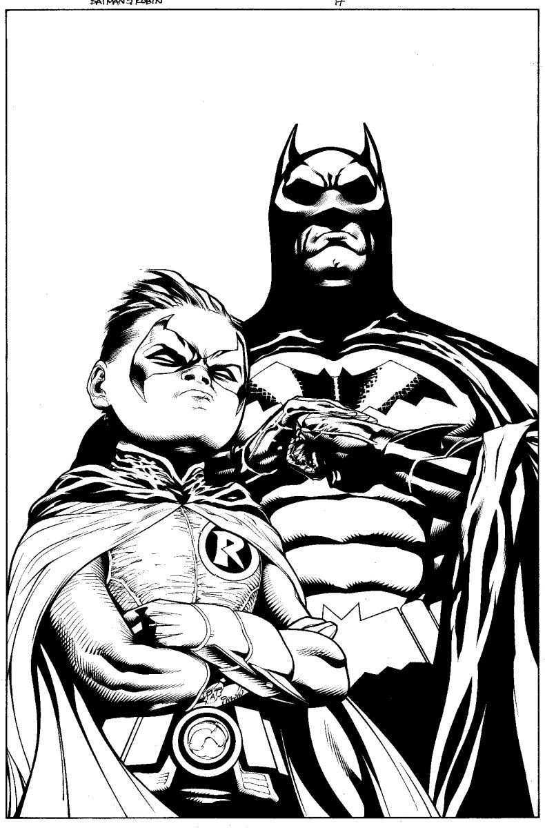
Peter Tomasi and Patrick Gleason take over Batman and Robin with issue #17. DC just released a peek at his first cover, and it can be safely said that he's definitely got the tone of the issues that came before. Enjoy the pencils and inks!

Like so many things, it hits in November.


The inks cover up the nice shading as is usually the case.
I like Damian, but Batman looks too much like Bruce.
batman looks too much like the movie version. the cowl obviously has been taken from them.
and yeah, the inks took a lot of the depth away.
Def an A-list artist, his Aquaman stuff was the best. Damian appears like he’s from the Children of the Corn or something, a real darkchild. This really shows what inks can do to pencils in an incredible way.
@ZEPPO: I concur. I liked how Quitely made it look like there was someone very different under the cowl.
@Zeppo @Kenzaburo I agree. Dick looks to stiff and big.
I don’t know though, the more about the new Bat direction I read and see, the less I feel like I want to pick anything up. I just can’t seem to get excited for any of it.
and yes, there are a lot of puns in this post.
@Zeppo @devildog @WeaklyRoll: Yeah, but Quitely was the ONLY artist who drew Dick Batman thinner than Bruce Batman (that I know of) because that’s the crazy attenton to detail that keeps him from being a monthly artist.
Every other artist just draws Batman as he’s always been, which is, sadly, to be expected.
That looks nice.
Batman looks displeased.
@Conor: this is a rhetorical question in the big scheme of things, but what do you get out of having Grayson built and look like Wayne when in a bat costume.
@Conor Mark Bagley did a great job or making Dick look like himself in Batman during all the fighting at least and his posture. He drew the book like it was Nightwing with a cape which is exactly the way it should be drawn with Dick as Batman
@WeaklyRoll: What do I get, pesonally? What does the world get? What do artists get?
Me? I get nothing. I’m past the point of being disappointed that Quitely is the only artist who seems to put the thought into how Dick Batman should look.
The world? Nothing, really.
Artists? I guess it’s easier for them to just draw Batman the general size and shape that he’s always been drawn.
Damien looks like he should have a clock around his neck.
That’s… not the best angle on Damian’s head there.
Gleason is a good artist, I am looking forward to seeing his interpretaion of the series. I think his Damian is great.
It sucks that Quietly can’t do a monthly, but on the bright side, because of his absense I have been exposed to some other great artists. I will admit, I am really gonna miss Quietly’s art. The fact that Dick was smaller than Bruce would be is so brilliant. Dexterity vs. Bulk.
If Bruce and Dick ever duke it out, I’d like Quietly to draw it.
By the way … maybe that is Bruce … don’t Judge!!
Is that a Flava Flav reference?
Batman’s look is how I picture Conor and Josh looking down at some of my posts on here when they are about to hit the delete button, which thankfully they haven’t done lately (thanks guys!)
Poor Damian, getting all chubs in the face from those unhealthy Gotham Unified School District lunches.
in all seriousness…Great looking art.
Tony Daniel does a great job making batman look slimmer also.
Batman & Robin #17? I’m too fixated on B&R #14 to even think about this yet.
It’s been like two months since the last issue of this.
And–knock on wood–I have an awful feeling that DC is going to "Scott Kollins" us unexpectedly on B&R #15 so that this story arc can finish in time for the relaunch.
Damn, Frazer Irving, I love your art. But you’ve been slated to do this arc for like a year now. I don’t think it’s too much to ask for this to have come out quicker than it did.
i love this title i hope it stays consistant and hopefully gleason can put his stamp on dick batman like quitely did, but either way i think the title will continue to be a stand out batman book
It doesn’t really bother me either way because the dialogue and actions will discern the characters more than the look. Yes, it’s nice to have some visual cues (ala Quietly or Clarke), but there’s more to a character than just the look. Also, I’ll be checking this bad boy out.
Wow. I read this in trade, but I may have to pick up the first issue just to catch what Gleason is doing. Very nice. Tremendous Damien, even.
Man, I can’t believe this whole thread has gone without a "That’s what she said" @WeaklyRoll
@Conor: I think Cameron Stewart took what Quitely had started and kept the book looking consistent. Then again, his style looks very similiar to Quitely’s.
The art looks awesome. Gleason has really grown as an artist over the last couple years. I like that he can make Damian look young like Quitely but his head looks a little weird here.
ack..
Yes , Tomasi is finally writing Dick Grayson again . His Nightwing stories are classic . Thank you DC for giving this man the job . H e should have written Battle for the Cowl instead of Daniel .
Damian almost looks like Chucky there actually.
@Franktiger: You’re right!
What AmirCat said…who says by issue #17 Bruce won’t be Batman?? Looks like him to me.
Michael Keaton’s still got it.
@connor
I think all the Batman and Robin artists, apart from Tan, made the effort to show Dick was not Bruce.
I’m not reading an of the other Batman books at the moment.
I wonder if we’ll ever get a peek at #14?
@Zeppo
I agree.
I think that’s Bruce.
Who says this is Dick?
Looks nice but without Morrison B&R is dead in the water…
I respectfully disagree with Connor’s comment that all other artists draw Batman like Bruce. While it may be a generally applicable rule, I think a notable exception is Mark Bagley’s recent work on the recent JLA/JSA crossover. How they’ve written Dick in that story arc is another topic of discussion (too hard on himself, not comfortable in a leadership position…two things that definitely don’t apply to Mr. Grayson), but I feel the difference in the physical presence as expressed by Bagley.
@Troyster: On the other hand I see no difference in the way Bagley draws Dick in JLA and the way he drew Bruce in TRINITY.
He looks more like Grayson to me, but I’ve been reading B&R over and over so much, it might be just stuck in my eyes that way…