Since I started writing these articles for iFanboy, a few people have suggested that, as a professional graphic designer, it might be interesting to write about logos in comics, i.e. the way the title of the comic is written on the cover. Every time this came up, I avoided it, thanking the person for their suggestion, but dismissing it. I rarely notice comic logos on a conscious level, (unless they put me off buying the comic). It obviously isn’t that I dislike design, or don’t care about it (it’s my work and a passion), but when it comes to comics, I’ve always let the imagery speak first. I always chose to let my understanding and knowledge of design take a back seat to the simple comic-reader within me. On some subconscious level I was cutting off from the rationale of why I was attracted to something, and simply enjoying the ride, the feeling, to desire to purchase and immerse myself in a new comic.
As soon as I tried to explain all of the things that I wasn’t noticing, I realized that I was noticing them, but I hadn’t ever articulated my opinion, even to myself. While I was reacting to comic logos on a gut level (which, incidentally is how I think graphic design functions work for most people), somewhere deep down I was also analyzing why and how.
In the past I’ve done a fair amount of logo and identity development for various kinds of businesses and individuals. Just like a business logo, comic logos are designed to echo the characteristics and aura of what/who they represent. Visually, a logo must give a hint of what to expect, to entice the appropriate people to pay attention.
Personally, I have a strong preference for two kinds of logos; Old-school logos, and reinvention logos. The first is consistent, it has a permanence, is practically unchanging, and basically is just like the heroes it represents. The second genre has to be more flexible, like the heroes it’s designed for it has to be able to grow and adapt.
 Old-school logos
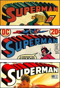
The strong, unbending, uncompromising logos of the superhero world, by the very nature of the solid and permanent heroes that they represent, the logos must remain similarly constant and unyielding. These are the IBM’s, the AT&T’s, the American Airlines of the superhero world. Most prominent amongst them of course, is Superman.
At their inception there were no computers to aid in the design of these logos, by necessity they were painstakingly hand-drawn, using every instinct of the typographer to create a line that simply felt right. Without graphics programs to help the designer build a mathematically balanced line, it had to come from the designers gut and training. The Superman logo is a great example of this, from it’s vaguely clunky beginnings 70 years ago, it’s been refined and cleaned up, but basically it has hardly changed. 70 years of being current, usable and balanced… do you know what that means? In all likelihood, none of the people who read this have been alive that long.
The idea of creating an effective logo form that (with small alterations over time), can work and be effective for over 70 years is insane. To give you some idea of how unlikely this is, most businesses change their logos every 10 years, out of necessity mind you, not choice (logo creation can be time-consuming and difficult). Hitting on a timeless design is rare, and in many instances accidental, or at least unexpected. An unchanging logo is able to not only maintain brand awareness, (i.e. people are so used to seeing it that they no longer question it’s existence. It just is, it’s become a part of our understanding of the very culture the logo is part of), but also to communicate stability, strength and reliability.
Naturally these are traits that large business desire, especially businesses who deal with large sums of money, or dangerous travel, places that need to inspire trust. When a logo doesn’t change for many decades, a strongly identifiable brand is created. For a business, this is gold, it means that people will perceive them as established, rock-solid, trustworthy. If you look at Superman as a brand, this image fits perfectly. He’s the original hero, you want to trust him, he’s meant to be solid and reliable. The tenacity of this logo massively reinforces that image, helping to create him and it as an expression of all things relating to what is intrinsically American.
Despite some comparatively superficial changes, in many ways the Superman logo is the perfect logo. It hasn’t changed and therefor it’s instantaneously recognizable, and has become an intrinsic part of the American vernacular. From any designers point of view, this is true genius; The ability to create something that will not only fulfill it’s original purpose to communicate the needs of the client, but go far beyond that and become part of our visual language. This is a Holy Grail for designers; We’re always trying to design something so simple and perfect so lacking in extraneous elements that it never dates, it is ageless, and will not only always be synonymous with what it represents, but be able to live beyond that. People will never be confused because the brand is always true to itself.
 Reinvention logos
On the flip side of Superman, there is a second genre of logo, one that must be more mutable, and yet still be able to express the inner ideal of the superhero it represents. This works, and is in fact essential, because there are heroes who’re more sensitive to outside societal changes and technological advances. They are not archetypes of mankind, but instead have been developed to be intrinsic to the world they’re depicted in, as expressions of our advancing understanding.
While the logos created for these heroes must be as satisfying and effective (as a tool of visual communication) as the more stable and unchanging logos, these must be a little more amorphous. Designed to represent and speak to the implications of the changing character and fashion of the hero, these are logos which will, inevitably, be similarly forced to grow and adapt, in line with the superheroes they are made to represent. As emissaries in the world, these logos are just as important as the old-school logos, but as icons, as part of the visual language of our culture, they take far more of a back seat to the superhero.
Over time, with changes in the character of the superhero, the logo can begins to break, it can’t communicate well enough, and is forced to change. In this respect, Iron Man is an example that really stands out. It’s changed quite a few times over the years, and each time has been very identifiably as being fashionable in it’s context. Just like clothing or music, logo styles go in and out of fashion, the logos have come into (and gone drastically out of) fashion. This makes a lot of sense with a hero like Iron Man, who’s very powers are dictated by the current thinking in regards to science and engineering. How could he have an unchanging logo? How would that communicate the comics facility for change and growth? No, it is essential in this instance that the logo be able to be completely reinvented once in a while, so that it can still be an effective part of the Iron Man mythos.
As with any other kind of logo, there are numerous categories and interpretations of the comic book logo, these are just the first two which jump out as I begin to look. There is a tremendous wealth of information and history to absorb, and now that I’ve started, I don’t think I’ll ever be able to stop.
Sonia Harris lives, designs, reads and writes in San Francisco. As early as she can remember, she was reading comics, and being taught about design. If you’d like to, you can mail her about these, or any other things at sonia@ifanboy.com.


Nice article Sonia, and one that’s near to my heart. Does the colon and the subtitle dare suggest this will be a series? Please say yes!
You know what logo has never wen’t out of style? The X-Men logo. I mean yeah, it was different during the Stan Lee years, but after that, it’s been the 3d text for pretty much every issue of Uncanny. Even the adjectivless X-Men logo is predominantly the same 3d style text it has been since issue 1, changing ony when Grant Morrison took over, I think.
Interesting, now I want to flip through all my trades and look at the logos.
Great Article:
The branding of the Superman Logo is amazing, even my grandmother would recognize that logo.
It really is absolutely amazing that the Superman logo is essentially unchanged for almost 70 years.
@ComicBOOKchris – I thought the same thing until I realized it wasn’t that cool b/c the X-Men logo is just the same type treatment as SUPERMAN just from a different angle, you know? 3D text seems to be something that holds up in the comic world. Btw, love the Hank Scorpio avatar.
In design class we had an assignment where we had to create a magazine cover, I pulled letters from some of the best (in my opinion) logos in comics to create my fake FANBOY cover, and then I found this site and was pleasently surprised to see they stole the same F. Great minds think alike. It’s on my website if anyone cares : http://www.kreiderdesigns.com/classwork.php
@kreiderdesigns Thank you… I really don’t know if I’ll write more, I’ll have to wait and see.
@comicbookchris I know what you mean, but the fact that it was completely different at it’s inception rules it out for me: http://comicbookdb.com/graphics/comic_graphics/1/1/47_20050910214724_large.jpg
Interesting article. The only long lasting comics logos I could think of are MAD Magazine and Heavy Metal Magazine, and MAD Magazine changed its logo in 1955 it seems.
Great article! I never thought about the Superman logo.
Love this topic. Reminds me of the Helvetica doc. Typography is really fascinating. It’s a whole world of art and science that’s designed to only be noticed sub-consciously. Sort of like a film score. It’s there for emphasis, but if it’s not seamless, it stands out in the wrong way.
This article is complete, old school, reinvented bollocks.
Lovely piece Sonia, you know your logo onions!
Have you read any of Todd Klein’s logo studies on his blog? Most iluminating – I asked him nicely and he did the Flash logos for me. Plus, his sloppy Joe recipe is ace, if you add meat . . .
Another excellent article, Sonia. The thought that occurred to me as you described the Superman logo is that it represents the negative aspects of the character. By that I mean the idea of some that consider him boring, ineffect, your grandfather’s superhero. Next time DC feels the need to reboot him, maybe they should take another look at the logo. Of course, then they lose all the pluses of the old logo.
Kinda related: When Eisner and Jeffrey Katzenberg came to Disney, several animators asked if there could be a "Touchstone Animation" label for projects that might not fit the Disney label. JK pointed out that the name Disney is the premiere name in animation known around the world, why would you want to give that up? His point is that financial resources dictate going to the brand’s strengths.
Sonia’s totally right. I’ve never consciously noticed that the Superman logo has never changed. Even in his spin-off series like “Superman’s Pal, Jimmy Olsen,” the logo was there. Heck, even in “Action Comics,” which doesn’t have the word Superman in the title, they’ve used the logo as seen here: http://kleinletters.com/Blog/wp-content/uploads/2007/08/action764.jpg
I like the fact that I’ve taken it for granted is exactly what they wanted to have happen. Interesting. If you do another article like this, I’d love to read it.
Great article Sonia as ever. I would like to see a study on the various incarnations of the DC Bullet Logo…
Superman’s logo has become the typography of any and every superhero logo…any time there is a spoof or homage to a hero…it is often times written in that "Superman style 3-D"….the brand has become synonymous with the product! Like "Kleenex" is used regardless of the brand of tissue…or "Coke" is often used to indicate any soda/pop/cola or Jello-O for any gelatin desert….ok, now I’m hungry……
This article makes me feel good.
@Paul – I agree about typography and love that documentary.
@Sonia – I enjoyed this, and as a designer, I always thought I had a "forgiveness" level or ignored parts of comics. The article made me realize, like you, I’ve taken note of these things then threw them to the back of my mind.
Viking #1 is good design wise and so are J Hickman’s books from Image.
The design of a book plays a BIG role in my purchasing decisions.
@Tad: Overhaul the Superman logo? Wash your mouth out, young man! Odd times they have tried, the world seems off: http://www.comics.org/coverview.lasso?id=41168&zoom=4
@Mart – make the logo an actual 3D logo and give away 3d glasses. Wont it be a nice overhaul? You also get to see Superman’s fist jump at you.
@JumpingJupiter – too bad for Bullseye: Greatest Hits.
@target242 – also Krembo.
Is that Star Sapphire in a Superman Book? Must’ve been a GL Crossover.
Awesome article, Sonia! If this article does turn out to be one in a series, I hope you end up writing about superhero symbols, as well!
@GL2814 As I recall, while Hal may have shown up at the end, it was a one-off Superman story.
@Paul I love that film so much
@Mart Thank you, I had been told about Todd’s blog, but never looked. Took a look last night and was blown away. What a talent! Thanks for the reminder.
@GL2814 I’ll try and find the full cover when I get home tonight and post it for you. I liked it because Superman was cowering from her, hehe.
I dunno how to post the image, but here’s the old link:
http://www.comics.org/coverview.lasso?id=25912&zoom=4
That costume is a classic, really elegant and so much better than the skanky new Star Sapphires. According to the Grand Comic Book Database there, GL wasn’t around that issue.
Never mind a kneeling Supes, this was the sexiest cover I’d ever seen up to the time it appeared:
http://www.comics.org/coverview.lasso?id=24554&zoom=4
Sorry Sonia, I’m getting too OT, likely!
@Mart That’s fantastic, is that a Neal Adams cover? It’s not just sexy because of the image, that art is HOT!
Yes, it was Neal Adams – but even when he wasn’t drawing it seemed like every issue had a fantastic Julius Schwartz hook.
http://www.comics.org/covers.lasso?seriesID=116&skip=200&show=50
And look at the great angles (and look at how hot Lois is on that Sapphire cover – the dress is like a vague afterthought).
i love your intake and input on every article you do. they are so great!!
That Star Sapphire/Superman cover is awesome.
Came across this -> http://kleinletters.com/Blog/?p=3619
@JumpingJupiter Yes thanks, that’s the blog that a couple of people mentioned above. I hadn’t seen it before, but I’m totally into it now. Bloody great resource. Good old Todd Klein eh?
Great article Sonia, as a designer myself, I’d love to see more like this from you.