To catch up, read Comic Experiment: Can the panels alone tell the story?
So last week I was out of the country and decided to read a comic in foreign to see if it made sense. This week, I’ve only just returned, literally having sat down at my desk home from the airport, to finish the experiment. I urge you to read the results from last week, wherein I read a few issues from the Death of Superman in Italian, but I can summarize by saying it was less than successful.
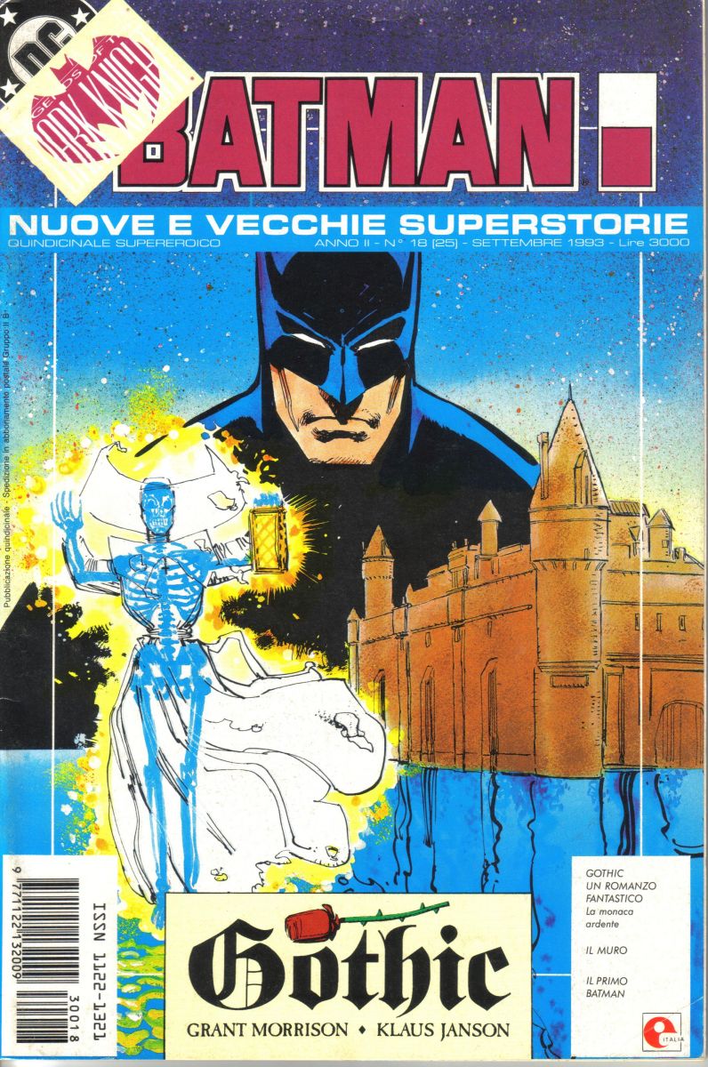 This week I “read” two issues of Batman. A more modern issue titled Gothic written, presumably in English, by Grant Morrison, and illustrated by Klaus Jansen. As well as a Detective Comics 44 published in the US in October of 1940, just to get some Golden Age fun by Finger and Kane thrown into the mix.
Unlike last week I hadn’t read either of these issues before, so already the tone was different, but for those who don’t remember, the deal is I read through the comic only looking at the art, because the word balloons are in a language I don’t know, and see if it’s possible to glean the story from just pictures. We wax poetic often about how the pictures should be able to tell the story, thus the foreign language thing is part gimmick and part safety net. Your eyes want to read what’s in front of them so this experiment probably won’t work with English comics.
Awesome side note: your eyes will automatically read any language they know, so they used to scroll Russian phrases across screens of suspected spies. If your eyes followed the words, then you knew you Russian, and you were thus quite obviously evil. Modern spies are trained to resist this test.
So did Batman fare better? Only one way to find out! Onto the results…
Observation 1: Quality and/or collaboration matters
That may sound dumb, but I am trying to find general trends so go with it for a second while I explain. Without spoiling too much, I got a lot more out of this week’s issue. Last week’s Superman book, while being an important story for the character’s history, wasn’t exactly the best comic, even in English. Here, however, we have an early Batman story by Klaus Jansen and Grant Freaking Morrison. So part of the reason this book may have fared better is simple skill. Even in the 80’s Morrison was producing good work and we know he has an affinity for the Bat. Obviously I can’t comment on the relationship between writer and artist, i.e. was Morrison turning in full scripts with panel breakdowns or was Jansen allowed a bit freer reign? Either way, the proof is in the pudding and this book actually has some substance even without the words. Which is all the more impressive as I hadn’t read it before.
Observation 2: Old Ads in Comics are still funny no matter the language
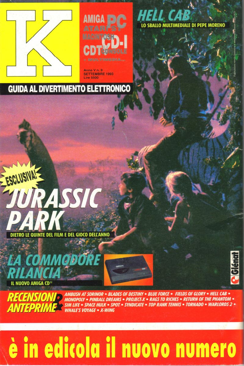
Whole segments of the video show have been dedicated to the silliness of old ads, usually a bit older than the late 80s, but still. The point is old ads are funny in any language. Marketing evolves just like any other field so it should come as no shock, but I think it’s because ads are trying harder than most types of media to convince the viewer of something, and the older techniques just feel so antiquated. At the same time I really wanna play some Italian Atari Jurassic Park, so I guess the ad worked?
And we’ll be laughing just as hard 20 years from now. I try to buy as few single issues as possible. Much like Conor, it’s simply not the format I prefer. But when I do I am stunned by the ridiculousness of even modern ads. I think it’s been written about on the site before but sometimes it seems like advertisers in comics just have no clue who the audience they’re aiming for is. I guess we should just be thankful they still think there’s an audience at all.
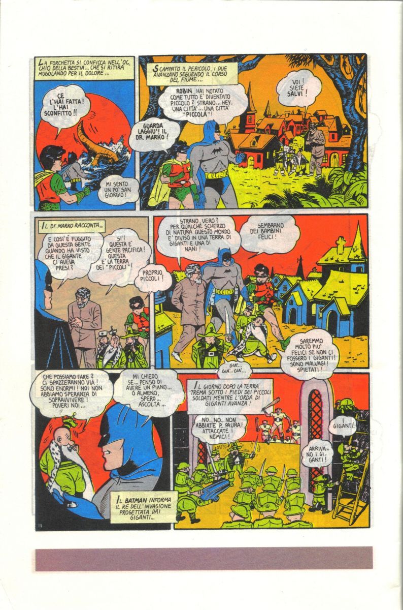
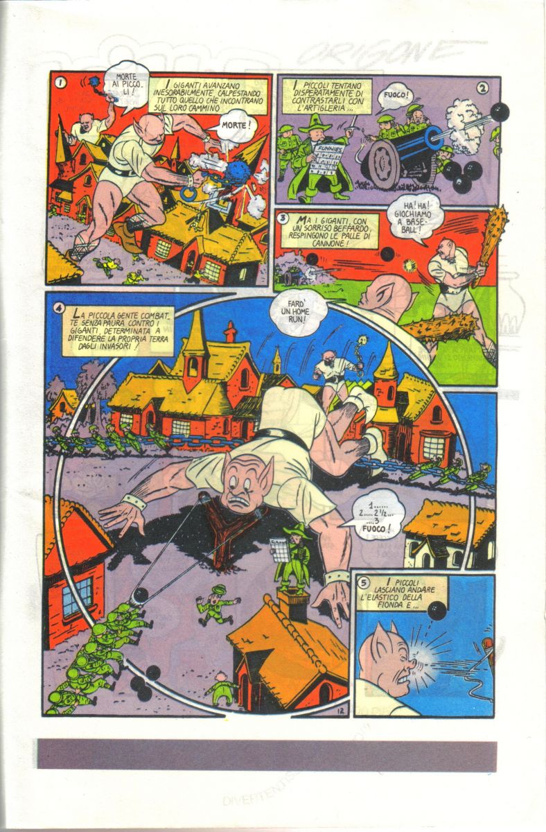
Observation 3: Golden Age comics read much faster when you skip the words
Again, no great shock, but when you take away the insane amount of text, you can actually get through a Golden Age story pretty quickly. I’m sure I missed some real gems no having the words, but I also wasn’t exhausted by the time I put the book down. I still go the gist of the story too. Batman and Robin fight weird goblin giants in seemingly sexual positions then eventually help a town of tiny people defeat the goblins once and for all (see below). Oh yeah, and it was all a dream Robin had cause he fell asleep reading some book about that stuff.
Observation 4: Color matters
Even though this book came out in the days before computer coloring, the Gothic storyline really benefited from good coloring. Nothing over the top, it is Batman after all, but it was so easy to tell where I was in the story just with the color palette. Even a flashback was immediately recognized, “Ok, I see a hand drawn cart and everything is in brown wash, I’m clearly back in time.” No words required. The color helped draw me into the art and really get a better fe
el for the story without words so much so that when the book ended on the a cliffhanger I actually wanted to know what happened next! Then I realized I’d need to go get this issue in English as well as the subsequent issue, which might be a hassle, but it also meant the book had done it’s job.
Conclusion
So is it possible to tell a story without the words? It seems like it, but it’s not a guarantee. It requires more skillful creators, or possibly just better collaboration, and more thought to action over words. I’ve read books that were supposed to be silent and even then I’ve felt they missed the mark, so it’s clearly not easy, but it can be done. Is it worth? For me, I’ll say no. I like words, I think they usually add rather than detract from the story, so unless you’re really looking for the challenge, I say buy comics in a language you know.
TRY IT YOURSELF!
For your viewing pleasure I’ve scanned two consecutive pages out of the book for you to make sense of. If you speak Italian then it won’t work, but otherwise have fun figuring out what’s happening, and feel free to provide your own dialogue in the comments.
Ryan Haupt is so jet-lagged he probably couldn't read an English comic even if he wanted to. He probably has some Swedish stuff lying around from a Top Shelf sale. Maybe he'll review one of them but until then you can hear him awak on the podcast Science… sort of.


You’ve touched on it, but the idea of sequential design…the way that images flow into the next to tell a story. I’m interested in seeing more creators push those boundaries and get away from the rigid panel by panel layouts we’ve been seeing since forever. Now don’t get me wrong, i LOVE a well done traditional panel by panel layout (Mignola-verse stuff comes to mind) but i think that we have come along way with our visual sophistication that we’d be able to follow a well designed comic that did more experimentation with sequence and panel design. What do you think of that?
Fascinating series. Love it. The old ads are great. I totally feel ripped off today that are current comic ads are missing that wonderful kitsch that was in the old stuff.
In general, I think you should be able to have a general understanding of what’s going on without reading the word balloons and captions, but still, the words are just as much a part of it and at best take the story to a whole new dimension. A great example is “Axe-Cop: Bad Guy Earth” where outlandish concepts are illustrated literally to hilarious and sometimes unsettling affect. If it was just the pictures or words alone it wouldn’t work.
As for more experimental panel-layout and design, I often find stuff like that distracting and hard to follow. But I’m a simple man, you see.
Try this with a comic Seth Fisher drew!!