ULTIMATE SPIDER-MAN PREM HC POWER AND RESPONSIBILITY
What did the
iFanboy
community think?
Pulls

Size: pages
Price: 24.99
This review contains spoilers, click here to read
This is not a review of the HC - it is a review of the regular first TP that has the first seven issues of this series.
The Ultimate line is supposed to take known characters and change them - at least that's how I understood it. From what I saw it seems that there are only minuscule changes, and this entire TP seems like a 30-Seconds Bunnies Theatre production.
It's too short and congested - things happen too fast and it seems like this is a highlight reel of the regular Spider-Man.
There is no emotional involvement from the reader because of that... Peter is bullied at school, Harry Osborn is a dick but a friend of Peter's for some unexplained reason, Peter goes through a "screw you aunt May" phase because of the transformation into Spider-Man, uncle Ben dies without any resonance and the famous line is shoved in there in a crude manner, the Green Goblin is formed pretty quickly, Peter turns into the joke cracking Spider-Man pretty fast and starts helping people pretty fast, and it feels like someone's telling you the plot of a movie while on a sugar rush.
The art isn't bad but it isn't good - the method of painting a character in several places in one panel in order to show the reader how s/he moves (which is a nice method that's overused) is done without much thought - if you try to figure out how he got from one pose to the other it looks like a wire-assisted kung-fu movie.
The coloring is too bright all the time and is too dark in several panels with the Green Goblin in them.
There are things that are just overused - the stupid "figure in the air covering part of the moon" shot, the explosions behind people's faces to show surprise etc.
The anatomy is exaggerated, there is panel recycling (and partial panel recycling) but not a lot and panels painted in one color but also barely - just the large panel of Osborn's destroyed lab where everything is blue and the end where everything is grey.
Things also get comical unintentionally - when Marry Jane runs from the party it seems like she is dancing, there are too many panels of people's heads which get funny after a while - people are too close to each other and it seems like every time they decide to talk, they huddle.
Theres' also one place where the art didn't make sense to me - where peter is shown in several poses in one panel, without a mask in a black outfit, and in one of the poses it looks like one of his hands comes out of his leg.
There is also Peter's hair that has the habit of getting shorter or longer pretty fast - in the space of several panels.
The Green Goblin's design is also comical - he looks like a dumb body-building gargoyle which makes him look like a joke and not like the menace he truly is to the regular Spider-Man.
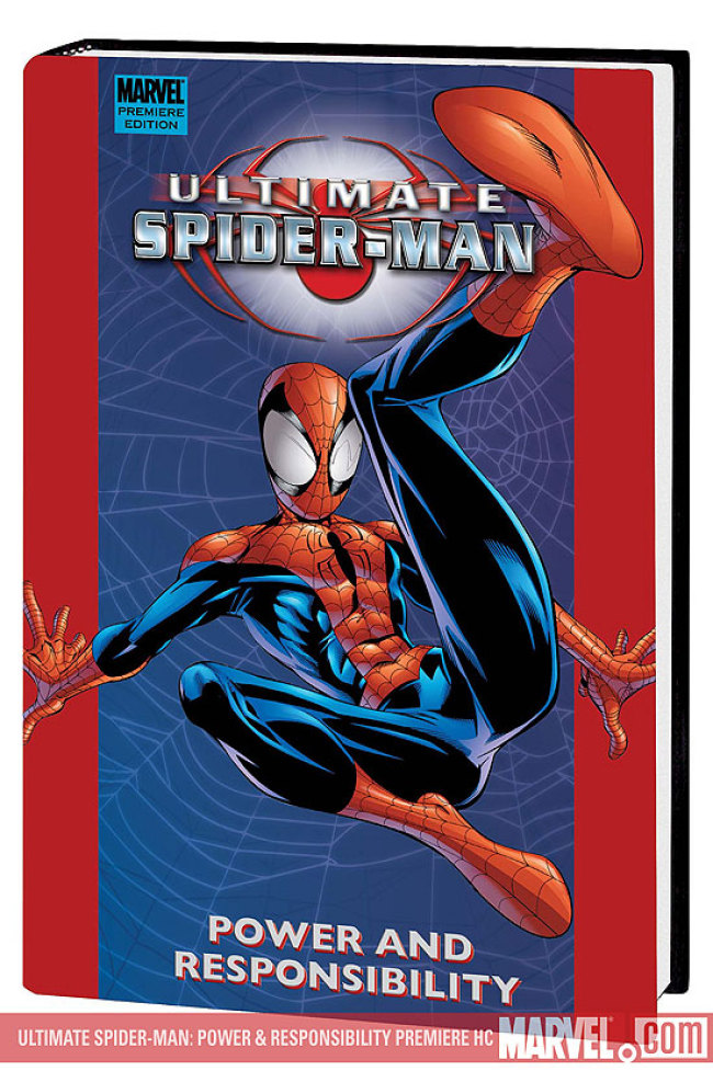
The cover of the TP is stupid and boring - a drawing of Spider-Man and the background is a photo of Times Square.
I know those are nitpicks but when the art is boring (pencils, inking, coloring) this things tend to pop-out and be less forgiven or forgotten.
The layouts are nice but needed a different art team to make them look good.
The dialog is clunky sometimes - like the "shall we dance" line that Peter said to the thief. Things happen far too fast and in a very crude manner, and the way uncle Ben died is pretty dumb - some thief stumbled into their house and shot him, although they'll probably change it to the Green Goblin which will be less dumb but still dumb and cheap.
The plot is basically: Peter is a dork that gets bullied, Peter gets bitten and has a mid-life crisis and joins wrestling, Peter is cool now, Peter leaves wrestling, Ben dies, Peter recovers pretty fast and starts helping people, the Green Goblin is formed, the Green Goblin dies, the Green Goblin lives, The End.
Meh.
This is an interesting idea that got ruined - it's basically regular Spider-Man but much faster and without the emotional resonance. I have the 2nd and 5th TP that I still need to read and they might induce a change of mind, but I doubt it.
Art: 2 - Average


People will cry foul when you say that this book wasn’t a success. But the Ultimate line was supposed to draw in new readers–with few exceptions, it failed. The line was supposed to make its way onto regular newsstands to be sold amount magazines–this idea failed, with the exception of racks in Borders and Barnes & Noble. The line did not appeal ENOUGH to younger readers who wouldn’t’ve read comics otherwise. It failed despite Bendis’s idea of what younger readers would like to see in a reboot Spider-Man book. Maybe the prospect was hopeless–maybe NOTHING would have worked–but this sure didn’t. Nevertheless, 35-year-old guys who’ve been reading comics since they were 8 love to say that Ultimate Spidey is a great book, the perfect evolution of the Spidey franchise. They have a reason for saying this: because the book was very good at doing what it did: making 30-year-old readers feel like they were reading something meant for the younger readers of today. The whole thing creeps me out. 35-year-olds caring about a 16-year-old Peter Parker having sex with a 15-year-old Mary Jane Watson, 35-year-olds pontificating about how "realistic", "natural" and "snappy" the (trendy, cliche) dialogues of fictitious teenagers are. With that said, I’ve read over half of Ulitmate Spider-Man up to about issue 100. Why? Because I got it for free and because reading it is a curious exercise and a good epitome of what passes for good mainstream comics today. I think you’re being a little too hard, though, especially on the art. And I don’t think Bendis’s writing here is "bad", just…weird. He is a GREAT plotter, though.
There’s a weird disconnect, though. In the dialogue. In how Ultimate Spider-Man was marketed. It’s supposedly been written for a younger audience…that doesn’t actually read it, but it’s read by a much older audience who praises it…in large part because they think it does a good job of reaching the audience it doesn’t reach.