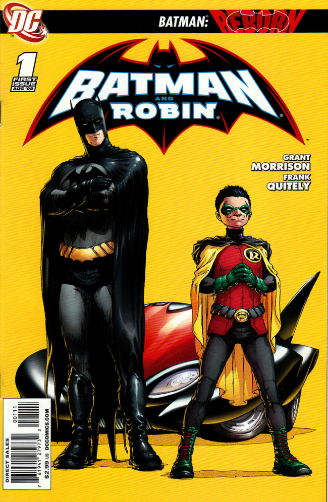
BATMAN AND ROBIN #1
What did the
iFanboy
community think?
Pulls

Size: pages
Price: 2.99
‘Crime is Doomed’-Damian (aka Robin)
At long last, Grant Morrison is back on the character he is perfectly suited for. With a new Batman and Robin to play with; what type of stories will he tell? Will he decide to go back to his metapsychial and psychological tales of the Bat? Or will we see a more playful side of Batman with a more colorful art style for the character?
What we get is a more fun, Silver Age style of Batman in this first issue. Grant Morrison my friends can write any type of Batman he wants, and still make it the best comic of the week. This first issue was a whole lot of fun. As a whole it’s more of a set up then anything else for this new world Morrison gets to play in. But there is no sign of the type of story he got to play with in RIP. Instead this calls back to the earlier days of Batman when it was campy and fists were flying. The art style certainly made this look campy, but the diaologue is as serious as ever. Overcompetant villains, a more likable Damian, a very determined Dick Grayson; all of these things are in this comic and all are written very well. Morrison has also wrote a new villain into the mix and without getting any spoilers out….he is certainly one of the more creepiest members of Bat’s rouge gallery.
The art in this, more then anything else, makes this one of the best comics out of the week. I have always love Frank Quitely; but frankly I didnt think he could do a Batman story. Unless this is the Silver Age (or 1960’s) I didnt think an over the top look for a Batman comic would work. But Quitely delivered on one of the more imaginative and colorful comics to come out in awhile. Everything about this just screamed the more campy style of Batman. From the flying Batcar, to the bizarre looking villains, to just anything in the city background; it all looks amazing. Plus for once, even if I do like Quitely, the faces are just spot on. They dont look pudgy or have weird dark spots on their face; they look exactely as they do in other comics. What also was great, and was a very nice touch, was to have the sound effects blend in with the art. If an explosion happens, the flames form a ‘BOOM’ shape, if someone lands in the water; the water forms as ‘SPLASH’ shape. Amazing detail and some of the love should also go to colorist Alex Sinclair. Instead of looking muddy he provides the right amount of fantastical backgrounds to an already hetic cityscape.
This might be only the first issue; but Morrison and Quitely delievered on a fun and more retro look at the Caped Crusader. It’s gonna be really tough for anyone to dismiss this issue as anything else but fun. It’s not deep or rewarding like his earlier take on the character; nor is it a psychological take on the mind of Batman. This was a great homage to the older days of Batman and I cannot wait where Morrison is going to take on the new Batman and Robin.
Art: 5 - Excellent


I totally agree with you and touched on most the story beats I thought were phenomenal. And yes, Daimian feels far more human here then he ever was. Now he’s actually fixing the Batmobile instead of fixin’ to hit Alfred with a batmobile!
Granted, you used the term "metaphysical", but you spelled it wrong. 😉
@FACE: Ah….I missed this relationship 🙂
This from the guy who crapped all over "Old Man Logan" this years greatest comic?! Nope, can’t be trusted!
Put your Grant Morrison boner away and read it again, it wasn’t that good. I guess there is no middle ground with you, huh?