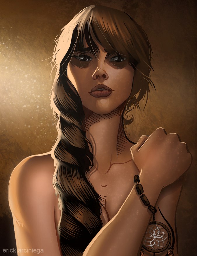
Erick Ariciniega coloring
Welcome to a new installment of #Tweetfolio reviews! Feel free to check the links after this article to catch up on previous installments.
This column’s going to be different: instead of pencilers I’ll be reviewing a colorist’s work. Perhaps nothing in comics is currently more misunderstood than the importance of coloring. Whether you realize it or not, the coloring across the line is what separates the art of Marvel from all of its competitors. For aspiring creators out there, it’s vitally important to recognize that good coloring can not only add to your comics but save them where the art falls short. For growing publishers, it’s crucial to understand how good coloring can help build series and in turn build franchises. Aspiring pencilers need to understand how good coloring can make or break how their work looks to publishers who might want to hire them.
I’ll be reviewing the work of Erick Arciniega available here.
Bon Alimagno: Can you tell me about yourself?
Erick Arciniega: I’m from Mexico, the same country as Marte (Gracia), (Edgar) Delgado, (Carlo) Barberi, etc. I’m 23 years old, and my first job as a colorist was exactly two years ago. This triggered my love for comic books as I didn’t use to read comics. I’m a full-time concept artist working in the video game industry.
BA: How would you describe your style to someone who doesn’t read a lot of comics?
EA: I try to combine a little cartooniness with some realism, while always trying to achieve a professional look. The mood is the most important thing to me.
BA: Who are your favorite colorists and what do you like about them?
EA: Marte Gracia — I love his style. I’m amazed how he takes the cell shading style and takes it to another level. Justin Ponsor — he makes everything look like screenshots from a movie. Rain Beredo — he makes everything look so real, I love that.
BA: Marte, Justin and Rain have very different styles. Which one would you say is your favorite between the three?
EA: I will go for Marte, I’m a big fan of his work on Deadpool.
BA: What do you consider to be your strengths and weaknesses?
EA: My weaknesses: I think it’s that I have just a few books published. I’m still learning and developing my style. And the hair, it takes a little longer to figure out how to color hair.

Classic Marte Gracia coloring
My strengths: I’m a concept artist also, so I have a wide background in art, but at the same time it’s difficult to change from the concept art style to comic book art style. I’m always asked to color more cartoony. But I’m very focused. I always give my best to every book I work on.
BA: How many pages on average can you color per day?
EA: I color about 3 pages per day. Sometimes more, sometimes less.
BA: That’s a good pace. Often colorists at Marvel were expected to color at east two to three full issues a month.
Where else have you colored professionally and for what were those companies and what projects?
EA: I have worked mostly in indy comics, companies like, Interverse Comics (Last Apprentice, Bushidan), Bluewater Productions (10th Muse, Legend of Isis, Judogirl) and some weekly comics (Twilight Lady by JK Chen, Johnny Saturn). I also have several projects still under NDA. That’s just a few.
BA: What pencilers would you most like to color and why?
EA: Barberi. Paco Medina. Humberto Ramos.
BA: That’s good. Those are all Marvel artists and are almost always colored by either Marte Gracia or Edgar Delgado.
You mentioned previously that one of your favorite colorists is Marte and what he’s done with the cell shading style. I can definitely see your work emulating his. However Marte’s palette is also rare for a Marvel colorist. It’s darker than most and plays off a lot of browns, greys and purples like many of your sample pages do. What makes Marte’s palette work though is he’s able to be very precise about his lighting, nailing exactly where to place his lighting cuts to give the characters definition and allowing them to still pop off an overall dark page. It’s a very tricky thing he does. I see you aiming to do the same, but I think you need to work much more on your lighting. On most of your pages the lighting looks unnatural, with the natural lighting sources of the pages difficult to determine. You risk rendering dark, muddy looking pages that flatten the depth of field in the art.
On almost all of your pages the characters and backgrounds are lit almost as if a bright spotlight is being pointed directly at them. Repeated page after page this strikes the reader as unrealistic and throws the reader out of the story. It also makes characters appear too shiny as if they were composed of plastic instead of flesh. This kind of lighting was extremely common in the 90’s at the dawn of the digital coloring era. But with Crossgen/Wildstorm coloring, the movement towards a more painterly style emerged which retained the vibrancy of digital coloring but added more subtle shading and rendering, and a more organic feel to the coloring. Marte and other colorists like him are the exception with their cell shading style, but again they can manage it because of their firm mastery of lighting. I’d suggest you stick with playing off darker colors ONLY if you can master lighting the way Marte has.
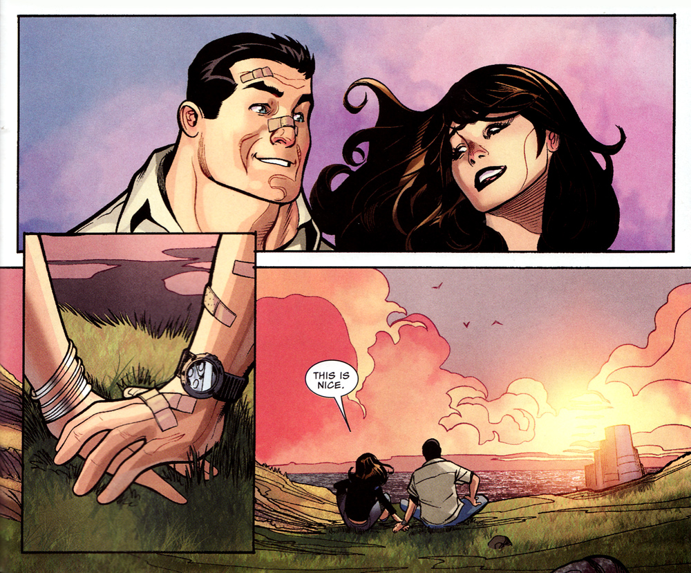
Classic Justin Ponsor coloring (Marvel)
From my time at Marvel, the editors valued colorists with warmer palettes rooted in playing off reds and oranges and lighter yellows and blues. Led by Richard Isanove, Laura Martin and Justin Ponsor, this style set the tone for the entire line and gave Marvel’s comics a much more inviting look and feel than most of the DC Comics line.
For next steps, I’d encourage you to study coloring faces. This is a seemingly small, but vital detail. If you can nail faces that can set you apart from a lot of other colorists. Study particularly the way someone like Justin Ponsor works with them, like how he colors Miles Morales in Ultimate Spider-Man. I talked to him about Miles in particular when the character first debuted and he told me part of his coloring approach came from studying how certain characters, like Broyles on Fringe, were lit on television, how the unique textures of his face weren’t blotted out, and how lighting touched on and ringed his ears. Nailing details that subtle builds the case in the reader’s mind that what they’re seeing is real, something they can lose their imaginations in, and not something created in photoshop.
EA: The lightning is always difficult, I really need to study more. Now that I see my pages through your review, I really noticed my problems, I really tend to go too dark. Ponsor does a great job on Miles Morales, I think I’m going to take it as a reference.
I still have a long way ahead of me, but I think that if I follow this advice I’ll be in the right direction. Thanks a lot!
BA: Thanks for participating, Erick! And good luck!
*****
Did you know that colorists receive exclusive contracts as well? If this surprises you, it really shouldn’t.
Coloring is becoming increasingly important in the comics industry for reasons that are not just artistic but economic as well.
Managing Marvel’s coloring corp was THE most important part of my portfolio of responsibility.
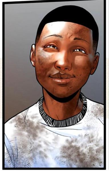
Ponsor & His Facial Coloring Technique
Far too often, when writers, pencilers and inkers took longer to finish their work than expected, it was the colorists (and letterers) who were asked to make up for lost time, stay up for days straight, and keep a book on time. Friday nights at Marvel (the typical deadline to send a book to the printer) were often spent waiting for the last colors to come in for books that could not be delayed (which by the time I left Marvel could not be any book). This put considerable pressure on our coloring corps and often I’d come to an editor and suggest other colorists who could take over some pages to relieve the burden on the primary colorist. The relief colorist would have to closely match the style and palette of the primary colorist. This was difficult figuring out at first but over time it became second nature and now for every colorist you see on a Marvel book I could probably name at least one who could come in and approximate that colorist’s style.
Just as pinch hitters in baseball are often asked to come off the bench and hit a home run on demand, colorists were often asked to perform as well in a few days as if they had all the time in the world. So you weren’t just hiring colorists based on their talent but how they performed under pressure, often tremendous pressure, with no room for error.
So good colorists don’t just make a book look good. They can literally save a book. They are the EMT’s, the first responders. The Marvel bench became one then that was full of not just talented people but consummate professionals, ones you could count on to help you when, frankly, your job was on the line.
With Marvel’s talent managers and editors, I helped build Marvel’s deep bench of colorists, a bench that could be trusted. It’s something I’m truly proud of and something I hope lasts.
Maintaing a strong coloring corps also strengthens a comic publisher’s economic health and market position. When I was at Marvel I spent a lot of time keeping our exclusive and most valued colorists busy so they didn’t take on work elsewhere.
Indeed, there’s a strategy that for the most part works where you position your best colorists specifically over a talent that hasn’t become a big name yet, but that you hope develops into a star. Excellent “A” level coloring would enhance a developing penciler’s strengths to the point that a publisher could expect they’d get a larger following. Eventually when that penciler’s name grew big enough a publisher could then shift that colorist to another penciler to help develop.
The reality is it costs less to get a great colorist to make an artist look good than paying an inker to do the same. A colorist can do two, three or even four or more books a month so they can make just as many pencilers look better. Inkers however can not say the same thing. The absolute fastest inkers I ever worked with could ink two books a month, and usually only with the help of an assistant. I know colorists who could color 100 pages a month (though most also had flatters helping). Locking down colorists then is the most cost effective way for publishers to enhance their line of series and build long-term value in both artists and franchises.
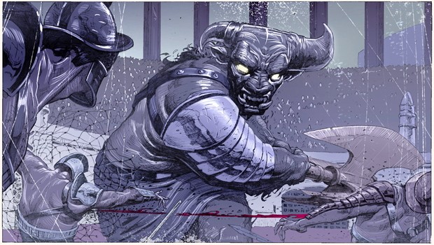
Dean White's "white line" coloring technique
Now, I’d also go so far as to say the most tantalizingly unexplored growth path for comics lies in finding out-of-the-box coloring styles. As I’d mentioned Marvel’s coloring palette is largely grounded in warmer colors like red, yellows and oranges, playing off lighter blues — what I used to describe as “the perfect sunset” palette. The biggest exception to this is what Dean White has been doing on Uncanny X-Force. When Dean first started coloring Jerome Opena, he essentially created a new coloring technique to color Jerome’s unique style, adding a layer of drawn-in white highlights which added unique depth and life to Jerome’s work that hadn’t been seen before. In setting a new look it also set the book apart for readers looking for something different. Indeed, Uncanny X-Force has been consistently one of Marvel’s best selling books since it was first released. While there’s a lot of things going right on that series, Dean’s coloring was an unexpected revelation and its success is in great part due to the coloring. Are there similarly new coloring techniques and styles out there that could lead the entire industry in new directions? Perhaps if colorists were given much more time to experiment and discover these new approaches instead of always acting as EMT’s for books in trouble, it’d be much more possible.
So: what about inkers, then? In an industry increasingly reliant on colorists where do they fit in? Well, check in next week when I’ll be reviewing one and giving my thoughts on inking — and how more than ever inkers ought to be valued highly again. In the meantime, feel free to leave your questions and feedback in the comments below or through my twitter @karma_thief.


This was a rad read. Thanks!
Great piece. Looking forward to reading the inkers one.
This was just great.
I´d like to know if I could translate this material to Portuguese and publish in our site http://www.kokocast.com
Thanks!