Covers, covers everywhere and not a cover to drink.

Cover by Alex Ross
The comic book cover redone with a magazine-style trade dress is not a new concept. The last big name book to utilize it that I can remember was Fantastic Four in Mark Millar and Bryan Hitch’s first issue. They’re doing it better here. In fact, they did such a good job with mimicking a magazine cover trade dress that I literally stopped in mid-step at the comic book store when I saw it. “What is that?” I wondered. I even had to do the lean back thing to keep my balance. Antime a comic book cover can do that it’s a winner.

Cover by Antonio Fuso
Just like Tomax and Xamot themselves, this cover really shines as a pair. These two versions of the Pick of the Week cover reflect the mirror images of the men themselves as everything but the logo itself is inverted. It’s a brilliant yet simple bit of design, just like the book itself. I wonder if it speaks in a Euro-trashy accent.
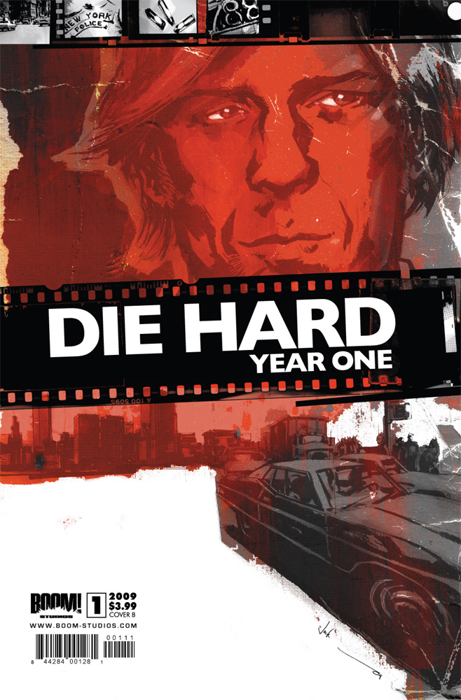
Cover by Jock
This cover is all about atmosphere, which is not surprising because that’s what Jock excels at. From the cars, to the grimy sheen on the art, to the shaggy haired Bruce Willis, this cover screams 1970s New York City. And talk about Bruce Willis aka John McClain aka One of the Greatest Action Heroes of All Time, Jock totally nailed the look and the smirk, which is something that the other two covers couldn’t manage.
Those are my favorites. What are yours?


I love the simplicity of the G.I. Joe cover.
I also found the cover of the JLA special rather striking: http://www.ifanboy.com/comics/dc_comics/justice_league_of_america_80_page_giant/1
That Astro City cover is just too busy for me. It makes me want to flip it open and find the sex quiz.
The Die Hard cover looks like a DVD cover.
Those are nice. The Astro City cover had me thinking it was actually some strange magazine.
My vote for the week’s best cover goes to the variant edition of Hulk 15. Red Hulk throwing X-Force-Wolverine at Punisher, guns blazing. You just can’t go wrong with that!
The Astro City cover frustrates the hell out of me, because it doesn’t sell the book. It disguises the book as a magazine that I haven’t heard of and didn’t come to the store to buy. If you want people to know a new Astro City is out, and Astro City comes out at random intervals you can’t look forward to, then goddammit, put the words "ASTRO CITY" in big letters on the goddamn cover! Don’t tuck them in the corner! You are supposed to be telling me what this is from across the room. Function!! I saw this cover online a while back and thought, "I am going to look right past that at the store," and indeed that is exactly what I did.
I think a shout-out is owed to this week’s cover of Amazing Spider-Man, which features Black Cat sexily digging her knees into a jagged pile of diamonds. Ow.
@Jimski – You nailed the issues I have with the Astro City cover.
I’m not fond of that Spider-Man cover. Her legs are rather poorly drawn. Look at the width of her thighs verses her calves. And the lack of any shadowing (is that the proper term) is just odd. That one didn’t work for me.
I thought the same thing about Astro City. I couldn’t find it when I wanted to, because I’m so used to passing over those magazines.
The Jack of Fables cover was fantastic this week. Great Bolland with a sense of humor.
@stuclach re; first comment-Or look for dazzling new sex positions to please you lover.
I was at the LCS yesterday and totally glossed over the Astra magazine, in fact someone in line in front of me bought one and I wondered what magazine it was, didn’t even realize it was an Astro City comic. I think they are losing a lot of sales on this cover.
@jimski: The ASM cover is beautiful.
I was also a big fan of the GL cover. More Carol side/middle boob (did we ever settle what kind of clevage that was?). Other than that I don’t think that there were too many exceptional covers, as Conor pointed out with opening.
The New Mutants cover wins the week for me. The cover featured a totally wrecked New Mutants logo but the strength of the Warlock image was amazing; seeing him so large and well illustrated maintanied the book’s identity perfectly. Good job.
Great picks! Love that die hard cover, might have to pick it up, how was it.
@MisterJ – I don’t look for those, because I already know all of them.
@Josh – I liked the ideas in the cover of Jack of Fables, but didn’t find the actual cover all that pleasant.
My personal pick would have been Astro City, GI Joe, and The Hood cover, and the Unknown Soldier cover. I really liked all of those.
These are good covers, I wouldn’t say they were the best though. Which is saying a lot from me considering I find Alex Ross a god among artists.
Two covers that stood out to me though were:
Dark Reign Sinister Spider-Man #4 (I love Bachelo and that cover is really well done. Love it that a gigantic Venom is eating the skyscrapers like corncobs.
JLA 80 Page Giant #1 (I don’t know who Jay Anacleto is, but he reminds me a lot of Alex Ross. The heroes look very realistic and the detail in the pencils are amazing. Also, it seems like it’s just a black and white cover and no inks/colors used for it. So I can appreciate the artwork more)
@TNC: THE JLA 80 PAGE GIANT cover was fully colored. Unless there was a black and white variant I didn’t see.
@conor: That varient would be the cover you provided for your own website. 🙂
But yes I literally saw the colored version on another website, and that looks even better then the B&W version. That would be a nice poster if DC would make one of it.
@TNC: As far as I’m aware, that’s not a variant. DC sometimes provides black and white versions of their covers in their solicitations, for whatever reason. It happened for like four months in a row for GREEN LANTERN last year.
@conor: Really? I didn’t know that. I wonder why they only show their covers sometimes in Black and White?
In fact I have a question about covers. That Astro City cover didn’t have all of that text on it when I see advance previews/solicts for it. Even when it’s the week the issue is coming out they don’t show the full version of the cover. It’s like that for a lot of comic books, why do companies not show the final version of the covers?
My top pick pick is Shang-Chi B&W, I like Parillo’s deadpool and the old-school converse that Shang-Chi is sportin. Then id have to go Sinister Spider-Man, bloated "Spider-Man" eating skyscrapers happy as a clam is sweet. Also I really liked Bad Dog’s cover. Theres maybe some better covers this week but the hands that were reaching for Lou and the "people" on the caution sign made me very curious to what happened in this issue, so much so it was the first issue i read when i got home.Plus Diego Greco is an amazing artist and i hope once Bad Dog is over he gets another gig somewhere..
That astro city cover is off the chain!
@stuclach-nicely played
I agree with previous posters on the busyness and non-comicness of the Astro City cover. It’s a very good send up of the magazine cover (I believe it’s aping… Entertainment Weekly?) but there’s just too much and weight of text on the bottom draws the eye down from the wide open top right quadrant. The other two covers are nice, though. Of the five books I bought this week, none of them really had compelling/interesting covers. Probably Thor would rate as my favorite this month, but at this point it looks the same as the past few Thor covers and comes off as boring. Interesting picks.
I thought the Astro City cover was really great this week. I almost picked it up, but realized I haven’t read the series in years. It’s a great though.
I think I like the GI Joe cover the best of the above. My favorite of the week is the Dark Tower cover. It has a cool ‘Battle of Hastings’ feel to it. Kind of hard to explain.
What’s that?! She looks like Firestar, Angelica Houston. Well, better than Firestar ever looked. Take note.
The GIJoe Cover reminds me of the last issue of Iron Fist from Brubaker and Aja.
"Very modern art." – Ghoulish recall coordinator, Fight Club.
@vadamowens – That Dark Tower cover is rather striking.
I agree with your agreement
@vadamowens – As well you should.
lol
I’m always a sucker for an Alex Ross cover.