Not a lot of gold in them thar hills this week, but there was beauty to be found if you looked hard enough. Here were the covers that shined the brightest.
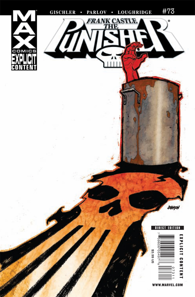
Punisher: Frank Castle Max #73
Cover by Dave Johnson
Now this one is an eye catcher! And that shouldn’t come as a surprise as artist Dave Johnson is in the business of interesting and eye catching covers. This cover is all about negative space and using the lack of a background to its advantage. Because of the stark whit background our eye is forced to the pot with the human hand sticking out and the Punisher logo contained within the trail of blood. There is a reason why minimalism really works when done right — the lack of extraneous details forces us to focus on what’s really powerful in the image.
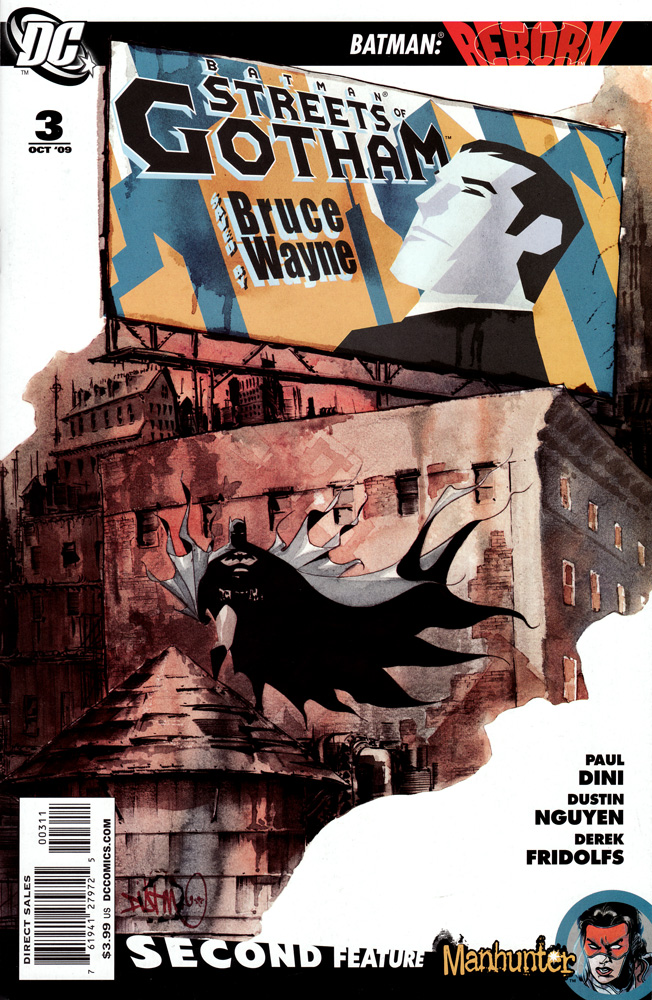
Batman: Streets of Gotham #3
Cover by Dustin Nguyen
Dustin Nguyen has been killing it with these Batman: Streets of Gotham covers and this might just be his best one yet. This cover is all about contrast, and I love it. It has two contrasting styles — the moody, water coloresque art in the foreground and the bright colored pop art of the billboard. Both are expertly rendered and the integration between the two is delicious.
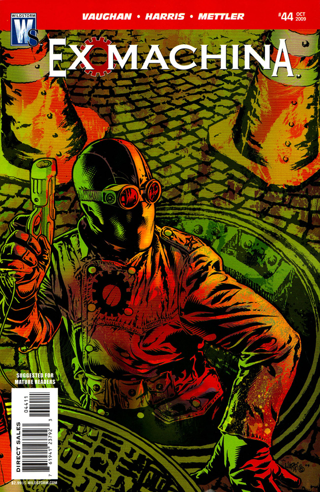
Ex Machina #44
Cover by Tony Harris
Cover by Tony Harris
There are two things that I really love about this cover. The first is the color scheme. I love how saturated it is in the red and green tones to the point where it’s almost disorienting to look at. This is a cover with color that pops. It’s practically a neon sign. The second thing that I love about this cover is the dizzying amount of detail. It’s almost at Geoff Darrow levels. When you combine the color and the detail, this cover almost overloads the eye. Almost.
Those are my favorites. What are yours?


My favorite was Streets of Gotham Cover. Even if I thought that Batgirl #1 wasn’t as great as the other Batverse titles the cover was still cool. I also liked the Viking cover and the variant Weapon X cover.
Ex Machina hands down looking all Lobster Johnson.
Conor is right, it was an off week for covers. Not that they were bad on the whole, but just dull. That Punisher cover is striking, really draws the eyes. Streets of Gotham was nice too. I loved the white-space bounding it. Not a fan of the Ex Machina cover, though. I’ve been digging the cover design of the "Spock Reflections" series from IDW, if not the cover art itself. I also thought Phil Noto’s cover for Batgirl is worth noting, if perhaps not the best.
Gotta go Power Girl #4 and Punisher: Noir. Not reading either title, but the covers kick some serious ass. I haven’t been a fan of the Ex Machina covers in a long time. They tend to get pretty redundant I think. And saying something is near Geof Darrow level detail is saying a lot. Especially considering that background on Ex Machina is photoshopped.
Ex Machina is great, as well as the Djorjevic (sp?) and Ross covers for Daredevil. Other than that, an OK week for covers
Shit, I take it back. Didn’t realize that Punisher cover was Bradstreet. Yeecch.
If there is one thing that has stayed consistant with the Punisher MAX since Ennis left; it’s the covers. All of Dave Johnson’s covers have been excellent and they are striking to look at. It’s a style I don’t see often with covers.
Punisher Noir also had a good cover. It’s variant (with Castle walking away from an explosion) was also good to look at.
When I saw that Streets of Gotham cover, I was hoping it would end up in this column. That’s a freaking awesome cover.
I really liked the 70th Anniv. Variants Marvel released. They were simple but the iconic poses that each character gave were classic.
@roadcrew1 and a riff on the 25th Anniversary covers from 1986 which I always liked.
I liked the Daredevil covers.
Not only is it an awesome Ex Machina cover, but a great issue as well. A lot is explained.
Only Power Girl really gets a nod of my books this week. There were a lot of good books, but the covers were not exactly exciting.
Worst cover of the week had to go to Amazing Spider-Man for one fugly Mary Jane!
These may not count, but the two Vertigo Crime books had fantastic designs to them. Good stuff.
I liked the Batman/Superman cover. It got me to buy the book off of the shelf.
But I always like monkeys.
No DD?
@Actualbutt: So the Punisher Noir Cover was one of your favorites until you found out who drew it? Does this mean it’s not the art that matters to you, but the name attached to it?
My favorite this week was the Streets of Gotham, and I’ve got to agree with SlightlyMad, the last two or three ASM covers have been hideous. They make it look like Mary Jane (who, last I checked was supposed to be a model) is the product of monkey incest.
I almost forgot: Dark Reign Mister Negative had a great cover this week, too.
The wrap around Daredevil #500 and the smallville sign variant of Blackest Night Superman.
I liked the punisher #8 cover, dug the way they used the old school avengers on the cover, even though the isuue wasn’t so great it was a awesome cover.
I agree on the Ex Machina one, they always have the best covers.
I’m normally not into cheesecake, but damn i dig that batgirl cover.
That cover’s really not cheesecake.
Pretty great choices, the only others that I would mention are Batgirl #1 and G.I. Joe Origins #6 cover A
@Mulletpeep: I agree with Conor, and I know cheesecake. I have a whole short box I hope my girlfriend never opens…
The Batgirl cover might not be cheesecake per se, but it does portray a physically idealized woman, without the top of her head (where the brain is), so it strikes me as a tad misogynist.
I love clean lines of that the billboard on that Streets of Gotham cover. It makes it looks like it’s simple to draw and design but I couldn’t do it to save my life.
@Harper: It’s fousing on the Bat symbol and obscuring her face because it’s a mystery as to who she really is. I think you’re looking too deeply into this.
The Batgirl cover is gorgeous and it’s not cheesecake.
Unless you have a chin fetish.
I liked the Punisher cover and the Ex Machina cover as well, but Daredevil 500 should be on the list as well.
@stuc – damn straight! the All Hail Megatron covers have almost all been tops of the week and this one was no exception.
when i picked up Street of Gotham i thought to myself, "they had better mention that in the best covers section on ifanboy". easily the most striking cover of the week
@Harper: what conor said. And you misused the term misogynist. A misogynist is more like that character my little sister watches… erm Squidword, a people-hating person.