I don't like to front. Because, girl, I know you like to keep it real. But if I promise to be genuine, can I show you some of my favorite fronts from just this week?
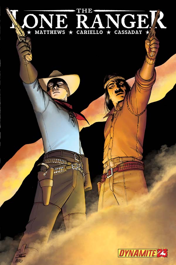
The Lone Ranger #23
Cover by John Cassaday
While this image doesn't quite hold a candle to some of my favorite Cassaday covers, you know of yore, it does show that he's still delivering some thoughtful illustration. I like the starkness of the black sky, but even more, the starkness of the Lone Ranger's crisp blue shirt. There's something eternally wholesome about this character, that regardless of his rugged actions, he'll always look like the guy who sidles up to the bar and asks for a glass of milk. The diagonal are also quite interesting, with the layer of smoke in the foreground, the orange rift of sky in the back, and these two figures betwixt them creating this peculiar illusion of depth. Pretty striking.
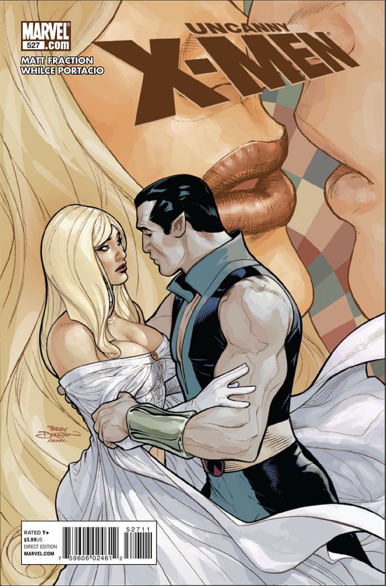
Uncanny X-Men #527
Cover by Terry Dodson
My late aunt left behind boxes and boxes of romance paperbacks. Smutt, as she often referred to it. Many, but not all of them, featured covers very similar to this one, with some form of rogue, maybe a cowboy or a highlander, grabbing at the elbows of a virginal schoolmarm or ruddy-cheeked bonnie, in the throws of unmistakable, unavoidable passion. As such, this is a classic image, with nice figure work, and a cool closeup in the background. Is that moment of closer intimacy a glimpse at the absolute future or merely a shade of possibility? What makes this more interesting is the cast. Namor certainly fits the archetype of brash, passionate outlaw. But is Emma ever quite this vulnerable?
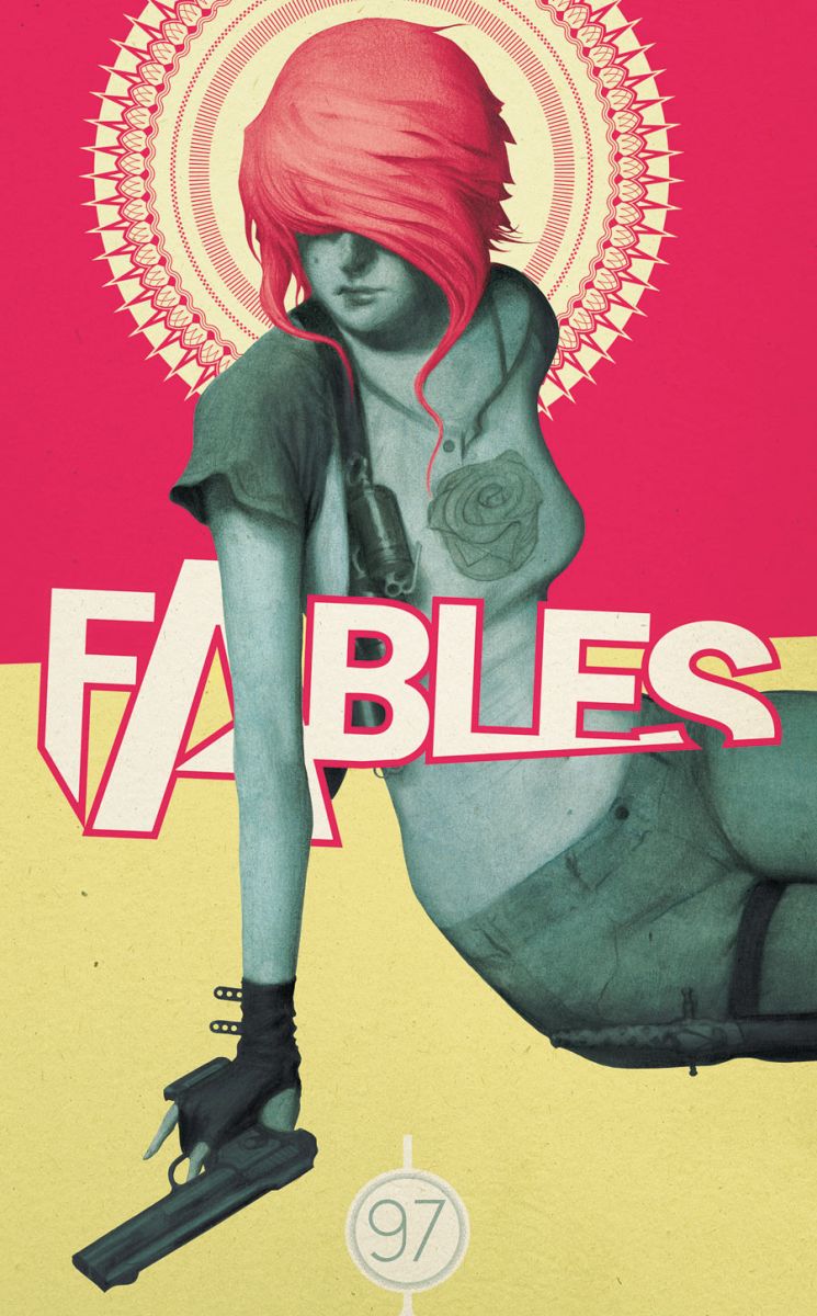
Fables #97
Cover by Joao Ruas
Nearing its 100th issue, Fables has a grand tradition of astonishing cover. Of the four issues of the current "Rose Red" story arc, I've highlighted all but one. There was nothing wrong with it. I simply didn't have much to say about it on the given week. As a variation on a theme, this arc's delivered some fantastic, usually haunting visuals. Here, we get what looks like a Mexican mural. The Lady of Soft Gunplay. The Lady of Animal Husbandry. Dig the rose imagery, the vibrant halo, the dollop of strawberry sherbet hair. And if you're into eye flow, how about that arm as an arrow right down to the gun? The logo, quite often an afterthought for so many series, is tucked lovingly, crookedly under her arm.


I wasn’t fond of the Fables cover when I first saw it, but it has grown on me. I think my main problem was the extremely unappealing mustard yellow used on the lower half. It makes me think of a run down elementary school.
Amen on the Fables cover. I’m beginning to not miss James Jean so much anymore.
Is that Ramona Flowers on the cover of ‘Fables’? Ramona Flowers with a gun? *blinks*
That analysis of the Uncanny cover in terms of romance novels is really interesting — I’m not sure it really works with what’s in the issue, or if I can read it as a comment on the characters as opposed to a generic pinup, but it is a striking image
I agree with Stuclach, that mustard reminds me of my elementary school desk chair. If only the rest of Uncanny looked as good as the cover. I thought both Secret Avengers and New Avengers had great covers. My favorite of the week was the variant Green Lantern Corps Cover. Barry dressed as a white lantern. Quite amazing.
I saw the Fables cover and said, if this is not in Covers of the Week I will complain. I am glad I do not have to. BTW last month’s Fables cover was excellent as well.
How is Chew #13 not on this list?
@bigben2012 – A neat Pulp Fiction homage, but other than that, it didn’t really stand out to me. But hey, it got PotW!
@bigben2012 Agreed.
That Fables cover was striking. My favorite cover of the week was Phoenix Without Ashes #1
I love the way Terry Dodson draws women, way better than Greg Land!
@ShaunR: I agree
i don’t know what the #$%@ just happened.
That Fables cover is a fantastic design. I love when the "image overlapping the title" thing is used well.
Also, ohcaroline cracked me up with the Romona Flowers line. That was awesome!
I must be in a minority, but I’ve loved the X-Men since the ’80s and I hate Dodson’s art. His big fat outlines always make me think of a kid’s book. I know it’s probably just my weird taste, but that cover, looks like crap to me. Can someone explain the appeal?