First impressions are always important. That's why I always show up to job interviews in my best evening gown.
Here are some fine, fine first impressions:
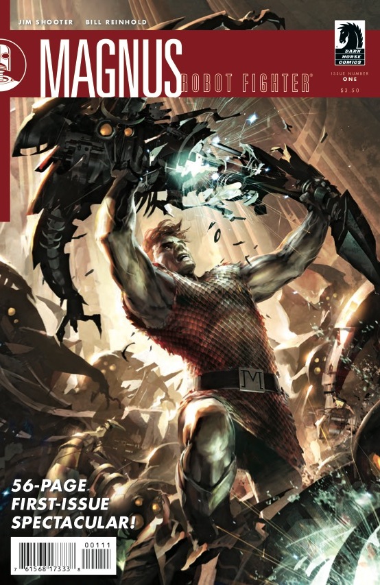
Magnus: Robot Fighter #1
cover by Raymonds Swanland
I have fought robots, and this is exactly what it's like. You just have to rip 'em limb from limb in your best modified Aquaman costume. I dig the dramatic lighting here, the idea that this is all taking place at dawn. After a very long night of mechanicide. The design elements are nice too, with a clean banner for the title logo.

S.H.I.E.L.D. #3
cover by Gerald Parel
It's become something of a tradition to spotlight the new S.H.I.E.L.D. cover, and who am I to subvert expectations? Galactus has become more and more omnipresent these days, and not in a good way. But here, he at least retains his glorious stature. It's more than ominous. There's also a great motif here; the boundless grandeur of science and discovery. How it can dwarf even the greatest mortal minds. Here we are in some far-off nebula, swirling in water color murk. We feel small. But that's a little okay.

Baltimore: The Plague Ships
cover by Mike Mignola
We've been highlighting this book all week, and for good reason. It hits all the right notes. Baltimore is a Swiss army knife of vengeance toward the vampiric race. At a time when they need some tough love. Dig that crooked bell tower. Dig that folksy logo. Dig that swath of violent yellow orange in the sky. That note of blood dripping from the tip of his dagger.


That S.H.E.I.L.D cover definitely deserves an all caps EPIC.
I really want to start fighting robots now.
pretty much anything involving Galactus is a win for me.
Mike Mignola’s art just continues to amaze me. That is a beautifully designed cover!
No love for the paint by numbers cover of Sweet Tooth? What happened to your creativity? 🙁
"Baltimore is a Swiss army knife of vengeance toward the vampiric race." You can go ahead and call it a day, Paul. It’s not gonna get any better than that. Well done. 🙂
Baltimore’s cover looks like, well, every Mignola cover ever.
As a bit of a closeted typography fan I love the design of the Magnus book, and SHIELD is probably my favourite of the week. However, i need to give a shout out to the Secret Warriors Cheung triptych, which is nothing original but still a great image of great characters.
When I was a kid, I loved the Magnus painted covers. They were so cool. I couldn’t wait to see what they would do with the new Magnus comics. Was not disappointed.
Really dig the SHIELD cover. Making Galactus look cool can be challenging.
When fighting robots, it’s important to be wearing a skirt. Even if you’re a man.
I want to see Magnus fight Galactus.