Covers! Some, you want to frame. Others, you want to use as liner for a bird cage. And a few of them make you wish you had a bird cage in the first place.
Birds can live for like ever though, right? What if you die before the bird? And then your grandson inherits the bird from you. And the bird tells him all your secrets
Birds ruin families.
Here's some of this week's covers. The keen ones.
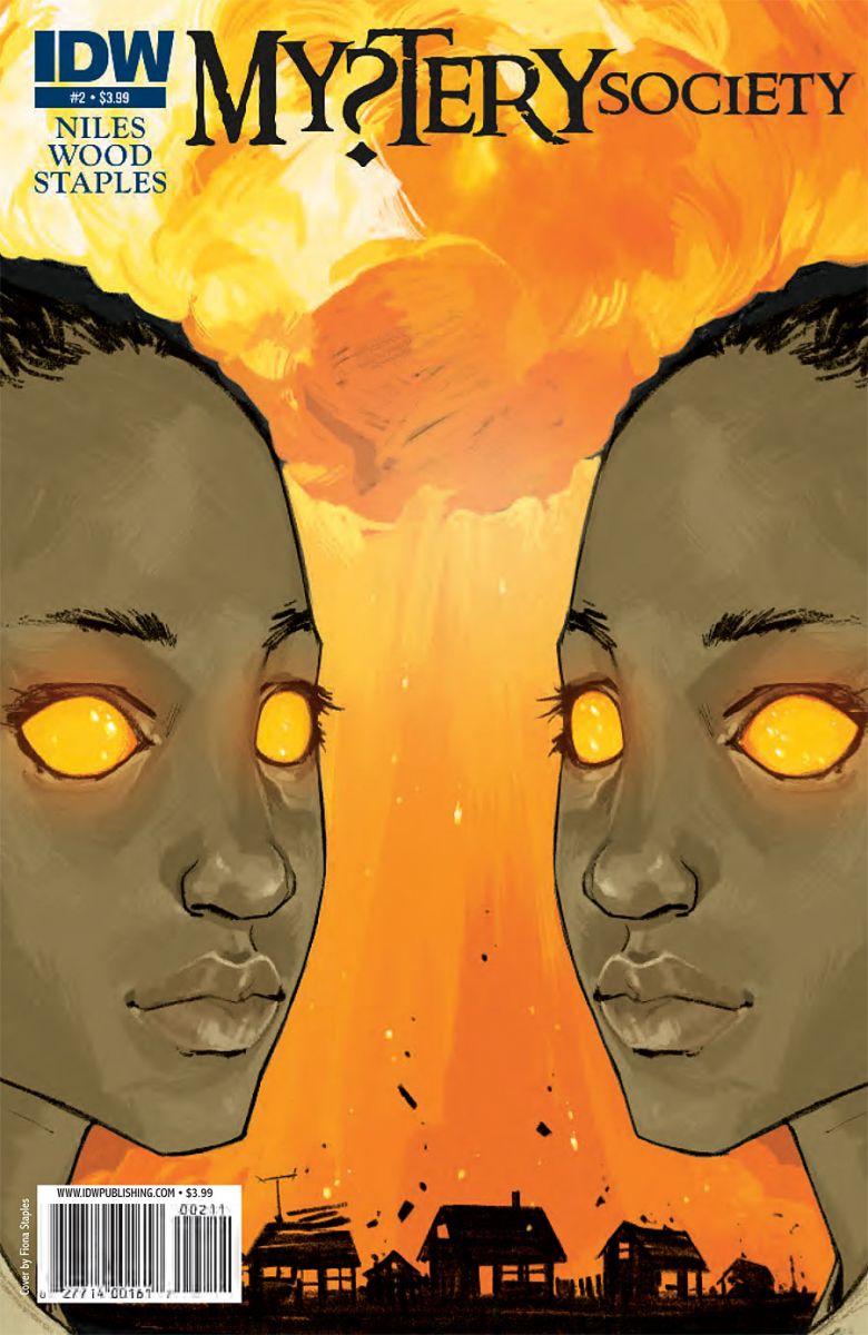
Mystery Society #2
Cover by Fiona Staples
Do you see two faces? Or a vase? Or a big orange mushroom cloud? You see all three because Fiona Staples is a genius. Great use of color, negative space, and optical illusion. Oh, also, read this series or you're missing out on one of the smartest, sexiest, zaniest books on the shelves. It's a romp.

Astro City Special: Silver Agent #1
Cover by Alex Ross
An Alex Ross image can sometimes feel stiff. Grandiose, but static. With this image, Ross does a couple of things to keep that from happening. Movement in the depth of frame, a pattern of falling silhouettes with irregular poses. A series of moments superimposed over one another to suggest both the passage of time and movement of the character. The elictric blue color. The radiating white circles practically glow.

Sweets #1
Cover by Kody Chamberlain
Minus context, my immediate instinct is that this could be a Daytripper cover. It features that same fisheye distortion that Moon or Ba might employ. That long, curving shadow. But then there's the ambient light and texture. That could be Ben Templesmith. Just look at that ethereal light radiating out from the streetlamp. It's a great combination of fine illustration and finishing effects. Spooky, unsettling. Pretty alluring too.


The Silver Agent cover looks amazing. I don’t know why but i’m getting a mirrors edge vibe from the art.
I love the styling of the sweets cover.
Don’t know why but that Sweets cover reminds me of Fell. I miss Fell.
I concur very fellalicious…makes me mad.. think i will go beat up some children with a bag of Koi fish and pit bull puppies..
Love the covers this week, but Batgirl seriously needed to be up here, too.
Superman #701’s cover was simple and striking to me. Loved it
Deadpool Corps #4. I never buy Deadpool comics, not a Leifeld fan. But give me a good G N’ R Appetite for Destruction homage and I’m on board.
Dont care for the MY?TERY cover (I only see two faces) but those other two are awesome!
Love the use of light on Sweets and AstroCity just looks COOL.
My favorite were Batman, Batgirl and BOOSTERGOLD.
Batman captured the RIP feel with the cover wich was a big plus for me.
Batgirl was a nice cover to end year one with, sorta a pictures worth a thousand words deal for me.
AND Booster with the JLI image in his sight reflection made me want to open the book and start reading it at my LCS.
@greg that G N’ R Appetite for Destruction homage was too cool.
Good job Ross!
Lovely covers + ace week for them this week (Dr Solar and Man with a getaway face are also pretty sweet too). Top choices anyhow 🙂