Covers! Every third Sunday I like to invite over family, friends, and local business owners to watch as I recreate my favorite comic covers in a sort of one-man tableua. It's kind of a weird hobby, but how else am I supposed to use this gazebo and mannequin collection I inherited from a hated grand-uncle?
Here's more than a few covers that stood out this week:

Northlanders #29
cover by Massimo Carnevale
I get a bit of a Mary Blair, Disney Land concept art vibe from this great piece by Massimo Carnevale. It just looks like a great, musty old storybook I'd find as a kid in my grandparent's basement. It feels aged, almost mildewed, in the very best way. A great blue monochrome with trippy yellow lights. It lasks the spitshine polish of the other cover, but that's why I love it so much.

Elephantmen #26
cover by Boo Cook
This is so 90's I can hear the Wild and Crazy Kids theme song ringing in my ears. What works, I think, is the top notch composition and layout. You've got an absolutely bananas central figure with a pretty complex design. She's dressed to kill and armed to the hilt. Everything about her is aggressive, including the torrent of bullets and upside-down pose. Cook was wise to place her against a solid background with a really clean layout. That means the entire focus is on this badass pinup character.
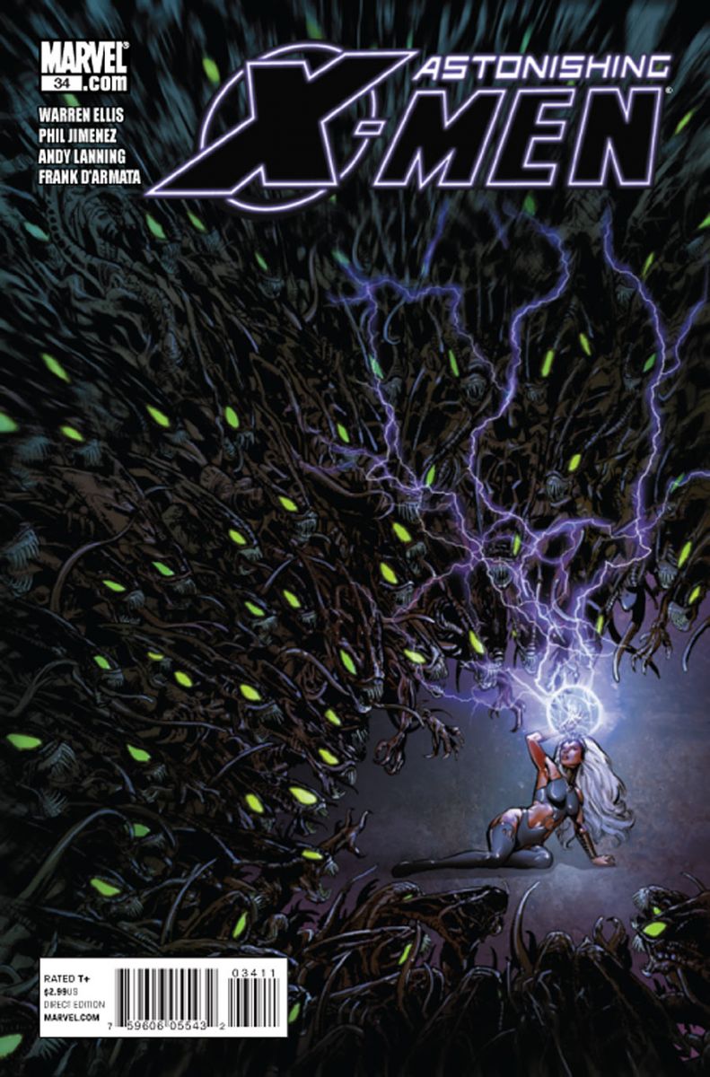
Astonishing X-Men #34
cover by Phil Jimenez
It's all about the composition. The focus is an isolated Storm. The horde of identical Brood (?) actually becomes negative space. A thoughtful move to position Storm just off to the right rather than center, allowing the enemy threat to totally dominate the image. A great play on the character's known claustrophobia.

Velocity #1
cover by Kenneth Rocafort
Rocafort delivers some nice cartooning that'd actually feel at home in Amanda Conner's Power Girl. It's a visual one-liner, with a speedster trying to find just the right pair of track shoes. An inventive way of setting the tone for a brand new #1.

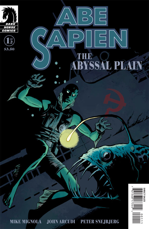
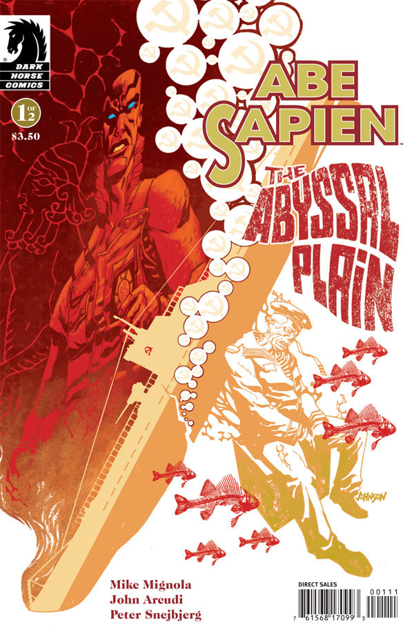
Abe Sapien: The Abyssal Plain
covers by Peter Snejbjerg and Dave Johnson
Two terrific covers for one hell of a book. I'm a little partial to Snejbjerg's if only because Johnson's take on Abe is a little too abrassive for my tastes. That said, he clearly has the winning composition, using the sunken U-boat and trailing bubbles to cut the image in half. I also like the level of distortion, suggesting the experience of looking at something through swirling water. For his part, Snejbjerg teases the same play of light and shadow he offers in the interior pages. And that angler fish is scary as shit.
What'd I miss?


I love those Abe Sapien covers. That Northlanders cover is beautiful, as well. It looks like a dream.
I also like the cover on Unknown Soldier #21. It’s a bit busy, but it conveys a lot of information. It makes me want to read the series.
Velocity wins.
Nice to see Elephantmen get some love.
Great covers.
I can’t believe Wild and crazy kids was brought up in this though.
Northlanders is next level awesome. A really sweet illustration….i’m kinda bummed i can’t seem to find the issue anywhere.
Good choices. I really dig that Northlanders cover also. Wish I could buy a print of that as it would quickly be framed and up on the wall.
I also liked the Captain Swing cover this week. Cool in a retro-steampunk chic sorta way.
This motivates me to read that Elephantmen trade that’s been sitting on the shelf collecting dust for a year.
Love the Elephantmen one
"Whuh-whuh-whu-ild and Crazy Keedds."
/synth-guitar-vox
I want to rob a bank to that theme music.
that Elephantmen cover is hella cool!
Great choices. Other then that horrifying cover of Elephantmen last month, this is a much better cover.
The Pile: I don’t know who Mico Suayan but he should be in control of the capes department in Marvel. His cover for Thor #611 has an amazing Thor on it, mainly for the cape. Jokers Asylum II: Clayface has a great cover by Kelley Jones. Shows his interesting take on the villain and showcases his unique take on Batman.
The Rest: Unknown Soldier #21 because…..well it’s Dave Johnson, that’s all I have to say. Thomas Edison is a douche…..in Atomic Robo: Revenge of the Vampire Dimension #1.
The Worst: Doomwar #5. Okay maybe ‘worst’ is a bit harsh for a man like John Romita Jr. But it just isn’t one of his best covers in a while. Plus even an image of Deadpool fighting Dr. Doom doesn’t do it for me.
Best Trade Cover: It’s a no-brainer, Batwoman HC: Elegy.
what the heck is Velocity doing in that cover?? has anyone ever put on or taken off shoes like that? something doesn’t work there for me.
I like the Northlanders cover, nice to see something different like that.
the rest are cool too
A little off topic but does anyone feel that Rocafort and Gho’s art loses a lot going from digital to print? Pages that looked fantastic on my computer screen looked dull while browsing at the store.
I dig the Dave Johnson Abe cover. I really like the color pallete and the ship splitting contrast on each side.
Love ya to pieces and this page is one of my faves of the site… But none of the ones picked grabbed my pupil list this week, Velocity, Xmen and Elephant mEn especially… For the record I loved the Action comics cover (lovely eyeflow – Luthors face stands straight out), Invincible (sucker for his covers really), Clayface (although tbh I think it misses a textural open goal), SpiderMan American Son and despite uuuu-uuuh-uggghly text: The Web. Batwoman Collection is lovely too.
Eye-flow is a myth. I should have you BANISHED!
😉
🙂
Eye flow is all. I should have you in one of my classes. My students learn not to diss eye flow at an early stage. Duchamps; nude descending a staircase. 1000 word report on cleverness of counter-flow. Tomorrow. Stock up on Red Bull.
However I cannot obviously write for toffee: Duchamp’s Nude or Duchamp: Nude, take your pic 🙂
Coincidentally, I wrote about Nude Descending a Staircase for my Physics for Design class. I think the assignment was to write about transformation in art. Or movement. It was a while back.
Which makes your earlier comment EVEN MORE ASTOUNDING.