Every week I get a little anxious. What if there aren't any new covers this week? What if they ship the books without them? They'd just start at that first page. Maybe an ad for deodorant. Or what if they just staple a bunch of old Hagar comics to the front? That'd be pretty weird.
Thankfully, that hasn't happened yet. These are a few of my favorites from this very week.
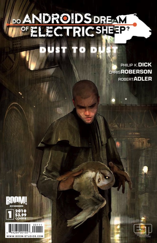
Do Androids Dream of Electric Sheep?: Dust to Dust #1
cover by Benjamin Carre
Well. This is somewhat unsettling. But also a little alluring. It's such a simple, haunting image and I was instantly drawn to it. Why has this strange, weather resistant man hypnotized this barn owl? It speaks of sleep and consciousness and all the mystery and thoughtfulness of Philip K. Dick's original question. Beyond that, quite literally, we've got a masterful urban futurescape done in a brown and gloomy impressionistic style. For such a seemingly simple and straightforward portrait, it begs so many questions. It's not just a preview of the plot within, but the tone and themes as well.

Detective Comics #865
cover by Cliff Chiang
We move from unsettling to…well, unnerving. I genuinely don't know if this was intentional or not, but that face is on a little crooked, and that makes it even creepier. I want to remark once again on the terrific colors being coupled with Chiang's linework. It's absolutely next level stuff, and his great compositions are exponentially enhanced by these contrasting colors. The neon green of that nasty hypodermic needle against the bittersweet red of the backdrop. Then the beckoning gesture of the right hand. "Come on in, Timmy. I dare ya."
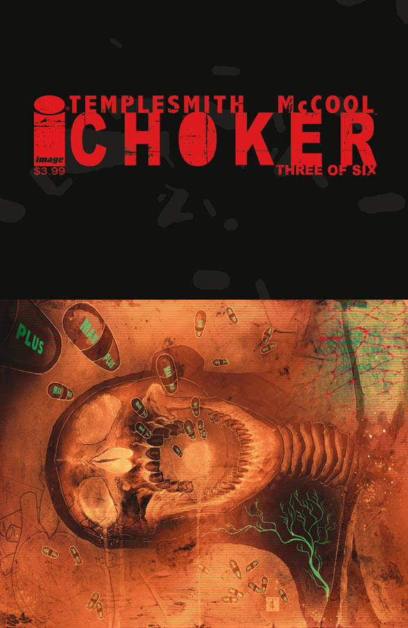
Choker #3
cover by Ben Templesmith
Variations on a theme this week, yeah. You know a Templesmith image the second you look at it. That ruddy, ghostly, sickly atmosphere. Like the light fading in the instant after a bulb bursts. Skin like brown paper bags, parchment, rice paper. The skin of old ladies. Here's a fine example of that incredible back-lighting softly humming through his forms. It's the work of a sinister X-Ray tech. So chilling. And then the choice to continue the pattern of the cascading pills upward into the black cover dress, almost like a photo negative. Creepy good.
Right then. What'd I miss?


Scalped anyone?
The Detective Comics cover got infinitely creepier when I noticed that the red smudge-looking thing in the foreground looks like a person, with the head right about at Zombie-Batman’s shoulder. Creepy
Jepp, Scalped looks great. I like the one from Power Girl, too. The implementation of the cover copy is really good. Someting that most comics with it are lacking. Like, the Detective Comics cover is great, but suffers from the cover copy.
I really really liked the 7 Psychopaths cover for some reason.
@deadspace I liked that cover too, but I felt it looked a lot like the cover design they were using for Immortal Iron Fist mixed with Civil War.
Loved the Chiang covers for Detective recently.
The Rest: Chris Bachelo keeps the amazing covers for ASM going with his Amazing Spider-Man #632. Tony Harris improves from his horrid first cover by making a good idea work in Justice League: Generation Lost #2. Since I can’t resist…..Romita Jr. does a great Deadpool cover for Doomwar #4.
The Worst: Green Lantern Corps #48 for having a pretty bad, digital cover. You can tell it’s digital because Stewart and Rayner look absolutely horrid. Again I fear for the future when digital will reign supreme fully.
Best Trade Cover: Keep the Wednesday Comics love going, because I love that graphic design.
I was hoping to see Detective on here this week. I dig his interiors too, but Chiang’s covers rank among my all time favorites. Sadly, it was the best part of the issue.
The Androids cover is wonderfully moody. This is why I love this segment, I always see gems here that I miss in the store. Great stuff.
Scalped was an excellent one and few were more striking than Detective. Shame that the interior quality has fallen so far from the magnificent Rucka stuff.
I really loved the cover to the ASM annual, beautiful line work and I loved the slightly off balanced cover copy
Unknown Soldier.