Did you know that covers were first invented in the late 1600s by textile workers in Spain? Originally, books didn't have covers or even binding. You just got a bag full of loose pages, and narratives were created by lottery. If you were lucky, you'd get through an entire story without even hitting any ads. It's absolutely not true, and a reason I'm never to be trusted. Except when it comes to…
The best covers of the week:
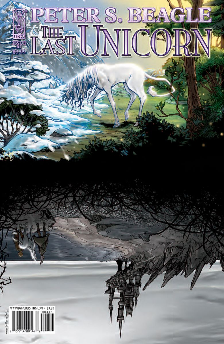

The Last Unicorn #1
Cover A by Renae DeLiz
Cover B by Frank Stockton
The unicorn. Ridiculous. Probably for the best that it missed the E-vite to the ark that day. Oh, who am I kidding? Unicorns are wonderful, graceful creatures. Whenever I meet a new horse I inevitably check for that nub of bone on its forehead in the hopes that unicorns are real and just biding their time on farms and outside glue factories. While I generally prefer my unicorns on crushed velvet under blacklight, this pair of images struck me as particularly whimsical. Cover A has that classic inverse image, the reflection in the pond. I've never read Beagle's original novel, but it looks as if this last unicorn is in for a very dismal picnic in Mordor. As for Cover B, I love that mix of warm and cool colors, using the unicorn as a focal point and a source of light. I have no idea why he or she has stumbled into a merry-go-round frequented by timber wolves, but the shapes are so interesting. The lines of that unicorn are so graceful, while still showing a clear understanding of animal anatomy. All appropriately lyrical and delicate and pretty.

Detective Comics #864
Cover by Cliff Chiang
You're struck immediately by the bold colors and clean design. Dig a little deeper and you find so many touches of brilliance here. The oh so subtle death mask of the moon. Those autumnal leaves drifting past the Arkham gate like vibrant tongues of fire. It also struck me just how fantastic that Detective Comics logo truly is because it doesn't detract from the image in any way. A very spooky Batman and it isn't even night time. Dusk maybe? Other than the shadows on Batman himself, the image isn't even all that dark. I think anyone's immediate instinct would be to do this all up in darkness, a black or midnight blue sky. Cliff went from bittersweet to mandarin! The color is just curl-your-toes good.
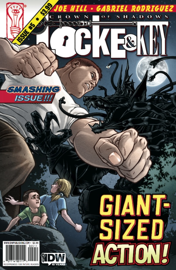
Locke & Key: Crown of Shadows #5
Cover by Gabriel Rodriguez
This is actually a very unusual move for Locke & Key, which generally has very minimalist covers. Mostly simple portraits of the main characters. This cover however embraces the special format of the issue, the series' first major monster battle. The battle of the cover rages on inside, with several full page splashes. It greatly deminishes the amount of story in the particular installment, frustrating for us steadfast single issue readers, but there's no denying Rodriguez had a lot of fun with this one. The shadow wraith is a particularly creepy design, and the perspective on this frame really sells the scale. Love the tabloid style copy cluttering up the image. Always a fan of creators breaking their typical design pattern and having a little fun.
Okay, pilgrims. What'd I miss?


I think those Last Unicorn covers just made me MORE gay. I love them. Also, Cliff Chang = drool.
@james lol. They are beautiful covers. I’m partial to the Locke & Key though.
I love that DC cover. Classic.
I generally prefer my unicorns in space with rainbows, but I’ll make an exception in this case.
I think the Locke & Key cover is a tad too garish for my taste.
I also really, really like the cover to G.I. Joe Cobra this week. The hint of Cobra Commander really works for me. If only my shop hadn’t run out of copies…
I was hoping that Detective cover would make the cut this week. Love me some Chian Batman.
Every week, my girlfriend (who’s never read a comic in her life) picks up my stack and judges each cover before choosing her favorite. It’s her way of being involved without being involved. This week she chose Detective. So she’ll be pleased to hear this. Who am I kidding? I’ll tell her and she’ll look at me like Who cares? What’s Detective? Who the hell is Cliff Chiang?
Sigh.
*Chiang Batman. Damn coffee jitters.
Nice choices, Paul.
You can see the Cliff Chiang Batman piece without all of the text over on his site here. If you click on the picture you can even see his process.
@Paul I loved everything about the Locke & Key issue, especially the cover. Of course each page in the first half of the issue was like looking at a new cover. 🙂
I knew it! I knew that someone was going to cover ‘The Last Unicorn’ in some capacity this week.
Those are good covers though…
@PaulMontgomery Don’t lump me into your comment on Locke & Key. I was completely satisfied with this issue of the series, storywise and artwise.
I loved The Last Unicorn movie when I was a kid. Cover B made alot of those memories come back. The little alcoholic skeleton/guard in the castle was my favorite character.
YAY! Locke & Key getting some love, this series has been fabulous in my opinion and the cover helps sell this issue. Not a great jumping on point, but grab #4 with this and you have a nice introduction to this wonderful work.
I liked Green Lantern Corps’s homage cover. Really emphasized how many characters we’ve gotten to know since Recharge #1
Didn’t much like the interiors, but I though the stark white of the Captain America issue was good. Battle damaged Cap is always cool, and I’ve liked a lot of Parel’s stuff for a while now.
That first Last unicorn cover was excellent. They were all strong, but that one in particular was on the money.