Covers. They're like a book's face. The panels inside are like vital organs. The staples are joints or ligaments. Gatefold spreads are like…the book…has a hernia. Bagging and boarding your comics is like…you're a serial killer. This metaphor was so nice at one time. Like only just a few sentences ago. I wish we could go back to that time. But there's no backspace key on this thinf. Thing.
Here are some of the best covers from this week's haul.
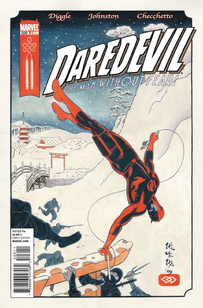
Daredevil #506
cover by Paolo Manuel Rivera
There's so much to love here. Minus the damn bar code, assorted credits, and the title logo itself, this image is all hand-crafted goodness. Inspired by Murdock's journey to the land of the rising sun, Rivera's been delivering some rough and rustic Japanese folk art. Straight up Ukiyo-e woodcut style! Even the printing looks a little distressed. My favorite detail might be the billy club design up in the red Marvel banner.

Fables #94
cover by Joao Ruas
Balance is spot on here, in terms of layout and color. The white Fables banner with all the elegant typography takes up just the right amount of real estate (unlike, say, the overwhelming 60/40 ratio of the Siege cover treatments). That vibrant teal more than pops. It also draws out some of the color in the gorgeous desaturated image of Rose Red's tossing and turning. I suffer from insomnia on occasion too, Red. Try putting a pillow between your knees instead of a brass instrument. Might want to get an exorcist for your linens too.I think you're nestling into the folds of Hamlet's dad, there. Oh, and wispiness! Like hugging a wizard on a foggy morning.
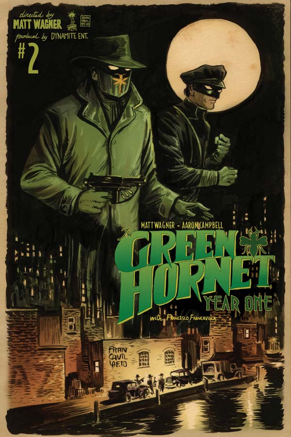
Green Hornet Year One #2
cover by Francesco Francavilla
Like the Daredevil cover, it's the hand-crafted quality of this image that so appeals to me. There's no shortage of artists trying to capture that aura of pulp these days, but Francavilla is truly a man out of time. He's simply imbued with that dime novel spirt. I'd say he's in a class by himself, but Sean Phillips is in there too. Not bad company though, right? It's hard to nail this one down. Maybe it's how the moon isn't even trying to be a perfect circle or that it looks like this was painted on the back of a cardboard sign. You can buy a pair of shredded-to-shit jeans, but everybody can tell when that denim's been bought and when it's been earned. This is the real deal from the dustiest corner of the basement. True grit.

King City #7
cover by Brandon Graham
It's like being fanned with a dozen creamsicles, isn't it? There's no escaping the pattern that's already emerged. We've got more hand-drawn elements. The title. The price. It's like an old school indie comic with all the personal touches, only this time it's coupled with clean, modern coloring. Lots of hugging curves too, from the cat to the watch strap and bracelets to the circular design in the background. Fans of Scott Pilgrim and all things surreal, storm this thing. What're you waiting for?
Alright, clowns. What I miss?


Some great covers here, but I thought for sure you guys would give a nod to Daytripper #5. That’s my pick for the week. So gorgeous.
That Daredevil cover is breathtaking. Lovely stuff!
Did you just call me a clown?
I love that Fables cover. I hadn’t seen the Daredevil cover. It’s also excellent. If the BPRD cover didn’t feature the gaudy "King of Fear" banner, it would be one of my favorites, as well.
That King City cover doesn’t do much for me. I like the hand drawn logos, but the actual image feels a bit too cluttered to me.
@stuclach – Agreed, that was one of the better BPRD covers in a while. But those banners…
I’d actually like to have the BPRD image as a poster. I screams Mignola in the best possible way.
Nice picks. This is the first time I’ve seen the DD cover and I want it as a poster. I also dig the Fables cover – your analysis is just spot on.
Oh wow, that Daredevil cover is awesome, hadn’t seen that one yet.
I was so bummed when James Jean announced he’d no longer be doing covers for Fables. That’s an awfully heavy mantle to take up, but that cover by Ruas stacks up against just about any of the series’ previous 93.
The fact that Paul included the Fables cover means he can stay.
That image is doing SO much.
That Green Hornet cover is baaaadass! Francavilla has quickly become one of my top 5 favorite artists today.
I don’t read the book, but the cover to Punisher Max this week was just awesome. Solicit said the cover was by "David Johnson" which I can only assume is the one and only Dave Johnson, which would explain why the cover is so good. Or maybe there’s a guy named David Johnson who also does comic book covers. But that would be weird.
All great choices, I didn’t even notice the Green Hornet one till now. Great stuff
—-
The Pile: Punisher MAX #6 (Comic bad, cover good! Another brilliant Dave Johnson design) The Flash #1 (Manapul is just teasing you to read this comic. Great use of the lightening and speed effect. Although some points taken off for the blatant tampering of evidence) Chew #10 (The series have had great covers in the past. Here we have a very disturbing image that goes along with the new antagonist)
The Rest: Paul pretty much covered it…
The Worst: New Mutants #12 (If you’re a fan of Adi Granov’s grey, static, and forgettable cover designs…..then ‘Second Coming’ is the event for you!)
Best Trade: Other Lives HC (Great design to show the art of Peter Bagge. Sorta has a manga-esque style of design to it.)
Personally, there’s no way Flash #1 with manapul cover has to be one of the top covers of the week. Loved the Fables one as well, still have no freaking idea who that dude in the pillow is, so any help would be welcome!
^^ lol i meant "isn’t one of the top covers"
sorry
I haven’t been reading Daredevil but I bought this issue just for the cover. The Fables cover is great too, but I was a little annoyed at how Veritgo placed the iZombie sneak preview logo up at the top when every other book that had the preview made no mention of it on the cover.
Did I complain last week that you never hit my taste with the covers? I take it back. Those are all great.