Here at iFanboy HQ, we dig on a lot of things. Rich deposits of vibranium we discovered beneath the planetarium for example. But we aso dig on great comic book covers. Here are some of this week's very best.

Spider-Woman #7
cover by Alex Maleev
Kiss of the Spider-Woman. We know that Maleev uses a live model to compose these images of Jessica Drew. I wonder if she has to flirt with live spiders while suspended from his ceiling. Either way, this is one gorgeous cover. Maybe not the best placement of the logo given all that negative space over on the left, but as a composition, it's a total knockout.
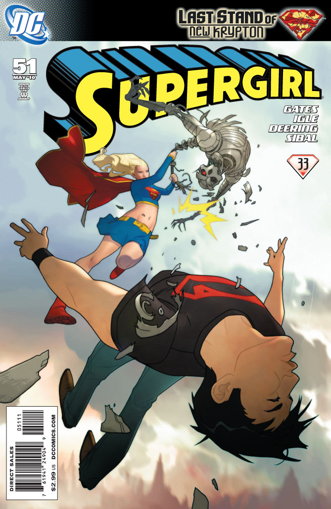
Supergirl #51
cover by Joshua Middleton
Bam! Right in the kisser. I'm a huge fan of Middleton's clean, crisp lines. He's always good for an angelic Supergirl. This time around, we get something a little more dynamic with this spectacular action shot. It's all in the perspective. Other versions of Superboy are known for obliterating the fourth wall, but here Conner Kent slams right into the invisible force field of the cover. You can really feel the momentum from that hit.

Amazing Spider-Man #625
cover by Marko Djurdjevic
A crash of rhinos! It's rare to find a Spider-Man cover totally devoid of the web-head himself, but with an image as striking as this, who's not gonna give it a look? Love the explosive yellow background as extreme contrast to the grayscale heads up front. With that jagged sunburst of yellow down the bottom, you can almost hear Rhino Prime's barbaric yawp. Throw in the sharp detail of the costumes and their twisted expressions of rage, and I'm reaching for some Excedrin. Slobberknocker!
Okay, gang, what'd I miss?


That Spider-Woman cover reminds me of the "Sex and Candy" music video (for some reason).
In my (occasionally humble) opinion, the cover on Joe the Barbarian #3 is absolutely stellar. I couldn’t wait to tear into that book.
spiderwoman looks like she has body paint on as oppose to wearing an actual costume.
That Spider-Man cover is PHENOMENAL.
good choices. I’ve liked all the Spider-Woman covers up to this point even if they are just generic pinup covers. but who cares? Maleev knows how to work a pencil
Big fan of the Supergirl cover. I love it minimalistic inking. Good color pallette too.
I really liked the cover for Irredeemable this week. It has a very simple quality it to it and similiar to a Dave Johnson cover (100 Bullets, The Mighty), whose work I’m a big fan of.
Djurdjevic is so insanely talented it’s ridiculous.
Spider-Man cover was pretty sweet. I also liked the Hercules cover – all the heroes looking at a single crumpled band of green fabric. Very potent image. Also, did anyone else think the Siege #3 cover would make great D&D art minus Cap? And did he look simply superimposed on the rest of the cover? It was weird looking.
I’d have to go with that ASM. Beautiful
I already made note of the fantastic cover for X-Men Legacy 234 with last month’s cover preview. It’s very striking how the artist managed to evoke such a sense of intimacy with just an expression and a bared hand.
Ali-G on the variant cover to Siege #3 is crazy like Bob Reynolds, and I need to buy it to believe it.
Djurdjevic is so talented it almost makes me want to learn how to pronounce his name.
Has Rhino always had faux eyes on his mask? That’s kinda weird.
Yep
Nice covers but I don’t know if I would call them the best.
My Pile: Brave and the Bold #32…..how could we forget the awesomeness that is Saiz’s Aquaman and Etrigan!? Azrael #6 by Francesco Mattina is just beautiful. Seriously if anything else, Azrael has had great covers since the run started. Can’t say much for the actual interiors though.
The Rest: Irredeemable #12 for a striking design by Krause. I’m going to assume it’s Krause since there is no credit on the site. Green Arrow #31 for having a gorgeous, painted cover by Mauro Cascicoli. Which, as PraxJarvin pointed out last night on XBL, is better then anything he did in CRY FOR JUSTICE. Incredible Hulk #608 for an almost perfect cover by John Romita Jr. Finally, X-23 #1 for having a striking and gorgeous X-23 on it by Alina Urusov.
Worst Cover: Choker #2 for looking like the guy has nothing but Tomato Juice all over his body.
Best Trade Cover: Punisher Noir HC by Dennis Calero because it has a badass new Punisher design walking away from a good looking explosion.
supergirl covers always rock and i always feel the need to peak in then get slightly dissapointed =/
I second TheNextChampion’s vote for Irredemable #12. I dropped this book several issues ago, but this cover caught my eye at my LCS as I was walking down the aisle.
I really like that Spidey cover! It makes me think of that commercial for "Life" on the Discovery channel with the two hippos fighting. Very cool image.
Alex sure knows where to place his name, I thought she was just lying on the floor with a shot from the top, eh anyway I really like it but as Paul says, poor placement of the logo.
The Amazing Spiderman cover is also compelling.
I didn’t buy the book but the X-23 oneshot looked beautiful.
Beautiful covers all although I’d disagree slightly with the comment on the Spider Woman cover… in as much as the negative space works perfectly with the eye flow of the pic which is fabulous. It’s got a mixture of yin and yang compositing and the directional eyeflow takes you from dead centre (diamond between forearm and shoulder and the spider, just in between both) up to the logo and then gently back down through the spider to her face which is as close to perfect eyeflow as I can imagine without going all fibbonaci. A tragedy that the barcode has to go and then spoil everything then but it’s a corker of a cover. So many things done gracefully right and added to my file of images I use when teaching 🙂
Supergirl – too much screen furniture and she’s too big compared to the perspective but nice regardless 🙂 Spiderman= beautiful but should have had the top left cropped a little (I know the eyes are dead centre but the image is right hand heavy because of the diagonal momentum. Losing some of the top left would have helped that a lot).
Still, strong covers one and all. Cheers muchos PM 🙂
@peekay – I’ve no problem with the SW composition, just the logo. There’s really no ideal place for the logo because the logo is kind of terrible. I’d rather it be vertical or at least chunkier so it’s not just a thin band across the top. As for ASM, I think this is a case where the logo and Marvel plate actually help the composition by removing that upper left quadrant from the equation.
@PM Horses for courses 🙂 of the three covers the Spider Woman logo is my favourite because of its restraint and balance. The other two are more recognisable and iconic but less… hmmm… less able to carry weight and gravity? I was going to say mature but that’s not what I meant. I like both, having been a fan of the comics for a long time, but I like them through familiarity rather than any appreciation for their design.
+ on the ASM cover you’re right – the logo/plate do help things and were obviously a consideration in the design. It’s probably just me (I’m more than a smidge over concerned with eyeflow – in other people’s images, I dare say mine can be ripped to shreds) but the red eye of the left hand Rhino being near centre makes the image right imbalanced as a result. It’s possibly down to the fact that his head is that much larger so to balance it out the shoulder should have been that less prominent. As David McCarthy says though it’s like arguing about which part of the Titanic is less wet – it’s still an ace cover and I’m faintly embarrassed with myself about bringing it up 🙂 If it had been a student image for me to mark it would have been my first comment but I’d still have given it a D and a smiley 🙂