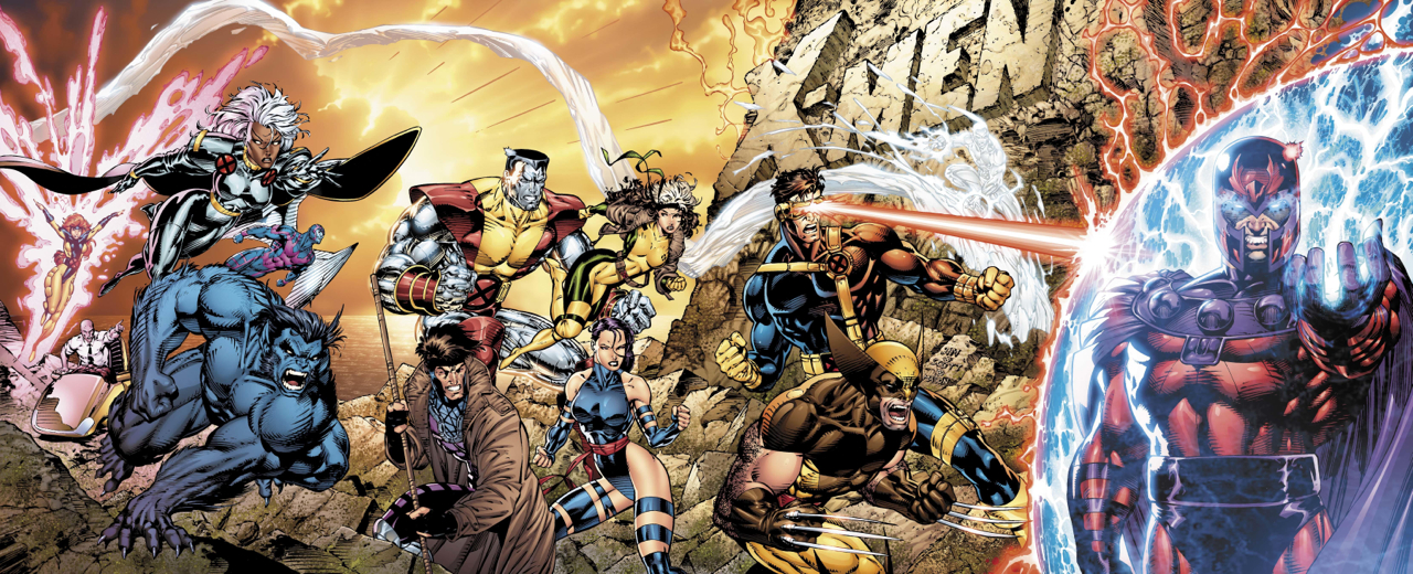
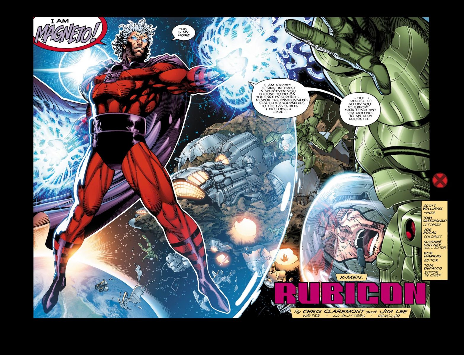
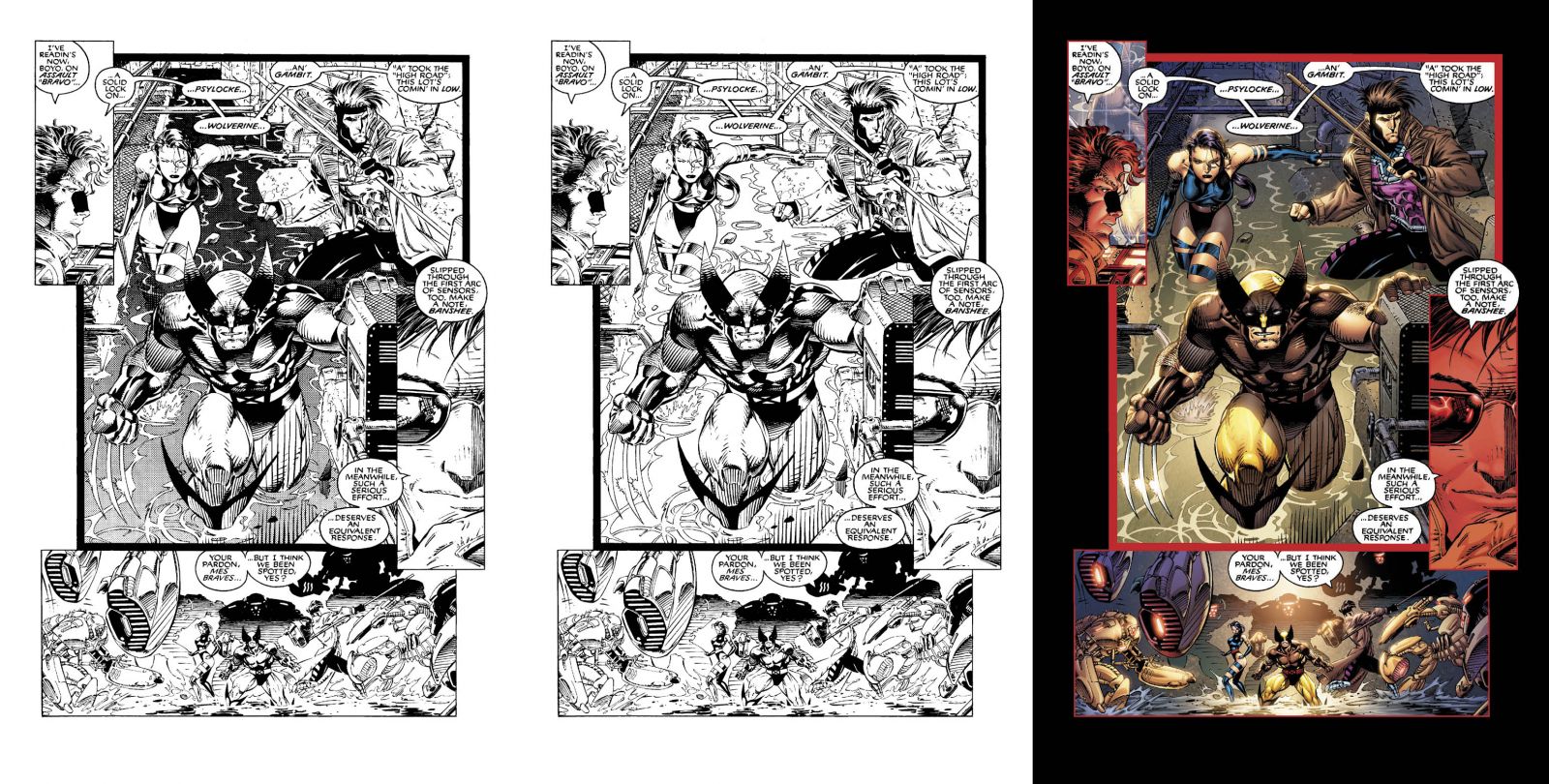
The world's bestselling comic book, 1991's X-Men #1 is gussying up for its 20th anniversary. The Claremont and Lee classic is getting a new paint job, and the results are up for inspection.


Look for it in October.
Comic Books Discussion, Podcasts and Community
The world's bestselling comic book, 1991's X-Men #1 is gussying up for its 20th anniversary. The Claremont and Lee classic is getting a new paint job, and the results are up for inspection.
Look for it in October.
iFanboy Social:
![]()
![]()
![]()

Copyright © Great Northern Media
![]() Some rights reserved.
Some rights reserved.

I already have 5 copies of this issue, I think I’m good.
I have the Ultra Fold Out one. I also am good.
Also for reference, the Cyclops Y suspender thing is just a walkie talkie right?
I have the Hardcover collection so I have no intrest in the comic, but I would love to see them release the newly colored cover as a high quality print!
That I would buy!
I would like to see Breitweiser and Dave Stewart re-color old 1960s Kirby and Ditko Marvel Comics.
I actually prefer the original colouring! It suits Lee’s art more.
more photoshop, more filters, more gradients!
the original is fine. Create new stories….plus we all have a few bagged copies of this somewhere. =)
Yeah it’s way to obvious to tell the coloring is all digital.
@wallythegreenmonster
Not those of us who were 2 when it came out.
Might read this, never read any 90s X-Men before.
I’ve actually seen these on FB. I’m all for recoloring books from before like 96. I mean one of the big things for me getting the Walt Simonson Thor Omnibus was how gorgeous the artwork looked recolored. I would love to see them recolor the whole damn run, it looks great.
This looks very nice. It can almost pass for a modern book with these colors, minus a few 90s tropes.
@Bryce31 –You want a mint condition one? Trade it to you for a state quarter than i’m missing. =p
@RickyStardust I agree. It just seems to bright or something. Doesnt work for me.
I think they should bring back this coloring for Wolverine’s costume.
When I clicked on the title of this post I thought, “Big deal. How much of a difference will it make.” Lots, evidently. I think this looks great. Then lights and energy particularly pop in an appealing way. I don’t think I’ll buy it, but I think the new coloring looks pretty sweet!
that does look nice.
I still have a few dozen copies of the original printing that I am lining my iguanas cage with. Nice thought though.
I love the new colouring. I think it looks great.
I have the first trade, don’t know if I’ll pick this up. Coloring looks great though.
Now that’s some good-looking comics…
Ok, vote: Which is better looking, these pages, or the preview pages of the new Justice League?
I think the TPB of this was one of the first books that I bought when I got back into comics….. I may just have to pick this up again, those colours for the cover/s look Awesome 🙂
It is always nice to see Wolverine in his correct colors again, even if it’s a reprint.
I HATE recolored old comics.
I’m good with the one I got, it looks fine as is and still love that run no matter how many copies were printed.