As part of their ongoing "Flashpoint Friday" series of teasers, DC has released five images they're calling "Five to Watch." They appear to be the symbols of five heros or villains whose roles change significantly in the altered status quo of the 2011 Flashpoint event.
Let's take a look at the symbols and their accompanying quotations:

"When did Cyborg become our protector of Truth, Justice and the American Way?"
Teen Titan vet Cyborg represents Real America.
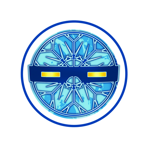
"Why is Citizen Cold the greatest hero of Central City?"
Snart attack! Johns has played a lot with the idea of the Rogues serving as alternate reality/future good guys (however misguided) in the pages of Flash. I never get tired of it.

"Where will the Ravager strike next?"
Daddy issues across multiple realities…
"Who is the Outsider and why is he better than you?"
It would be cool if it was the whole Outsiders team consolidated into one especially secretive dude.
"What is top secret?"
Bart Allen investigates!
As a reader, I'm really enjoying the playfulness of these Flashpoint reveals. It's part of the fun of these events, and if it gets people interested in the books, it's necessary to bumping up those dismal sales. So, images like this really make my Friday morning. Even if they do look a little like the stickers you get from the gum ball machines in the vestibule of Pathmark. "Just one or two more quarters til I get a Batman, mom!"
Thoughts? Speculation? Let's have it.


I like the look of these logos. While they do appear “stickerish”, they at least utilize modern graphic capability. (I’m looking at you, Heroic Age banner.)
The Outsider is Alfred. They’re finally bringing that back!
Same kind of trick like used in Blackest Night where different symbols were used to ramp up the interest in the different coloured corps. All pretty cool logos apart from the first and last.
Fighting the urge to comment on the merits of the logos themselves (2 and 3 are great, 4 and 5… bleeeech. There are other important aspects to making something look metallic other than a lens flare…)
I agree with @MisterShaw’s outsider prediction. Alfred Pennyworth *is* better than you.
Seeing the line…
“When did Cyborg become our protector of Truth, Justice and the American Way?”
…makes me wish that it was Cyborg Superman being the protector, not the Teen Titan.
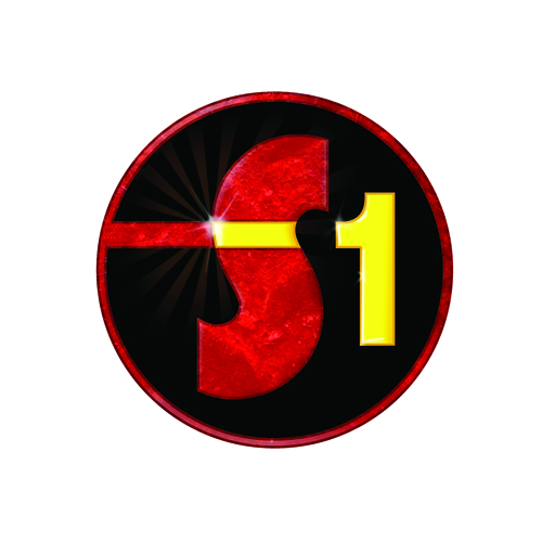
Subject 1’s color scheme is reminiscent of Plastic Man’s.
I just wanted to share my Pop Secret.
Man these logos…..ugh.
I second with @DrAwkward! That logo design for Subject 1 is totally Plastic Man colors.
I guess if it is Plastic Man then I will have to take away my stance of ‘not buying any Flashpoint’ comics.
CURSE YOU DC!!!!
it doesn’t seem to want to load these pictures here, does someone know about this?