I'll admit that I'm growing tired of the minimalist design aesthetic prevalent in comic fan art these days. There are only so many times I can see a character boiled down to their primary colors essence and still be engaged. So I was originally skeptical when I saw Marko Manev's post of Marvel minimalist character posters, but that that skepticism was debunked upon viewing. While not every post is a homerun, there are enough slam dunks to make you mix a sports metaphor. One thing I like is that there are elements of the characters look, powers and history; not just color pallette, and the faux aging gives each poster a bit more texture than it might have otherwise. Here are a few examples of ones that really work (or don't) and my thoughts on them. Rest of the collection at the link below. Enjoy!
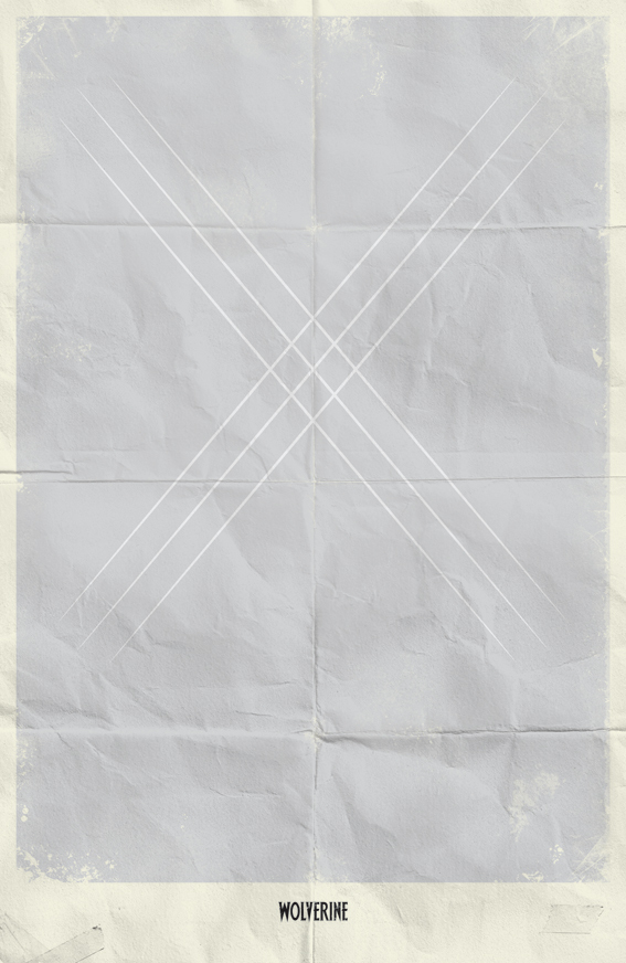
There's just something that works about the Logan slashing an 'X' into a surface. It's the Marvel equivalent of Zorro's 'Z'.
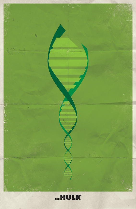
Here's one that didn't really work for me. I know the Hulk was made by changing Bruce Banner's DNA, but it was changed with a radioactive explosion, so I think I lean towards J. Robert Oppenheimer over Watson and Crick for my Hulk imagery.
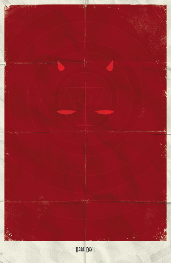
It's a shame Matt Murdock can't see this one because it's fantastic. The color is striking, the powers and costume are hinted at, and there's even a scale of justice to round out the image. If they snuck in a crucifix and some sadness it's encompass the entirety of the character.
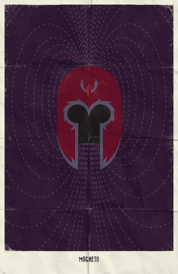
This poster is my clear favorite. For those that don't know, those lines represent a magnetic field and are accurately depict in a way that make my science nerd heart sing. Keep magnetizing, Erik.
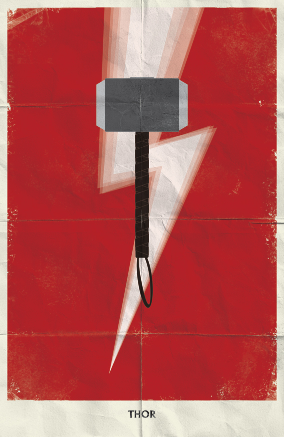
Thor I like, I just hope no one in the editorial offices of Whiz Comics notices because that color and bolt suggest another mighty mortal…
What say you iFanboy? Still stoked by the minimalism or ready for a bit more substance over style? Let us know in the comments.
Originally spotted (but barely) at The Behance Network.


daredevil’s poster is fantastic
Ryan, give the DD poster another stare. There’s a crucifix holding the scales of justice aloft.
The thing about minimalism…its incredibly easy to immitate on a surface level. It can also be incredibly lazy because it requires so little execution to pull off on a certain level. It takes so much more thinking to infuse concept and to take it to that next level. I tend to forget most of these minimalized fan posters.
These are fun design exercises, but i see so many of these, its tough to stay objective. The Wolverine one is my favorite.
LOVE Daredevil’s! Would hang that up in a heartbeat.
Can i buy these?
The more my taste matures, the more I like this kind of stuff.
The Hulk image is great.
…. on Wolverine.. I’ve never understood how the center square doesn’t just fall out of the image. There’s nothing supporting the “whatever it is” that Logan sliced.
Just went onto the site linked in the article, and there are some other great ones (The Cyclops one is pretty fantastic). Daredevil one is still my favourite.
I love the Daredevil and the Galactus. The frustrating thing about these fan projects is you can never buy them.
I love these.
Although how could he not do Punisher!? It’s so obvious I’m surprised he didn’t do a poster for him.
I like the Daredevil one.
I agree that I thought the Hulk one was more X-Men than Hulk, just based on the DNA helix. It would’ve been nice if there was some reference to radioactivity, even if it were a simplified atomic symbol.
I also agree that the Thor one looks a bit Big Red Cheesy. Just scrolling down, I thought SHAZAM! even though I knew it was supposed to be a Marvel character.
I really dig the Wolverine one.
I like the magnetic field in the Magneto one, but the helmet felt just the tiniest a bit too on-the-nose after the utter simplicity of the Wolverine one. I guess it’s necessary, and I don’t dislike it, it’s just that the first two set up an expectation of the character being stripped to just one element, and not necessarily a costume element. Not sure if I know how it could’ve been simplified, because just a magnetic field could represent a lot of people. Just a first impression, really.
Nice post, and nice artwork. As mentioned above, the distressed element, like they came folded in a comic book, adds a lot to the composition.
I also agree with wallythegreenmonster (but then when don’t I?) that sometimes these minimalist representation seem somewhat forgettable.
I dig the Black Costume Spider-Man one on his site . Mainly for the fact that, even though it’s just white eyes on black background, it’s the only one where the main color kind of oozes and breaks the border.
http://behance.vo.llnwd.net/profiles21/257135/projects/1829335/4a1522dff22677cb1e9227fbf9d51f4f.jpg
I think the Magneto one has a little too much detail with the entire helmet. Liked the magnetic lines though.
I think the Thor one was striking, but it is too much like Flash or Shazam with the lightning. Thor is the god of thunder, not the god of lightning. Hard to represent thunder visually, though. I would have been fine with a blue center stripe with red on the sides, that would hearken back to the Thor colors.
The Daredevil one is cool, but the Wolverine is my favorite. What a great, simple image, but it conveys everything you need to know.
Off to the web site!
I have the weridest boner right now.
@JNewcomb is it curving right and then making little circles? mine does that sometimes
Love love LOVE the Daredevil!
Here’s a link to where you can buy prints of these:
http://society6.com/markomanev
I like that he did one for each of the fantastic four and a few different spidey ones. Also the blackbolt one is awesome to.
The Daredevil one is great.
i ove the spider-man one. but i love spidey. i also like the thing ff. ish they did a nova.
I like the shazam one with some guys’s hammer in the way.
The whole minimalist character poster thing was fun, but I think it’s gotten a little tired. Unfortunately, a lot (not all) of the people that have been doing these have very little actual design sense (why is EVERYTHING ALWAYS CENTERED!?). I’m ready for the next thing now.
@ActualButt –yeah its basically a meme at this point. One notch below the “Stay Calm and…” remix posters. Tumblr is basically overrun with all this stuff.