As you can tell by my Pick of the Week last week of Fantastic Four #571, I’m on a bit of a Fantastic Four kick. I’ve been reading the Fantastic Four Omnibus Volume 2 recently as well and have been enjoying the hell out of it as the story inches closer and closer to the famous Galactus story. With the recent launch of Hickman and Eaglesham on Fantastic Four, the discussion over Eaglesham’s muscling up of the Fantastic Four — Mr. Fantastic in particular — has struck a chord with me and made me think a bit more about the idea of what a character is “supposed” to look like.
As artists come and go on comic titles, they draw characters that many artists before them have drawn and while they have a basic character design in place to follow, most artists attempt to put their mark on any given character. They do this for a myriad of reasons, mainly to make these characters their own, to provide their sense of style and uniqueness to a character. This is why over the years you may flip through the pages of your favorite comic book and see the look of the character fluctuate and change. Now this is fairly well known and not anything that’s unheard of. But what amazes me about the way that different artists interpret a character is the impact this may have on you, the reader. Whether you know it or not.
There seems to be an imprint made on the brain from the first time you see a character drawn in a comic book. Instantly this becomes your trigger imprint of what this character should look like. For example, when I think of Superman, I see Superman as drawn by Curt Swan. No idea why or how other than at some point in the early 1980s, I must have gotten a Superman comic (or most likely a licensed product) with Curt Swan art, and bam, my imprint was made. Every time I see other artists on Superman, be it by John Byrne or Dan Jurgens or Ed McGuiness, I tend to compare it to this imprint, and sometimes even passing judgment on the art based on this comparison.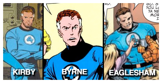 Most recently with Fantastic Four people seem to have interpreted Dale Eaglesham’s rendering of Mr. Fantastic as another example of how he beefs characters up with additional muscles, like he did in the pages of Justice Society of America. But as I read the classic Jack Kirby Fantastic Four issues, I realized that Kirby had depicted Mr. Fantastic in a beefy manner as well. Kirby’s depiction might not be quite as ripped, but definitely in terms of size and frame, if you compare Eaglesham’s Mr. Fantastic to Kirby’s you can see the connection. As opposed to, say, comparing Eaglesham to Byrne’s Mr. Fantastic, you would clearyl see the difference in frame and shape of the character.
So why have so many readers questioned this depiction? I think it has to do with the fact that Kirby’s Mr. Fantastic was drawn over 40 years ago, and there is a large population of readers whose Mr. Fantastic imprint was not created from Kirby’s depiction, rather from John Byrne’s Mr. Fantastic of the 1980s. Byrne drew Mr. Fantastic with a skinny/thin body type as opposed to a physical/muscular presence, as if making Mr. Fantastic skinnier would be more appropriate to someone with a super-genius level intellect. I think this generation raised on a lanky Mr. Fantastic (which was continued through the 1990s and into the 2000s, namely by Mike Wieringo) simply did not make the connection with Eaglesham because of their imprint of Byrne’s work. 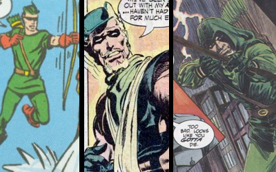 Another character this happens frequently is with the Green Arrow, who has had three distinct “looks” over the years. Many of the older fans, who first read of Oliver Queen remember his Silver Age/Errol Flynn Robin Hood look, while others (including myself) connect with his goatee’d look popularized by Neal Adams, while even others think of Green Arrow as a hooded hero as depicted by Mike Grell in the 1980s. No one is “right” when it comes to their imprint or opinion as to the look of a character, as they’re all technically “right,” but I find it fascinating to see how artists then build upon these looks when defining their rendition of the characters, taking what they consider the best of what’s come and mold into their definition of the character
Rich history of both story as well as art is what makes comics so special, and the instant connection with a character can last a lifetime. So whether you imprinted the small-eyed Spider-Man by Ditko or the contortionist Spidey by Todd MacFarlane, whether you know it or not, you’re carrying this imprint to your future reading and it’s what fuels your opinions when reading and interpreting the comic.
What characters do you have an imprint of? Were there any artists you absolutely hated because they didn’t match the character design you had in your head?
iFanboy Social:
![]()
![]()
![]()

Copyright © Great Northern Media
![]() Some rights reserved.
Some rights reserved.
Site by 
I was born in the late 80’s so when I started getting into comics my first impressions were of the highly styleized kind made popular in the 90’s. So for the X-men, in my head I see Jim Lee (also due to the fact the X-men cartoon was on the air which took heavily from Lee’s rendition of the characters.) Superman is Dan Jurgens in my head, and Spidey is the McFarlane Spidey. But for me, Batman is the Bruce Timm Batman. I realize that’s totally different then the style that was being done in the comics, but when I think Batman in my head, I think Timm’s, and that’s not bad.
As far as artist I didn’t like because they didn’t match the "impression" in my head, I can’t think of any right away. If anything when I got back into comics in high school I was looking for something different and new and I got that with Humberto Ramos on Wolverine, or Yu on Wolverine vs. Hulk. I love that there are all kinds of different artist doing different versions of the characters I enjoy reading.
Great article btw.
Great article. I never noticed before how Byrne’s Reed Richards probably has influenced my impression of what the character "should" look like, directly and indirectly. Or, to be more exact, I never realized that Byrne’s depiction of Reed was kind of a departure from Kirby (even though I’ve read some of the Kirby issues). I think my personal view of a weak/thin Reed was also affected by my first FF comic, which was a Byrne issue in which Reed at one point undergoes an aging process and looks like a shriveled old man.
On the other hand, I grew up with Jim Lee’s beefy version of Cyclops, but I’ve always thought he should be thinner. A year or two after first seeing Lee’s Cyke I read some older X-Men comics in which Scott Summers did not look like a bodybuilder, and thought the "Slim" depiction was better for the character. So I’d say Cyclops’ look has seemed very "wrong" to me in 90% of his appearances that I’ve read over the years. Wrong wrong wrong! But at least when Jim Lee drew him it was a showcase of an artist’s amazing and then-unique raw talent.
Good article.
My first exposure to Superman was from the first Donner film from 1978 (I saw it roughly 10 times between birth and age 10). When I visualize Superman I see a marginally in shape Christopher Reeves looking heroic in a very pale blue. When I visualize Clark Kent I see a bumbling Christopher Reeves with coffee stains on his tie. I haven’t been a big fan of the Superman comics over the years, possibly because of this image of what I think he is supposed to look like. I think the fact that the films were my first exposure is also why I love Gary Frank’s work in recent Superman books. He draws Clark and Superman the way I visualize them.
My first exposure to Spider-Man was actually in the films. I know a number of people love those films (and I don’t mean to offend anyone), but I found Spider-Man to be one of the most pitiful characters I had ever seen. I don’t connect with those characters. He is always hesitant, and always seems to allow distractions to keep him from succeeding when he should (grow a backbone and just fucking tell Mary Jane you love her. What are you waiting for?). I won’t even mention Spider-Man 3 and the dance scene. Spider-Man has made the worst possible first impression imaginable and has kept me from having any desire to pick up one of his books. I tried some of Ultimate Spider-Man, but it felt too much like the movies. Then I hear about the whole One More Day thing (I don’t mean to start a discussion of this) and it sounds exactly like the weak willed, not willing to accept personal responsibility Spider-Man I remember from the movies. I want to like Spider-Man, but my impression from the movies have kept me away.
@Ron – Aren’t you supposed to be on vacation? Go, relax. Perhaps here: http://www.atlantis.com/
I grew up watching the superhero cartoons of the 90s. So whenever I think of batman and superman I see the Bruce Timm versions. WIth the x-men I see how they looked in that cartoon, and spider-man and so on.
Good point Ron. My first impressions that stuck are Romita Jr on Spider-Man, Adam Kubert on Wolverine, Ron Lim on the Silver Surfer.
My spidey imprint is Mark Bagley’s first work in ASM so huge eyes are a big part of that, for the punisher it’s John Romita Jr., for a lot of the Avengers it’s whoever did the art on the outside of the arcade game. I think it might have been Ron Lim. Superman will always be drawn by Dan Jurgens or Tom Grummet in my head.
My Joker imprint will always be the Animated Series version. No matter how creepy he gets in the comics, I will always have Mark Hamill’s voice in my mind. Speaking of him being creepy; I remember going into comics again and reading ‘Arkham Asylum’ by Morrison. I thought to myself:
"Hey the Joker is a main character in this, I can’t wait. Probably remind me of the animated series"
Boy how wrong I was, and still am about Morrison’s take on Joker.
For me.. my first exposure to Wolverine was the 4 issue Miller/Claremont arc in the early 80s. I see Wolverine that way in my head to this day. As for Mr Fantastic? Of all the characters to wonder about body shape changes, why would we get bent out of shape over Reed? <no pun intended>
as an aside.. I know that we’re living in a world where it’s acceptable to put an "of" after myriad, but it still tweaks my brain every time I see it.
@TNC – I do the Hamill’s voice in my head thing, too. Have you seen Hamill as the Trickster on the old Flash series? He IS the Joker in that series.
@stuclach: I’ve only seen bits and peices of him as Trickster. But yes it does seem remarkably like Joker.
Speaking of anything Flash related. I only think of Flash in terms of Wally West; thanks again to a DCAU animated show. (Justice League)
I agree with you on the Kirby Reed, for 40 years ago, he was pretty muscular. For some reason I do like the skinnier Reed a little more, maybe it’s cause I think if he spent that much time in the gym, he would not have time to solve the world’s problems. But then again, he could just be taking HGH. Eaglesham’s cool too since it’s different that what we’re used to.
Usually, if I like an artist, I don’t mind their interpretation, even if it’s different than what I feel is best. What I do have problems with is that a lot of artists have trouble drawing younger versions of superheroes. An example is Gary Frank. He is an amazing artist, but for Superman Origins, I felt like the teen Clark had an adult head on a child’s body. Not sure if that answer is a tangent.
The thing with Kirby, he couldn’t draw any one who didn’t look heroic. His Reed above was actually Jack’s version of a skinny scientist. I remember Stan Lee’s anecdote about how he asked Kirby to draw Spider-Man first, but moved on to Ditko when Kirby didn’t catch the essence of "Puny" Parker.
Eaglesham’s Reed above looks like he should be a linebacker for the Chargers.
I’ve found this to be true even in other mediums, with non-central characters–for example, my first exposure to Spider-Man was from the old 60s animated show when I was a kid. Because of that show, now–no matter what–whenever I read J. Jonah Jameson in a comic, I hear the raging, gravely tones of the old JJJ from the 60s cartoon in my head. He’s the quintessential Jameson for me, from Amazing Spider-Man to Ultimate Spider-Man to any of the offshoots.
I grew up in the 90’s, but only read the older comics because they were cheap and I was broke. But, for some reason my impressions of my favorite characters stay in a state of flux while my less favorite seem to be grounded firmly in my mind. I guess it’s because I never got two consecutive issues of the same character when I first started reading, so I was forced to accept the changes in the styles of artists. I have since forgotten who drew the first Batman I read or the first Superman and just chose the artists that look the coolest to be the ones that I think of first, like Neal Adams Batman. Anyway, that’s just how it worked for me.
I tend towards the opposite end of the spectrum. I usually, though not always, prefer the sleeker and more modern appearance of characters. For instance, the new Thor look is awesome. I dig the new Cap. I prefer the black Batman to the grey. Grell’s Green Arrow to the others. Kyle’s much more modern costume to the awful traditional GL suits. Most of the newer X-Men costumes are far superior to the drab, singular suits they once wore. Though I do prefer the more uniform look as opposed the circus motley that ran through the 80’s. Where it becomes difficult is the ability to invest myself in a character I had an unpleasant reading experience with. For example, Superman. I read a few books back in the 80’s and 90’s. They were boring as hell and Superman was more of a mythic deity than a character to root for. It took a long time, and some very gifted writers, to make me try to re-evaluate that assessment.
I disagree that a person’s first exposure to the character is what drives their impression of how the character should look. When an artist creates an iconic version of a character, that version tends to stick. You don’t see artists returning to Green Arrow’s 1950s look. They usually stick with the Neal Adams version because that’s the iconic version of the character.
Kirby’s original version of Reed Richards was very slim. It was only in later issues that Kirby bulked up his renderings of Reed.
Personally, I’m not a fan of Mr. Fantastic looking like Mr. Universe. Still, I’m excited to get the first Hickman FF arc in trade.
That douchebag Rob Liefeld might’ve created him, but I always liked the Ed McGuinness rendering of Deadpool. Since his character is a bit cartoony and always breaking the 4th wall, the sort of compartmentalized art just seemd to work. That is always what I think of when it comes to Deadpool.
I have to say that when it comes to iconic images, Jim Lee stands out. I always think of his X-men, but his run on Batman was really amazing.
I came really started reading comics in the 90’s as well and starting after the reveal of Wolverine’s Bone claws in issue 75, Wolverine’s title managed to hold my attention for almost all of Adam Kubert’s run. This art was often gritty and managed to convey a sense of motion through each issue. You also really see a mentally defeated Logan try to wander through a world where all of his enemies knew he was without metal and come looking for him. I don’t know if it is part of it or not, but for most of that run, Wolverine was still on newsprint paper vice glossy which seemed to help the art even more.
I hated the way McFarline and all the artists after him for a few years drew mary jane.
the John Romita Sr. design with the straight hair and bangs is they way she’s supposed to look and I’m very glad that’s how it’s going.
The Marvel OHOTMU’S was the place where I saw a lot of characters first and is what I think of for deffinitive looks
Great article.
One exception to the rule, I find is the Joker. I love seeing all the different interpretations. TAS Joker, Nguyen Joker, Morrison Joker, DKR Joker, TDK Joker, Jim Lee Joker, they’re all equally valid for me.
Like flapjaxx mentioned above, Jim Lee’s Cyclops bothered me immensely. It’s not that Cyke should necessarily be skinny – he’s a superhero, it makes sense he’d keep in shape. But he was just way too big.
I’m bothered when I see Hawkgirl drawn with giant boobs. If you look at her original JSA appearances (I forget the artist), she’s got a very slender, toned, athletic body. Then we get the Benes version with giant implants. Bleh.
And I compare every Daredevil to JRJR’s, because he was on DD back when I first started reading.
New Ultimate Spider-Man has been mentioned in this light repeatedly since LaFuente took over, but it’s the big stand-out in my mind on this question. I really dislike the way he draws all the characters we already knew. Where he gets to start from scratch, i.e. Mysterio, it’s fine, but his Peter Parker just doesn’t look like Peter Parker from the previous runs (among other things, his hair looks ridiculous), and his MJ is unrecognizable until someone calls her by name. Granted, I am sure it’s plot-driven to have taken her in such a mousy direction, but she looks completely generic.
When I think of Spider-Man, it is Romita Sr. all the way. For Superman, John Byrne’s depiction springs to mind. Both of these probably have to do with the comic explosion in the 1980s when Marvel and DC were really churcning out all sorts of reprints and products. However, this trend seemed to hit overload in the early 1990s with Jim Lee drawn X-Men on lunch boxes, Valentine cards, etc.
It’s funny that after reading comics for about 20 years, most of my first impressions of characters seem to be based in products rather than comics. In fact, I know that my first and long term impression of Mr. Fantastic (all of the FF actually) was Paul Ryan’s art all through the 90s. He definitely drew my definitive Thing and Human Torch. However, after falling in love with Jack Kirby’s art and immersing myself in FF reprints, Essentials, and Omnibi, I specifically think of Mr. Fantastic as muscular. As Anville said, Kirby drew every hero as buff and…heroic.
Just talking about a Kirby Omnibus makes me wish they’d put out an omnibus of Lee/Kirby Captain America from Tales of Suspense and then his regular ongoing starting with #100.
neal adams batman for me. Also, I suppose frank Miller’s DD.
My first impression of most superheroes comes from their respective 90s series.
Norm Breyfogle Batman
Romita JR. Spidey
Jim Lee X-Men
@TNC
I sometimes have Hamil. It really is a great voice for the character; whenever he’s done it for the animated stuff and what little I’ve seen from the video game (I’ve only played the demo; like 50 times though. Damn you, lack of funds!) his Joker is always written in a cartoony way. I’d love to see him voice the Joker in an animated version of one of the more adult Batman/Joker stories.
I think when Reed is drawn skinny, it may be more related to his stretching abilities than his science-nerd qualities. It’s easier to visually contort someone with little muscle mass in the ways that Reed does. I’ve only read the 2nd issue of the Hickman/Eaglesham FF series, but Eaglesham didn’t draw Reed stretching once. None of the many Reeds that were there. I know the story doesn’t call for it, but most artists have drawn Reed stretching like they’re Frank Cho trying to insert some cheesecake into the mix (there are more cheesecakey artists out there, I just can’t think of ’em).
@captbastrd: Well when you do get the game (and some funding) you will note it is much more adult then his previous preformances. Some sexual jokes, he curses from time to time; it does feel more like comic book Joker then his animated form.
If there was some type of reversal for this topic. When I saw the design for Green Lantern I always thought that was the status quo for the costume. Then I fell in love with Alan Scott’s costume and now I wish all of the GLC wore his outfit as standard procedure. When I think of Green Lantern, I immediately think of Alan Scott. Also goes the same for Flash with Jay Garrick.
I might get laughed out of town for this but my defining interpretations are Joe madureira’s x-men. I was gutted when storm changed from the the weird bob haircut with exceptionally long front bits to her more classic look. I have subsequently lost any love for storm so I dont care so much anymore but at the time I was furious.
I also agree with the cyclops comments, he should def be slimmer than he is nearly always depicted.
This was a nice piece Ron, and definitely something to think about. Two artists that come to mind right off the bat are Bregfoyle and Maleev. Bregfoyle will forever be my Batman and Maleev will forever be my Daredevil. Not bad choices if you ask me.
For me the list is as follows
Iron Man = Bob Layton
Cyclops = Dave Cockrum
Cap = Jack Kirby
Thor = Walt Simonson
Batman = Neal Adams
Soider-Man = John Romita Sr.
Fantascic Four = John Byrne
Dr. Strange = Paul Smith
That isnt to knock the current groups of artists, but thats who I think of with those chracters. But when I see Humberto Ramos or Bill Sinekewiscz, or Joe Maduria do any characters I like I have to think about not picking up the book. Their styles just don’t do it for me
Ron, you just blew my mind. I’ve been so adamantly against the beefing up of Reed that i didn’t even pause to consider his depiction pre-Byrne. Come to think of it, Byrne’s Cyclops is what I have burned in my mind as well, which might explain my aversion to the huskier portrayals of him since. You have rendered the foundation of my comic-book perceptions into sand. Now my house of illustration bias is sure to fall.
A writer can also create an imprint of a character. "MY" Question will always be this one -> http://www.dccomics.com/media/product/1/1/11329_400x600.jpg
Yes, Byrne talks about how when he started drawing Mr. Fantastic the character overnight became anorexic.
Personally I like the thinner Reed. I just don’t see him in the gym working out enough to get that kind of body. And when he fights villians, he’s better known to use his smarts. But strangely enough I don’t mind Eaglesham’s version either. I don’t know why.
In fact, if I were writing the Fantastic Four (oh, one can dream), I would completely take away his stretching powers. His power is being the smartest guy within 100 light years. The stretchiness has always been his side power, for me anyway.
If you can believe it, I always see the X-Men drawn by Byrne, and especially Wolverine.
And I can’t imagine anyone else drawing Powers, other than Michael Avon Oeming. Come on!
And yes, Neal Adam’s is the Batman artist.
And Bill Sinekewiscz is the New Mutants artist. He really put his stamp on them for me.
Sorry, it’s spelled "Bill Sinekewiscz". My mistake.
Okay, I’m going insane here. Both of these are spelled the same way, and both are correct. (It’s getting late for me.)
Sienkiewicz. 😉
hmmm, this is a fun piece. Off the top of my head…
Denys Cowan drawing The Question.
Neal Adams’ Green Arrow.
Breyfogle’s Batman.
Walt Simonson’s Thor.
Funnily enough, Paul Smith’s Wolverine. And I don’t know if it was also in the Marvel Universe Handbook, but something that’s left an indelible impression on me are the little character cards that came with the Marvel Heroes role-playing game back in the 80’s. There was a card with a Paul Smith Wolverine (brown and tan cosutme), and if I ever doodle a Wolverine, I swear to you it’s with that image somewhere in the back of my mind.
Another one that sticks in my mind is John Byrne doing the entry for Scourge in the Marvel Universe Handbook. It’s funny because I don’t think anyone ever actually drew him quite that way in the comic, but the entry I remember was with a fedora, a white coat, and a skull mask. And to me that was the definitive version of the Scourge character that never really appeared that way in any comic and was gone once his storyline was over. Heh.
Canny piece Ron. I think I’m more agin hair colour change than physical tweaks – Lois Lane looked totally wrong when John Byrne made her a brunette with short hair, his Superman was grey originally and I still wonder who that redheaded imposter is who claims to be Natasha Romanov*
* Obvious comicy Black Widow story that someone has surely done by now, unless it’s just too obvious/crap – we know she’s decades older than she looks . . . what if she’s even older than that and is in fact Anastasia, last of the Romanovs?
@daccampo, Thanks! Hahaha! I got it wrong both times! Hahahaha!!
@daccampo, yes, Walt Simonson’s Thor!
Also, I want to change my X-Men comment slightly. John Byrne (pencils) and Terry Austin (inks) are my X-men artist team.
I’ll always remember Captain America as a werewolf.
Or that armor design for Daredevil.
Or the grey spikey armor Spider-Man had for a brief period.
One of these sentences are true. The other two are a crock of bull. Can you guess which one?
I fear it’s door number 2 . . .
@TheNextChampion, The sentence "One of these sentences are true" is the only true statement. That’s my guess.
@Mart and powerdad: Incorrect! When I mean one of those bad costumes is something I remember vividly it is the truth. But which one? 🙂
This was a great article. I was thinking about this a few weeks ago as I was trying to list my favorite pencilers ever. I’ve found that John Byrne has drawn my "definitive" version of a lot of characters: The FF, the X-Men, Superman, not to mention a vast majority of their villains. Nobody draws the "lower tier" LA characters like Blue Beetle, booster gold and Elongated Man like Kevin Maguire does. Neil Adams still has the best Batman. And there is something about the Dan jurgens Captain america that I love.
I grew up with Norm breyfogle and Neal Adams Batman so I always imagine Batman as being quite built but in a lean athletic kind of way so when i see Jim Lee or Ed Mcguiness or even the new Arkham Asylum game where they roid him up it just looks odd. Speaking of odd, dont even get me started on Kelly Jones Batman.
Another thing, not so much about anatomy, but I grew up with the Miller Daredevil where he had those awesome Ray Ban 3025 sunglasses but then Maleev drew him with having these small round sunglasses. That took some getting used to for me.
@TNC
I like Jay Garrick’s Flash costume, but i don’t understand where he hides that gigantic spaghetti strainer that he wears on his head when he is not in costume.
@JohnVFerrigno: He just leaves it lying around on his house. Or even better, he puts it in a glass case surrounded by lazers to keep intruders at bay.
I would be very secure with my helmet if I was Jay Garrick. It’s my identity!
I love this article. And the Eaglesham’s Reed is something that took a bit getting used to since Byrne was my first exposure to the FF and most of the following artist seem to take that model. Also, I’ve always had a thing for tall, thin older men so Reed Richards has always been a favourite of mine (yes, I unabashedly love that character). But honestly, there aren’t many characters that I have a particular image for, except maybe Superman, Lois Lane and the FF. Superman in particular is a character I’ve always had a definite image of what he should look and sound like. One of the reasons I have a incredibly hard time with Gary Frank’s Superman is that to me, Superman has never looked like Chris Reeves and I find the resemblance creepy and unsettling. The Superman in my head doesn’t look like any particular artist but Pete Woods is closes to my ideal (also, his Superman smiles and I like that). It’s sort of like how I always like that they cast Tim Daly to be the voice of Superman in the animated series because his voice was the closes to the one I heard when I read the books (which is completely different from the fact that Batman and the Joker sound like Kevin Conroy and Mark Hamil. I never heard those characters distinctly until I watched the cartoon).
@JohnVFerrigno, you probably never noticed that Jay is always caring a pie around with him. Then when there is danger and The Flash is needed, he eats the pie at super speed, and then the pie tin goes on his head. After the situation is taken care of, he quickly bakes a new one so no one is the wiser.
"Hey, did you notice Jay’s never around when the Flash is here? And wasn’t his pie cherry a minute ago?"
Hmmm…actually, it sounds like I’ve combined The Flash with Pushing Daisies.
@powerdad: You just combined two things to make the greatest idea ever. Get on making a script of that!
Granted Kirby’s Reed Richards beefed up over time but I think if you go back you will see that Byrne actually went to Kirby for the inspiration of the skinnier Reed Richards. Byrnes wasn’t as much a departure from Kirby as it was more a departure from Rich Buckler and John Buscema.
http://1.bp.blogspot.com/_7S6koRX0l1w/RwUwEDONsUI/AAAAAAAABgw/s6oFIZb-gwE/s400/FF.jpg
http://1.bp.blogspot.com/_kxF371gMSro/SQeFvovxHHI/AAAAAAAAFC8/OsPIdbrQEyE/s400/ff2.jpg
@Hawkboy, You are definately correct. Reed started thin, and then bulked up over the years, and then Byrne overnight cut him back down to size.
Romita Jr.’s Spider-Man is the imprint stuck in my head for that one. Same goes for many of the Spider-Man villains. It’s the Bruce Timm Batman and Superman. I didn’t read Fantastic Four until way late, so the imprint that stuck with me is Wieringo. I always thought that Reed was thin, not just because of his intellect, but more because of his powers. But I do still like Eaglesham’s FF. Other than those imprints I can’t think of any others offhand.
The answer was the Spider-Armor by the way. I remember it as an unlockable costume in a PS1 Spider-Man game and I just loved it for some reason. Apparently it only appeared once in the comics and got destroyed in a vat of acid. So I guess I can’t always get what I want.
Here’s a pic of it if you don’t get what I mean:
http://images1.wikia.nocookie.net/marveldatabase/images/thumb/6/6e/Spider-armorfirst.jpg/250px-Spider-armorfirst.jpg
@TheNextChampion, oh man!! I was just about to guess that too! 😉
Cool pic!
The Silver Surfer is a big one for me. The 80s ongoing was the first comic I really followed closely, and when artists diverge from that depiction of the character, I tend to think there is something "off". I have seen some modern renditions that improved on it, without keeping it static, and find those the best. Others seem to make some odd decisions, the differences throw me off. I think, as you say, it all comes down to howmuch they differ from the core impression that was created when I first saw the character.
My first impression of Batroc (way back in Tales of Suspense #75) was that he was a good leaper.
I believe time has proven me correct on this one.
Ron this topic seems like a variation of a question I emailed a while back. Is this the answer? o=