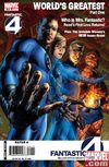
 Over on his blog, Executive Editor of Marvel Comics Tom Breevort has released the cover for Mark Millar and Bryan Hitch’s first issue of Fantastic Four and it features a radical redesign of the cover dress that is more in line with a magazine than a comic book.
Here’s Tom’s take:
And I’m really enamored of the book’s new trade dress, which I’m debuting here for the first time. Designed to have more the flavor of a mainstream magazine than a typical comic book, FANTASTIC FOUR once again looks sleek and progressive and cutting edge on the racks. In the same way as when the Ultimate books were first introduced, FF will now not be mistaken for anything else we’re publishing.
The purists are probably going to freak out because it really does look nothing like a “normal” comic book, save for four of the most famous comic book characters being on the cover.
I like the new trade dress. It is long past time that Marvel did something to “update” the Fantastic Four in the collective mind of the readers who tend to view that book as boring and stodgy, not something that holds up to modern sensibilities. Getting Millar and Hitch on the book is a great first step, and modernizing the cover dress is a logical next step.
What’s funny is that from very, very early in its run, Fantastic Four had on its cover, above the title, The world’s greatest comic magazine! And it was something that stuck through most, if not all, of its history. It was a throwback line from the early Marvel days that is now being realized with a modern twist.
I have high hopes for this book. It’s been a while since I bought a Fantastic Four comic, but every now and then I keep coming back to it because they are the first family of Marvel and I desperately want their book to be good and exciting and something that everyone is talking about and buying.


Is it just an update of the whole book or just the cover? Will there be magazine-like content in addition to the story?
I like the re-design, but the art–especially their faces really blows.
Also does this mean iFanboy will be changing the banner on the front of the page to match FF’s new look?
Ha – Funny Dave..
I’m torn on this – I love graphic design and I love trying something new – but I also get annoyed/worried when the title of the comic/magazine is along the bottom…
Initially it looks like it’s called “World’s Greatest” but that’s just a nitpick…
I like the art alot, I can’t wait for this run.
Im sorry, but that art is awful.
Also, does it really need to have two marvel logos, and two fantastic 4 logos?
I like the idea, but the execution is poor. They need more artistic and creative use of typography. Do a google image search for “esquire magazine” and look at what they did compared to the new FF cover.
http://www.eamesoffice.com/jscripts/tiny_mce/plugins/imagemanager/images/2006_11_3.jpg
http://girlstalkinsmack.com/wp-content/uploads/2007/06/angelinaesquire.jpg
are both more artistic and more visually interesting than the FF cover. They are going to generate buzz with this attempt – but unfortunately the art and design is so bad, people will just ignore the book.
Also, does it really need to have two marvel logos, and two fantastic 4 logos?
There is only one Marvel logo. The one on the bottom is a watermark on the web image that Marvel puts on everything they send out.
They are going to generate buzz with this attempt – but unfortunately the art and design is so bad, people will just ignore the book.
You really think that people are going to ignore the book because of the art of Bryan Hitch, one of the most popular artists out there?
Those Esquire covers remind me of New X-Men during Grant Morrison’s run. And I think the Marvel logo at the bottom right is just a stamp for the digital image. I wouldn’t expect it to appear on the comic.
I don’t mind it. That is to say that it doesn’t really peek my interest nor does it annoy me.
I think any comic book fan is going to be able to recognize it is Fantastic Four without being able to see the title at the top of the cover. And there have been two movies out, non-comic-book-store-going-consumers should be able to recognize the characters when they see the comic sitting in Boarders.
You know what, I change my mind. Fantastic Four has always seemed a bit softer and similar to a “PG” content. Like an “Adventures” book. This new cover doesn’t at all make FF seem more edgey, but it does spin a little bit of Fantasy and Science Fiction into it. And for that I like it.
You really think that people are going to ignore the book because of the art of Bryan Hitch, one of the most popular artists out there?
Yeah, I’ll put money on that one. This first issue is going to sell a buttload of copies, and if it’s any good at all, that will continue. People bought the Ultimates despite years long delays. You know how much this would have to suck to not sell a bajillion copies?
So, how much you thinking?
I love the idea of a redesign but this one feels like a magazine parody, mostly because of the Mrs. Fantastic/Invisible Woman blurbs.
Did someone post some comic cover redesign ideas on one of the forums? Those were more interesting.
I’d like to see more of an action cover, rather than imitating something a photo magazine would stage. The goal shouldn’t be to imitate glossy magazines but to create something extremely cool to highlight the strength of the comic.
This isn’t doing it for me. I agree with the above statements that It feels like a magazine parody rather than a new “dress”. as a side note the Things neck-less head is throwing me off.
When it comes to new cover redesigns, I loved the unique look that the Batman comics picked up after No man’s land. Radical departure yet tasteful.
the Tiki
I guess I’m pseudo excited for this book. I love Hitch’s art (although I admit, the faces on this cover do indeed suck). I’ve never read a FF book beyond the Ultimate FF. Would this be good for a noob? My gut tells me yes, but sometimes, you never know.
I find that Millar’s writing usually isn’t that complex, so it’s probably going to be fairly new reader friendly.
As long as Millar writes Ben Grimm the way Stan Lee used to, I’m on board!
That is an awful , awful cover. I also think Marvel is stupid for putting Hitch on a monthly. He took so long for the ultimates to be totally released, that by the time it was finished I didn’t care anymore. So unless Hitch can freeze time or marvel is willing to have a bajillion fill in issues I think this is going to be a mess. and while Hitch is a talent, he is very overrated.
They already have six issues in the can.
Hell yes!!, finally something worth reading from the cannon FF universe. I was just about to drop this book b/c the Black Panther/Storm arch was about the worst comic done at Marvel.
I give it up to Marvel for trying new things. The cover redesign is interesting, but I feel like Marvel (and DC for that matter) already fuss too much over the covers. And I seriously doubt this “magazine” approach is actually going to bring in non-comic readers. In fact, it may dissuade sales to the younger set and ultra-casual comic readers that may get thrown off and think this is a Wizard-type piece.
Finally, Bryan Hitch is great, but this cover art doesn’t look like his. It’s almost Quitely-like. Is this image definitely final?
it looks stupid. nothing more. nothing less.
Their adventures will also be divided up into Science, Lifestyle, Babes, and Fitness; making Fantastic Four the #1 Men’s Superhero Magazine.
That’s hot~!
According to his interview on Fan Boy Radio, Hitch wasn’t the one that held up Ultimates. I don’t know what actually did delay it, but supposedly the pencils were done long before the issue came out.
The compression on that image is really bad, that is hurting the art. Also, I don’t think this is completely final, because the Canadian price is listed as $3.75 and the Marvel has recently dropped the price to $3.05.
I think they want the logo put on twice because of the way comics are usually put on the racks in Book Stores and Comic Shops. It sort of nails both the top and the bottom to allow greater visibility with buyers, but the actual Fantastic Four logo doesn’t really show too much. Also is the actual size of the comic changing too?
I’m the same as some of the people above, Like the new attempt, but it’s not great.
This feels more like a redesign of the classic Marvel covers than it does the more recent ones. It brought back the subtitles and hints, and the whole magazine vibe of it. I enjoy it. Classic comics had a very fun vibe, that had too much going on, and new comics have a very stern vibe (generally) with too little going on. This found a happy medium.
But Ron, I agree. The WORLDS GREATEST really bothers me. It could be a lot smaller, and the FF name should be their to compliment it, not just a logo.
Millar is the Micheal Bay of comics. I don’t mean that as a completely bad thing either.
What i mean by that is that if you go and read/see either of there works you are going to be entertained, there will be explosions and cool lines and designs and at least 4 “there is no way that is possible but hey it looks cool” moments. But that is about it.
I always felt that characters feel a bit off when I see either of there works ( some more than others) and i don’t feel like there is much more being said than what is being blown up in front of you when they are telling a story.
thats not all bad though.
I’m all 4 new things. Especially with the FF so they don’t become too out dated. That said, I think the cover sucks. Sorry to be so frank.
I like it, it’s a change. Maybe not the best change possible, but it’s nice to see them try other things. Also The Ultimates was one of my favorite books of all-time so I feel like I owe it to Millar and Hitch to see what they do with Fantastic Four, which I’ll be honest I haven’t cared about for a long time.
I can’t really complain about anything. I haven’t cared about F4 at all lately so I can’t blame them for trying new things.
I forget how long they’re going to be on this title. I remember I heard Millar was saying that he wanted to stretch the story longer then originally intended.
If Millar and Hitch doing this book I personally think the way Brubaker and Phillips are doing Criminal in “seasons” with spaces in between is the best way to handle delays a keep them to a minimum. But I don’t know if they can really do that with a title like F4 which is kinda a fan favorite as a monthly. I would love to have this team doing a long drawn out multi-arc story but I don’t see how that can happen. I’m glad though that they’ve got so many issues in the can ahead of time.
I think at this point it is probably not fair to judge whether this new layout treatment is good/bad or success/failure. For me it will be interesting to see what they do with different covers over time. What you are seeing in this image might be tweaked here and change into something else anyways. Especially in an internet world like we live in where feedback is instant and readily available.
However I too commend Marvel for making an effort at evolving the art form and trying something new. And I think that the FF is the perfect book to do that on considering it’s history and place in the Marvel U. It was the book that kicked off the second wave of Superhero books in the 60’s and for the longest time really lived up to it’s name of being The Greatest Comic Magazine. I too wax nostalgic to see it that way again. Although a new artist and new layout will not ultimately be what makes that happen. I hope Millar brings something great to the writing.
I don’t know if you read issue #551 on, but F4 is really good right now. Really good jumping on point and very intriguing and I’m not even a fan of the Fantastic 4.
All I have to say is that Millar usually is a bit smarter than Michael Bay fare.
The comic has been good since Civil War. I was gonna drop it once Black Panther left, but this last issue was really good, so I totally intend to read the current arc.
Oh, and while the “dress” is interesting, that art is scheisse.
I like the idea of the cover redesign, but feel like the art isn’t sleek enough to carry that cover design. The art still looks too ‘comic bookish” for lack of a better term. If they are going to do it, they should go all they way and do something a bit more digital in feel…
You can’t judge a book by its cover but you can certainly judge a cover design by the cover. The job of a redesign is to grab attention (and your money) on day one. There’s no need to see it over several issues. It either works or it doesn’t.