 I had seen the cover for this issue of The Comics Journal in the comic shop, and I must admit that the cover blew me away. Then I happened to run across this exceptionally long excerpt of his interview, where he talks about using Hal Jordan, and why he did so. I think a lot of the purists out there are going to agree with him.
COOKE: He was a jet pilot, he was a test pilot, and he was an intergalactic, you know, cop. What was cool about him too was he was an incredibly modern design. Gil Kane did something really wonderful there. There’s no man-panties. It’s like a tunic and there’s no cape. There’s no extraneous flap on the gauntlet or the boots. There’s no detailing. And the use of black. It’s just a brilliant-looking outfit. It’s a slick package. And the other real reason that I wanted to make him a strong part of it, was having read “Emerald Dawn,” you know? And nothing against any of the guys who did the project but – unbelievable.
He goes on about this, and I must say, the thing I loved about The New Frontier is that he did get the character right, at a time when it seemed like no one could. Of course, this is still one of those projects that no one else could or would have done.
There’s a lot of article there, and it’s just part of the article printed in the magazine. I think it’s probably worth your time if you’re a fan though.


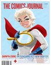
Although its hard to get past that PG cover, great read. I hope there hasnt really been a falling out with DC…er Darwyn Cooke and DC…..Gonna miss him on the Spirit…..but im excited about the New Frontier DVD…
-Scott aka target242
You don’t like the cover? I think it’s brilliant.
I think that cover is pretty tacky, however, anything with Hal Jordan is great. There aren’t enough Green Lantern fans out there. Green Lantern is one of the few mainstream comics left that doesn’t take place on earth….or earth 2 or 3 or whatever. Green Lantern is limitlessly enjoyable simply due to it’s less ordinary, exciting galactic atmosphere and the fact that Hal is a regular guy whom has to deal with this crazy environment. And yes, a very sleek costume design is his, indeed!
What in holy hell is tacky about that cover?
It’s so clever it shames me.
Sweet!
I thought the cover was great. The 40 page interview with Darwyn Cooke wasn’t too shabby either.
But oy vey, does it hurt when TCJ hits my pull box.
I LOVE THAT COVER!
“you can see yourself in her boobs.”
HA!
Such a great cover. I’m gonna try and pick that up this afternoon.
I’d love to see Cooke do more work with JSA characters.
Maybe you don’t know that the mirror says “Objects in the mirror should grow up and move on,” which I thought was pretty great.
I’m a little over halfway through the interview and it is fantastic. Gives me some hope that running layout detail at a publication for several years isn’t as worthless as it feels sometimes…
There are also some color reprints of some John Buscema stories from the early 50s. Like every ish, TCJ is top notch.
Funny thing is every time i see power girl i look at her boobs to see if ummm they were drawn abnormally huge and when i saw the mirror i started cracking up.
I remember reading somewhere (might have been in a previous ish of TCJ) about how the guy drawing Power Girl early on (wish I could remember the name) said he increased the size of her chest more and more with each issue and continued to do so until the editors caught on.
That’s one of the funniest practical jokes you could play in a comic book, I figure.
I loved this issue–there was some interesting criticism on how much the interviewer talked about the Batman animated series, to the point where Darwyn even rides him for it a bit. Cover was nice–showed it to the fiance and she laughed her ass off when compared to whatever issue of Meltzer’s JLA that was with Power Girl’s redonkulousity.
It’s a funny idea, I’m just not into the style of the art and the coloring. Looks tacky to me…like 50’s Diner meets the Jetsons or something. Call me crazy, ’tis my opinion. Power girl should have a powerful bosom…what’s the big D anyway? jk.
You’re crazy.
Also, I’d avoid the New Frontier if you don’t like that style. Shame though. It’s perhaps the best thing out of DC Comics in the last 5 years.
I totally understand why some people don’t warm up to a retro feel. It IS 50’s style art but with slight updating. It’s an artistic choice. I’m not all that thrilled with Alex Ross because while his paintings put the characters in a more realistic world, they also lose the power of artists like Jack Kirby.
Cooke’s placing of his story in the 50’s/60s made it a perfect match for his style. I enjoy his take on The Spirit even more which is in present day but echoes Eisner’s work from earlier decades.
Both Darwyn Cooke and the cover are brilliant. The key to me was his handling of the characters in New Frontier. He infuses them with real personalities and every choice just seemed to resonate. For example, Wonder Woman in Vietnam taking the side of the Vietmanese women and her ensuing conflict with Superman over it. The art seemed to just fit the style and mood he was trying to achieve.
The cover, as with all of Cooke’s art, is amazing and innovative.