ActualButt
Name: Sam Fryer
Bio: Graphic designer and illustrator in Philadelphia.
Reviews

Walking Dead is known for giving the reader that all too familiar chill up the spine, but it doesn’t often…
Read full review and comments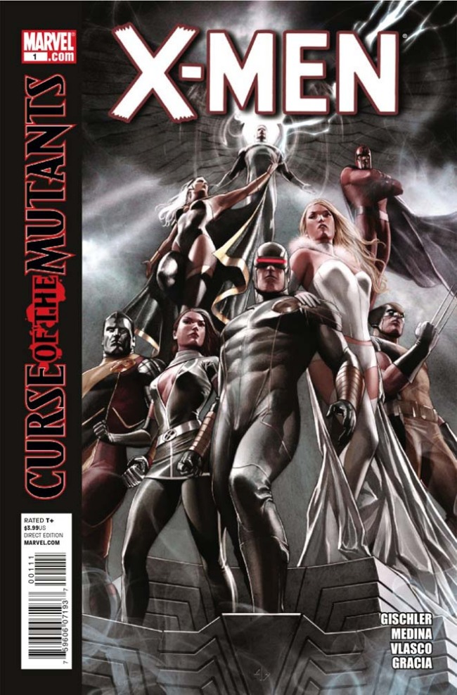
At first, I was hesitant because of the seemingly obvious bandwagon jumping-on, but then I remembered Uncanny X-Men Annual #6…
Read full review and comments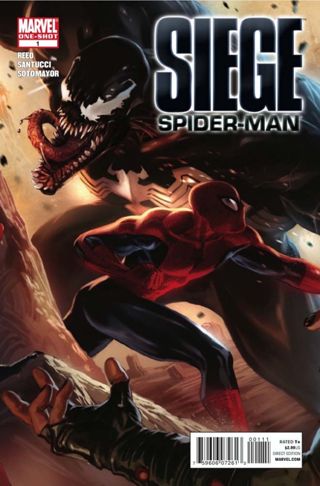
This is a must read for fans of Spider-Man team-up stories. Brian Reed spins a fun and dynamic adventure featuring…
Read full review and commentsAll reviews by ActualButt
ActualButt's Recent Comments
DC Announces ‘Before Watchmen’ (UPDATE)
February 1, 2012 11:00 am I'll take redundant over contradictory any day of the week.
Go To Comment
DC Announces ‘Before Watchmen’ (UPDATE)
February 1, 2012 11:00 am Very good points. I agree that DC is just reacting to what people buy, and Marvel does the same, but that's not how we grow an industry people. A lot of the responsibility for this kind of marketing rests on the readers, but a good portion of it rests on the publishers too. True, neither publisher have truly been innovators in a long time. An innovator is not reactionary. That doesn't mean that this is a good idea though.
Go To Comment
DC Announces ‘Before Watchmen’ (UPDATE)
February 1, 2012 10:53 am Those kids that only know Star Wars because of prequels or the Clone Wars don't actually know Star Wars though. I know this because I've talked to some of them. They don't even know who Luke Skywalker is. They don't give a damn about Han Solo or Death Stars, or anything that makes Star Wars cool.
Go To Comment
DC Announces ‘Before Watchmen’ (UPDATE)
February 1, 2012 10:48 am He had it coming.
@Chris Hargett, I'm not saying that everything he's written stands apart from the original creations. And anyway, Len Wein's Swamp Thing as it existed before Moore got his hands on it wasn't anything spectacular. Moore turned it completely on its head and created the Swamp Thing mythology as we know it today. Without him, it would just be DC's version of Man-Thing or a shlocky horror book. I would venture to say that he's done more to create Swamp Thing than Len Wein.
Go To Comment
DC Announces ‘Before Watchmen’ (UPDATE)
February 1, 2012 8:49 am Zeppo, Watchmen was a finite story with a beginning and end. Spider-Man and other superhero comics were always meant to be enduring serialized adventures that would keep going until people stopped buying them. Moore and Gibbons had a single story to tell, so they told it. Biiiig difference.
And to those who consider Moore a hypocrite for having a problem with people writing his characters while he does things like League and Lost Girls; The stories Alan Moore told using existing public domain characters were new and different takes on those characters. He used their existing context as a setting in order to inform the reader's perception, and give us a frame of reference for the characters. He used our preconceived notions as a setting for his story, not the elaborate on or change the originals. This is just adding to a story that was completed. He has every right to be upset.
Go To Comment
DC Announces ‘Before Watchmen’ (UPDATE)
February 1, 2012 8:36 am Everything that needed to be said about what happened "Before Watchmen" was said in flashbacks in Watchmen.
This is an obvious cash grab, and I'm sure it will sell, even to those who are against it. When you attach a name like Darwyn Cooke, you're gonna get some sales. However, if you as a reader are truly against this series being done, I urge you to say that with your dollar and pass this up. I will seriously read anything done by Darwyn Cooke, but I also have principles. I'm not opposed to unnecessary prequel stories being told, but I am opposed to creatively stagnated cash-ins.
Also, "Before Watchmen: Epilogue"? Really? At least Marvel's long ridiculous titles with too many colons make some sense. Oh, and they have a better logo too.
Go To Comment
Oni Press Gets Their Own New Logo
January 26, 2012 3:19 pm eh, old one was better.
Go To Comment
Art: Marvel Appreciates Art with Avengers Art Appreciation Variant Art
January 26, 2012 8:25 am Wow, Khoi Pham fail. "Look! Cross-hatching!"
Go To Comment
New DC Comics Logo: Confirmed and Now In Multiple Thematic Colors! (UPDATE)
January 20, 2012 10:26 am Just say "publish".
Go To Comment
New DC Comics Logo: Confirmed and Now In Multiple Thematic Colors! (UPDATE)
January 20, 2012 10:25 am This whole thing is a huge misstep, obviously not done with any forethought. Any new logo, good or bad, should have been rolled out with the New 52, not 6 months later. The logo is still inappropriate for comics however, and the most adaptation you're going to see a few months from now is maybe different colors. The idea of a glowing green logo for Green Lantern and lightning for the Flash is cool, but won't last. A logo needs to stand on its own first, and can then be interpreted into new permutations. This seems designed with customizability in mind first. Very gimmicky (on the other hand, what screams "COMICS!" more than gimmicks). It does look good on a screen, but it doesn't look good in print. Also, logos that rely on gradients are limited in their use, and will suffer greatly when translated to one color printing.
I'd like to see a poll on this subject to get an idea of the general feeling towards it.
Go To Comment

