WINTER SOLDIER #2
What did the
iFanboy
community think?
Pulls

Art by Butch Guice
Colors by Bettie Breitweiser
Letters by Joe Caramagna
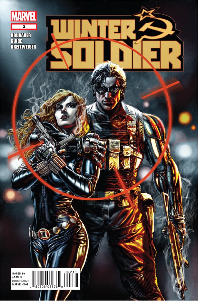
Cover by Lee Bermejo & John Tyler Christopher
Size: 0 pages
Price: 2.99
I liked it. It felt very Tales of Suspense to me. Brubaker writes to Marvel’s legacy without sacrificing a modern storytelling sensibility, for the most part.
I love the art, but I also have some issues with some aspects of the art. I hope people won’t get upset when I compare it to the Bendis/Maleev Daredevil/Spider-Woman/Moon Knight runs, but there is a certain photorealism-meets-Sinkiewizc schtick which sometimes really suits this almost-real-feeling espionage material and sometimes just looks messy, boring or downright cold.
While I love the beautiful stills of Natasha, they seem more like scattered memories, as her mouth is usually closed in panels where she is supposedly speaking. This makes the comic seem much more like a movie, which is weird when you factor in the 800 pound gorilla that is literally in the room, until he jetpacks away.
In other words this could be really fun or really spy-tastic and it hasn’t quite decided yet and while it’s doing a fine job of both it’s not doing a great job at either. It could just decide to do both quite well, and it might seem more solid in trade.
That said, I was way more confused about the panel-to-panel action and staging than I ever expected to be in a Butch Guice adventure story. There are times when the art is espionage story or adventure comics or action-thriller graphic novel spot-on, and times when I’m not sure exactly how Bucky threw that punch.
I’d rather that the action was explicit and that the effects were toned down a bit, especially the “Maleevian” still-life, if you will. I dig the whole “man-out-of-time” thing, but when Natasha does a full-layout backflip and kicks two guards in the face, I want to actually slow down and look at it because it’s so damn beautiful, just like they go to slo-mo in the movie. Some of the payoff panels are two rough-looking.
And some of the backstory exposition sequence looked a little straight from Wally Wood’s 22 panels to show while the writer explains using a debriefing sequence (with Steranko colors).
Other than those minor quibbles, a solid 4.
8)
Art: 4 - Very Good


really messing up my to/two/too today as well as my there/their/they’re