THE RAY #1 (OF 4)
What did the
iFanboy
community think?
Pulls

Art by JAMAL IGLE and RICH PERROTTA
Cover by JAMAL IGLE
Size: 32 pages
Price: 2.99
Huh. Well that was actually pretty fun! There’s a pull quote for the back of the book, DC marketing team: “Surprisingly, I didn’t hate it! – Johnny Destructo” You can go ahead and use that if you want.
I should be honest: I don’t know anything about the previous incarnations of The Ray, but then…I have a feeling most of you are with me on this. This super-hero never really jumped off the shelves and into my pull-list, but with Gray and Palmiotti at the helm I figured I would take a peek.
There is a lot to like about this book…the main character isn’t white, which automatically makes me curious, (it’s actually a pretty diverse cast) he’s constantly naked despite what you think you see and his parents are adorable hippies (think Ben Stiller’s parents from Meet The Fockers). There’s a punch that goes through the back of someone’s head, which I always enjoy, there’s reference and use of something specific from Batman continuity and interesting uses of his light powers. I like his inability to dress and the secret ID thing. Our boy can manipulate light, which manipulates what you see, so of course he can make himself look like anyone he wants. I hope they explore that further. I like the Quantum & Woody chapter titles, or for those who don’t remember the brilliant Q&W series, think Scott Pilgrim.
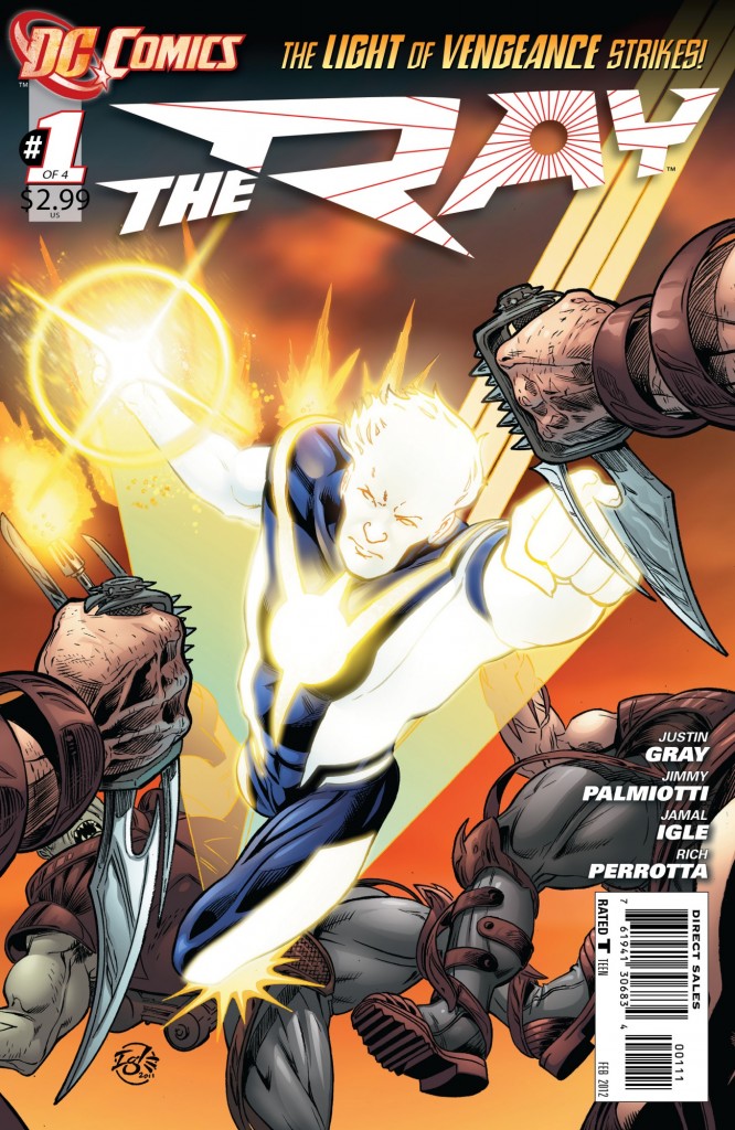
It isn’t all whipped cream bikinis though, there are some negatives. We spend faaaar too much time inside the head of our main character Lucien. There are ten hefty thought boxes on the first 2 pages alone. Another gripe? The cover has nothing to do with the interior, except for the fact that The Ray is featured. He’s fighting giant flying squids on the interior..but why? I do love that most of the issue is character-driven and we spend time getting to know our cast, but I could have used just a touch more danger and a little less inner monologuing. Also, The Ray seems to be throwing light discs that look like Nerf frisbees?
The art by Jamal Igle is pretty strong, if not amazingly dynamic and I like some of the details he lays down on the page. When Lucien first meets a couple of girls after transforming, the red-head’s shirt is doing that thing where the buttons are a little taut, allowing the viewer to see ever so slightly into her shirt. Nice touch. About the colors though. The palette by Guy Major, a fellow who’s work I really enjoy, isn’t quite bright enough for a book about a fella made of light. I think about the lighting effects that Rod Reis is doing over in Aquaman right now, and just the shimmering effects that he puts into Arthur’s chain-mail armor, and I think that sort of attention could be made here.
This is a fun, if not particularly ground-breaking or memorable first issue, but Gray and Palmiotti have their work cut out for them if this title is going to go the distance. The Ray as a character amongst the icons in the DCnU just doesn’t feel like a mainstay. I guess that’s why this is a 4 issue mini-series.
Also: “The Light Of Vengeance Strikes”? Gah.
Art: 3 - Good


Leave a Comment
Login or Register to get involved and leave a comment