THE PRIVATE EYE #1
What did the
iFanboy
community think?
Pulls

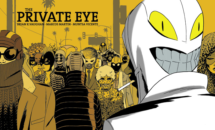
Art by Marcos Martin
Colors by Muntsa Vicente
Size: 32 pages
Price: UP TO YOU
Private Eye was fantastic. It is so thoroughly detailed that it is a very believable near future. Like the best dystopian future tales, it comments more about our society now than it does about the fantastic possibility of the future. Vaughn is nuanced though, as this tale is certainly dystopian without being apocalyptic.
In the world of The Private Eye, Vaughn allows what advancements have been achieved for the good of the city (green rooftops, hovering cars, marijuana cigarettes) to be the background and setting, while the repercussions of the disappearance of privacy are at the forefront.
It is a realistic vision of how cyclical history can be. The U.S. was founded largely on puritanical ideals and lifestyles. Slowly through urbanization and technology we lived more publicly, and now, in the sprawling metropolis of L.A., on the tricentennial of the nation’s founding, a new generation guards privacy and identity having learned from the mistakes of a generation that practically gave it away.
In the final pages, Vaughn also sets up a plot that gives the main character reason to discover more secrets of the treacherous world.
Aside from some obnoxious references mixed in with the clever ones, and some clumsy exposition by a couple of goons, the flow of the writing was good.
On the art side, I found Martin’s art to be beautiful, but the thin lines were a little bit overwhelmed by the beautiful colors. Bolder linework would have been a better match. Similarly, I found the letters a little too thin, especially in a digital format, sometimes pixel thin lines don’t appear at all without zooming in fairly close.
The figures were a little bit malleable, in an inconsistent way. The horizontal layout didn’t add or detract for me, because a clean layout is really what’s important for digital comics, where people are reading on an array of different devices, and it needs to be at least legible on all of them.
Mostly there was a lot to love and little to criticize. It gave a feel for the world and set up a continuing story, and the art was groovy. You can ask for little more in a first issue.
Art: 4 - Very Good


Dude, you write elegant reviews and they are always a pleasure to read and a refreshing sight to the normally 1 paragraph reviews wherein the writer says something like, “this issue was great! they knocked it out of the park. I love the slow burn of this series. This team is killing it! yeah, those don’t really do anything for me.
So keep it up my friend!
Thanks dood 🙂