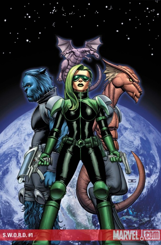
S.W.O.R.D. #1
What did the
iFanboy
community think?
Pulls

Size: pages
Price: 3.99
There are so many cliche’s I could utilize to open this review. One might argue I’ve already opened with a cliche. If I have, then please forgive me, as I want to open with a different cliche which I probably should have used as the first sentence rather than the fourth. Make that fifth.This comic has filled a void that I didn’t even know I had. Glad I finally got that out there…
I was originally attracted to S.W.O.R.D. because I was so impressed by the only issue from Kieron Gillen I have ever read, Phonogram: Singles Club #3. Even so, I wasn’t sold until I heard that Beast held a lead role in the title. Beast is probably the only X-Men I give a rat’s ass about, and that’s due solely to the ’90s cartoon. I was pretty excited, until I saw that infamous preview with Goat/Giraffe/Chester Cheetah. I was incredibly disappointed. How could somebody draw Beast so wrong? What was he smoking? How did this slip past editorial?
After my nerd rage simmered down a little, I stumbled on some information that really changed my mind. Steven Sanders was actually hired to draw this title because of his Beast design. It’s not that he can’t draw him, but rahter he chooses to draw him this way. That made all the difference in the world. After reading the issue, this design really fits with how Beast is being written in the book. That’s not to say he’s out of character, but simply that the style of S.W.O.R.D. allows for a different perspective on his personality (specifically within his relationship with Agent Brand).
Also in defense of Sanders’ Beast, when has Beast ever had a definitive design? Nobody’s ever really drawn him the same. Sure, there have been ‘plot’ excuses explaining away these redesigns, but is that really necessary? The complaining about Beast is the same to me as bitching about Eaglesham’s Reed Richards. It’s not that they’re drawn poorly, just drawn differently. I like them, and if you don’t, I will eat your children until you do. I love this design, and I think it’s both fresh and tasty.
The rest of Sanders’ work is really stunning. I hesitate to call it ‘cartoony,’ but it is defiitely not photo-realistic. I’d definitely see hints of Frank Quitley in his lines. His characters have a certain malleableness to them that I find really pleasant. His aliens look great, as do his technology. His characters look dynamic. There is a big splash page with the original Death’s Head that is simply excellent. I want that page hanging on my wall. If you are unsure about his style, just flip through the book in the store until you find that page, as it is just magnificent. The story really moves at a fast pace, and Sanders keeps the pace very nicely. The transitions are great and never really feel abrupt.
Despite how much I love Sanders’ work on this book, I think there can be a little more imporvement. As much as I love Beast’s new snout, it seems to bend in ways that it shouldn’t in certain panels. There is also one panel (which I believe is in the preview) where Brand is just a little too close to the camera. I trust that he will be growing as the title moves on because I feel like his work improved page by page through this issue alone.
The writing is excellent. Gillen’s dialogue is very sharp and witty. In some ways this feels like a British sitcom. At the same time, there is a certain level of believability to the characters. It never steps over the line into what I call Gilmour Girls territory, a place where dialogue is so incredibly sharp and witty that it seems impossible to actually occur in a natural conversation. Brand is sharp and witty because her personality is also, not because Gillen needs a vehicle for oneliners.
Did I mention this comic is packed? There is so much story packed into this issue it is really insane. Everything moves and moves, and there are multiple plot twists within the first issue. This should be the posterboy for anti-decompression (aka compression). Putting that much plot in a book can be dangerous, but Gillen pulls it off expertly. It’s just so good. This book is currently filling the void left by Captain Britain and MI:13. I hope against hope that this lasts longer than Captain Britain, and would suggest it to anyone who still gets misty eyed for that old friend.
Art: 4 - Very Good


I lied. It’s not a splash page of Death’s Head, but it’s close. It’s the third page before the end of the feature. It looks really good.