MIGHTY AVENGERS #34
What did the
iFanboy
community think?
Pulls

PENCILS: Neil Edwards
COLORED BY: John Rauch
LETTERED BY: Dave Lanphear
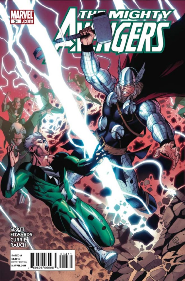
COVER BY: Khoi Pham
Size: pages
Price: 2.99
Starting with the art, I found it very inconsistent. Specifically the inks at the beginning, done in a very marvel style but the last few pages were very much akin to Bendis’ ALIAS. Now granted either style works with me BUT the shift was pretty jarring and totally pulled me out of the narrative.
Storytelling. Now being someone who had defended Dan Slott earlier on in his carreer I find myself biting my tongue here. The very contrived response of Wasp’s makeshift Mighty Avengers ruined what could have potentially been a very ominous ending, all for the sake of saving page space via compressed storytelling. This is unfortunate because Slott’s ideas are clear and engaging in theory; however, his execution has left much to be desired as of late.
The series is a fairly fun one and I hope he only get’s better because otherwise I don’t see myself reading a title like this in the future if it has his name on it.
Bear in mind the overall art score shouldn’t necessarily matter. I’m breaking down the Art score because I feel Edward’s is a professional penciler who doesn’t deserve to be categorized with these “Andrew” inkers who obviously don’t have their #!@# together.
Pencils: 4
Inks: 1
Art: 2 - Average


Leave a Comment
Login or Register to get involved and leave a comment