MAGDALENA #1
What did the
iFanboy
community think?
Pulls

- adickhead
- AlecHunter
- AlexG
- barrow
- BatStewie
- betrayl
- broderboy
- btljuce
- chewie810
- ComicAddict
- comixfan
- conor
- convoy83
- COWoDOOM
- Croz
- cyberauron
- Demo916
- djgarciarx
- donny
- DorianP
- ElDiabloBlanco
- erikduane
- Excelsior
- firebird
- FraggleUprising
- fudd71
- Funnybooks
- Gabe
- GimpTactics
- gothamknight
- GrendelRK
- grizly
- HerrStarr
- hidefjohn
- jacketFace
- Jeffc
- jfontana
- JimmyF1982
- jimmyg
- JonBoy
- josh
- jtrem
- juand182
- justderek
- kevinscomics
- KidJayson
- marcushill73
- Mart
- mattfox7669
- MikeDee
- mitchster
- MoniBolis
- mymatedave
- OliverTwist
- omegalife2002
- RadConsv
- Ravenslave
- rhan
- rix0r
- scallionsncreme
- sjharrison
- synapse
- sythspawn
- TaBfan19
- theegreatone
- unkec
- Unoob
- Valcyn
- viewaskew117
- WhiteLantern
- zayaz
Artist: Nelson Blake II
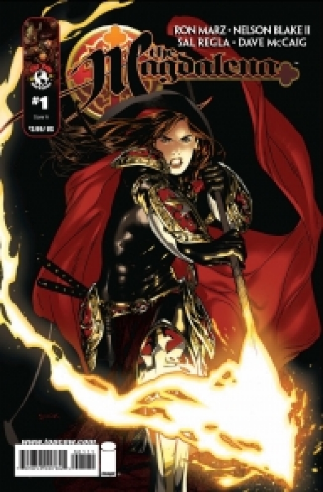
Cover: Ryan Sook
Size: 32 pages
Price: 3.99
This review contains spoilers, click here to read
I do not think I will pick up the second issue of this book. After listening to the podcast and standing in the comic store, I thought why not give this a shot. The story sounded similar to the Buffy universe, but it didn't deter me. Upon reading the issue it seems like everything was being laid out in order for the reader to know the motivations of the Kristoff character, and the Patience( the current Magdalena). It seems like there was no subtext to keep me interested. I could be completely wrong, but there is no intrigue to keep me hooked in as a reader. I wish I could comment more on the story, but there literally wasn't much there to even elaborate.
The art work with the exception of Ryan Sook's cover, left much to be desired as well. The characters fell into the category limited expressions, and closed mouths for the dialogue scenes. The demons design weren't very exciting at all no points for those things. The Elba beach pages felt unnatural, although I had never been to a beach in Elba. Upon look up the beach, it really threw me how in accurate the beach was drawn. Even the architecture in Prague did not make me the reader feel as if it was Prague. I would rather split the difference between the writer and the artist, one not providing enough material and the other for not putting more detail to distinguish it as Prague , through page layout and such. There were instances where a hard ink line was drawn for shadows of furniture, but not followed up through the rest of the panel, they should have chose one over the other. Some of the lighting in the scene had me confused it looked as if the light was hitting from one direction on the characters,but not effecting any of the objects around it( page 4 for example, the statue and Sister Anneli). There is even a point where a window is casting shadows on to the room and magically miss the character standing directly in front of the window. I didn't like some of the color choices when it came to portraying space in the comic. I could go on and on, but I do not have that much time. I gave this a 2 for story and art, because the writer and artist are trained and the presentation isn't slapped together. The title logo and Ryan Sook's cover are the only saving grace for this issue.
Art: 2 - Average


Leave a Comment
Login or Register to get involved and leave a comment