HERC #2
What did the
iFanboy
community think?
Pulls

Art by Neil Edwards & Scott Hanna
Colors by Jesus Aburtov
Letters by Simon Bowland
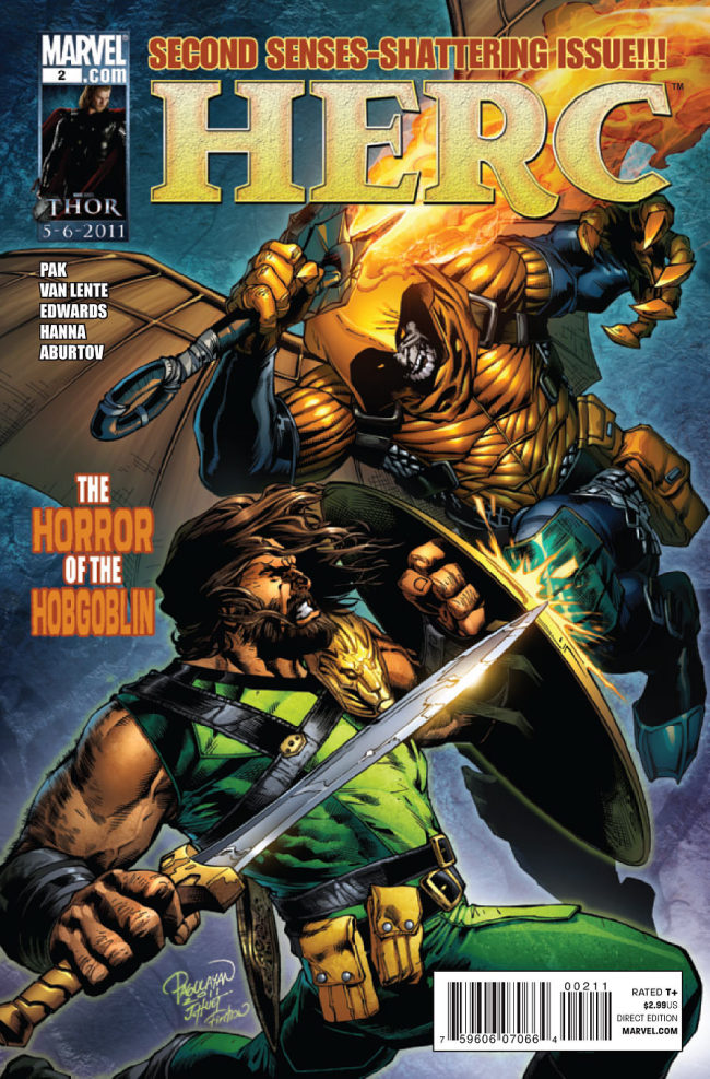
Cover by Carlo Pagulayan
Size: pages
Price: 2.99
It really feels good to be a Hercules fan, doesn’t it? Sure we’ve had are share of ups and downs but the ups are really what keep us reading anything involving the Greek God. That and we’ve also had two great writers with Fred Van Lente and Greg Pak to keep us entertained for years. With this new Herc series the first issue started of strong, albeit in a completely different tone from previous stories. How does the second issue fair for this new ‘grim and gritty’ Hercules?
I think what makes this great is that Pak and Van Lente knows it’s just an action book. There is nothing deep about it, no messages they want to convey. At the end of the day this is just Hercules beating the crap out of bad guys. A guy like me wants nothing but that in a book like this. Here we have Herc give a beat down on Hobgoblin which is a good thing. Ever since I read that first trade of ASM’s ‘Big Time’ I’ve loathed this new Hobgoblin. I also like it that, to keep with the grim and gritty, Kingpin might be a factor in future issues and these two definitely seem to have a balance with each other. Overall this is just a fun, action packed issue and nothing more. Nothing bad at all to say about.
However, I think a change in artist might do this series some good. Now Neil Edwards isn’t doing a bad job. His art for this book is more then servicable and there are some good pages in here. But everything about it feels a bit too stiff. Characters are really posey and there is no natural fluidity about them. When the moment calls for a big pose, like Herc holding a bow and arrow, then it’s fine. But when it involves Herc flying around with Hobgoblin or talking to Kingpin then it doesn’t work. Also, the coloring is a bit too bland for my liking even if it’s suppose to fit the tone of the book. Yes we’re in a bad area of New York City, but let’s have more then drab browns and greens.
Some iffy art aside, I really do like this book. It’s everything I like about Hercules: It’s action packed, funny, and in the end you can really tell Greg Pak and Fred Van Lente enjoy writing this character. It’s not everyday you have a writer (or writers) legitamately love a character like these guys do. Even with the shift in tone this is a still a highly entertaining comic to read. Not sure if I want this to tie into an event so closely with the next issue; but I have confidence these guys will make it fun to read anyways.
Art: 3 - Good


Leave a Comment
Login or Register to get involved and leave a comment