GREEN LANTERN #60
What did the
iFanboy
community think?
Pulls

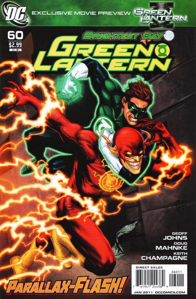
Art and cover by DOUG MAHNKE & CHRISTIAN ALAMY
"DC 75th Anniversary" Variant cover by FRANK QUITELY
Size: 32 pages
Price: 2.99
It’s good to be a Green Lantern fan again in my opinion. These last couple of months I’ve been so off this series with all the Brightest Day tie-ins and the various Guardians hogging the spotlight. But it all changed with the last issue when Geoff Johns finally, FINALLY makes this series about Green Lantern again. Having the Guardians put to the side really made this series a joy again. Well not only does Johns continue that trend here, he also brings in some revelations that really made me shocked and excited for issues to come.
Granted we’ve seen the Hal/Parallax fight countless times by now. Geoff Johns really has a thing for this entity even when he did a whole series of stories to prove he isn’t a factor in Jordan’s life anymore. However, he makes it interesting (for me at least) by having Parallax invade Barry Allen. Yes it’s another person he has invaded but in making it Barry he will continue the focus be on Jordan since the guardians would have no ties to Barry. The first half of this issue was just Hal/Barry/Parallax talking which would be enough. But then the second half we finally get a reveal on who is under those bandages and it really shocked me. I never expected this to be the man involved with the Guardians. But for once Johns actually surprised me at the end of an issue.
Now the art seems to be really different here. It’s still Doug Mahnke doing some gorgeous pencils, but something does seem off. I think that the roles of the main inker for this series has changed with this issue. Usually Christian Alamy does the main inks while 2-3 other artists ink along with her. While Alamy is still credited here, it looks like Keith Champagne has taken over the main duty of inker. It’s funny how easy it is to tell when the change is made because the pencils and colors look a hell of a lot more sharper then before. I’m not saying that Mahnke’s art looks ‘improved’ or ‘better’. It’s just that with Champagne as his inker, his pencils look just as amazing as they always were. All I’m saying that with his art looking just as amazing, seeing a new inker on board (or just taking over from before) isn’t a bad thing for me.
This title really has hit it stride again for me. Geoff Johns puts the Guardians in the background (although they are used a bit more here) and keeps Hal Jordan the focus of the book. It’s what this title should have been like since Blackest Night ended. With more gorgeous artwork by Mahnke and a newish inker on board, this title seems to have a new look on life. Can’t wait to see where this series is gonna go next. I though I would never say that ever again for this series.
Art: 5 - Excellent


I haven’t opened this yet, I’ll have to see if I call tell the inker changed like you have been able to.