DETECTIVE COMICS #16
What did the
iFanboy
community think?
Pulls

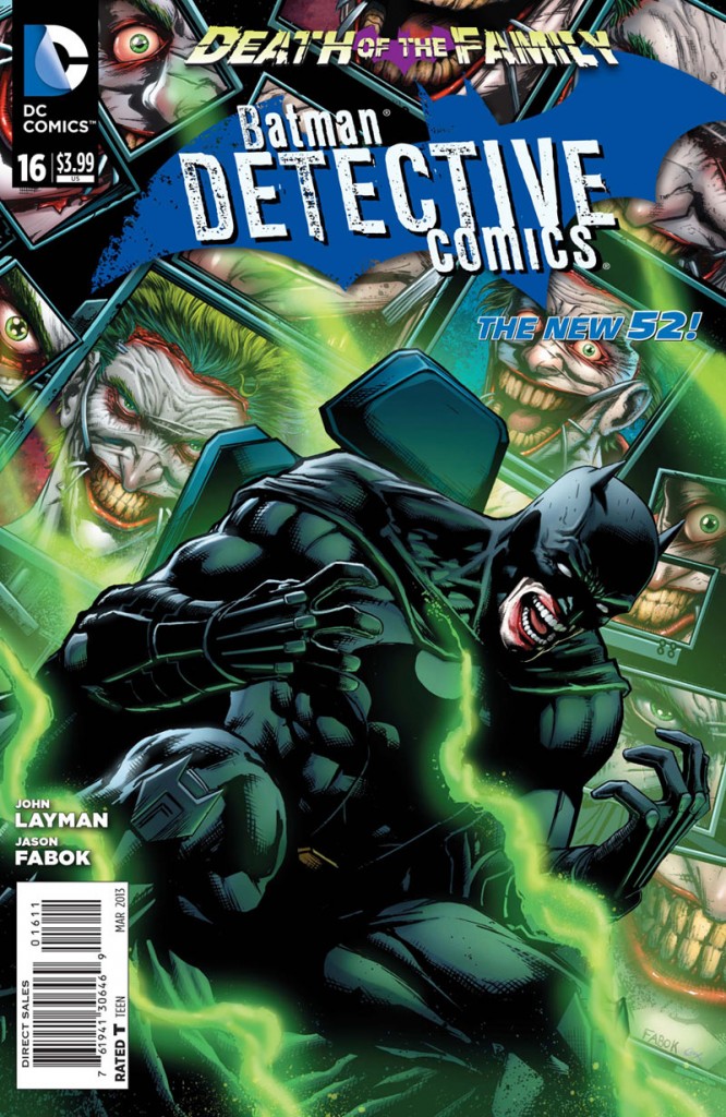
Art by Jason Fabok & Andy Clarke
Colors by Jeromy Cox
Letters by Jared K. Fletcher
Cover by Jason Fabok & Jeromy Cox
Size: 40 pages
Price: 3.99
The inconsistency of this series is really starting to bug me. Like with another DC series, All-Star Western, the potential with he creators involved are there. John Layman is one hell of a writer and if you don’t believe me just read an issue of Chew. Jason Fabok is an improving artist but he hasn’t lived up to potential yet. This wouldn’t be such a big deal if these two didn’t work on DC’s second most prestigious series in Detective Comics (First obviously being Action Comics).
I liked the idea of this issue with a gang of Joker look-alikes devastating the city. It makes perfect sense that when Joker comes back to Gotham, the real crazies come out to play. But the dialogue in general is pretty uneven for me to fully enjoy it. Batman is talking like his counterparts in the old Burton Movies and trust me that is not a good thing. There’s very little humor in this too which is surprising considering Layman tries to put some into his issues. The back up involving the new ‘Emperor Penguin’ was much more intriguing to read. Layman is slowly getting this story of Mr. Ogilvy’s taking over of Cobblebot’s out and the slow burn has made this really enjoyable to read. I have no idea who these supervillains are that Ogilvy has assembled but they certainly look interesting. Hoping we get to see more of this story bleed into the main story down the line.
The art by Fabok is just as uneven as the script. He suffers from ‘David Finch Syndrome’ where the images LOOK good but not so much on a technical level. (Considering Fabok works a lot with Finch I’m going to assume it is contagious.) Images like Batman on top of a car or on a jetpack look really cool. But then you see other panels of weird layouts or character movements and it takes you out of the story. I think he is trying to be too ‘sexy’ with his pencils rather than telling a coherent story. The same couldn’t be said for Andy Clarke and I really wish he could take over the main story. The back up works just as well because of Clarke’s crosshatching. He puts more emotion into the characters in one panel than an entire issue of Fabok’s.
I really want to enjoy this new run by John Layman and Jason Fabok but I am not really digging it. Don’t get me wrong, the potential is all there with Layman’s ideas and Fabok’s ‘sexy’ pencils. But on a technical level it is not really doing it for me and I’m starting to lose interest in this book. I’m willing to give this one more issue to see if it’ll sway me. Detective Comics has such a rich history that dropping it seems to be sacrilegious for a die-hard Batman fan like myself.
Art: 3 - Good


Leave a Comment
Login or Register to get involved and leave a comment