CAPTAIN AMERICA REBORN #6 (OF 6)
What did the
iFanboy
community think?
Pulls

PENCILS: Bryan Hitch
COLORED BY: Paul Mounts
LETTERED BY: VC - Joe Caramagna
COVER BY: Bryan Hitch
Size: 40 pages
Price: 3.99
I could write a review that begins by focusing on what a fiasco the whole return of Steve Rogers has been, but as ardent comic book fans, we’re all well aware of how badly Marvel fumbled the ball. Walking into this issue, I set it all aside, trying to focus on this issue and the story it tells. Of course, not much has been too ruined for me because I’ve held off on reading “Who Will Wield the Shield?” and the latest issue of Cap.
The story as a whole has been rocky for me. While enjoyable, I’ve had issue with a few of the story elements. I believe if I were to look back, my review record starts with humbuggary, is replaced with joy, and now, I’m somewhere back in the middle. While the criticisms of the issue being trite, predictable, and over-the-top are all valid, I still grinned like an idiot the whole time I read this issue.
Everything in this issue sort of fell into place. The characters did what they needed to do to serve the story, and the action was classic comic book fun. There were no surprises here, except of course for the giant-sized Red Skull. That was awesome. What I found the most engaging in the story is the aftermath of Steve’s return. His brief dialog about his visions of the future had my eye brow raised in curiosity, and these story threads seem to be something to look forward to, which Bru and crew can hopefully pay off. Even though it feels early, I am happy to see Steve Rogers back in time to kick Norman Osborn’s ass.
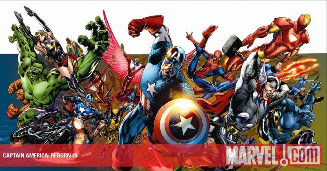
I’m pretty luke warm on the art for this issue. While I felt the first couple of issues were a bit sloppy for Hitch, I found the middle issues to be really nice looking. This issue falters somewhat with disjointed characters, loose facial expressions, and an overall muddy appearance to his line work. There were some stunning shots, particularly the full page spread of Steve’s glorious return on the Washinton Mall. Of course, the art could have been a lot uglier, but I guess I expect a lot more from Hitch these days.
Art: 3 - Good


Absolutely agree on the art. First two issues did not impress. Issues 3-5 had some great art. Issue 6 went back to the earlier not so great art, probably because Marvel editorial had a cattle prod to his nether regions.