CAPTAIN AMERICA & HAWKEYE #629
What did the
iFanboy
community think?
Pulls

Art by Alessandro Vitti
Colors by Javier Tartaglia
Letters by Joe Caramagna
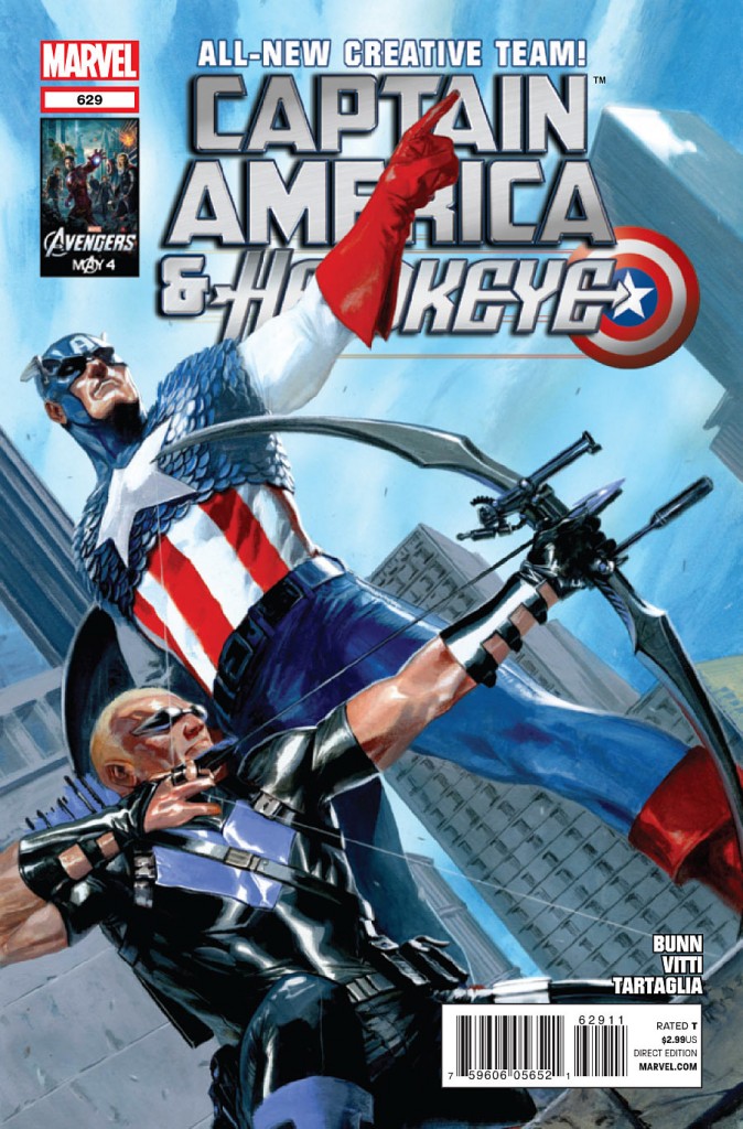
Cover by Gabriele Dell'otto
Size: 0 pages
Price: 2.99
I was planning on dropping this title, but decided to pick this issue up because of how solid Cullen Bunn has been writing lately. In this regard, he did not disappoint. I felt he nailed the voice of the characters pretty nicely. Cap and Hawkeye are at odds, which is all they seem to do these days, but Bunn keeps the dialogue entertaining between the two. The story is your standard start to a mission that isn’t going to go well, and we’re left with a sense that everything is not as it seems. Again, this is pretty standard for a superhero story. The action in the issue is great, and Bunn did a great job penning action that shows Hawkeye and Cap fighting together as if they’ve been fighting together for years. It’s sort of the same sense you get from watching Batman and Nightwing fight together. I thought that was a great touch, and really made the action sequences more interesting.
The art, on the other hand, is not that great. I think this art suffered from trying to be too dark and gritty. The inking completely muddles a majority of the art, and the color pallette is really, really dark. It sort of complicates the lighter, fun tone that Bunn is trying inject into the story with the character banter and bombastic enemies. The storytelling is servicable, and I was never lost. There also were a couple of cool panels, mainly in the action portions that were well done. The art seems to have a bit of an identity crisis, and I think it needs to choose whether it wants the dark realistic tone, or a brighter,less realistic style. I think Vitti may have had the idea to marry the two ideas with his pencils, but the post production seems to have ruined it. Or maybe, the post production tried to save what was poor penciling. Either way, I didn’t enjoy the art on this one.
Overall, it’s a solid start to an arc. It’s just too bad Bunn couldn’t have had a stronger artist because the art just may be enough to keep away from this one. Hopefully, the next issue will show an improvement as the team works together a bit more. I’ll definitely give it a look through at the shop and make game day decision on it.
Art: 1 - Poor


Leave a Comment
Login or Register to get involved and leave a comment