CAPTAIN AMERICA CORPS #2 (OF 5)
What did the
iFanboy
community think?
Pulls

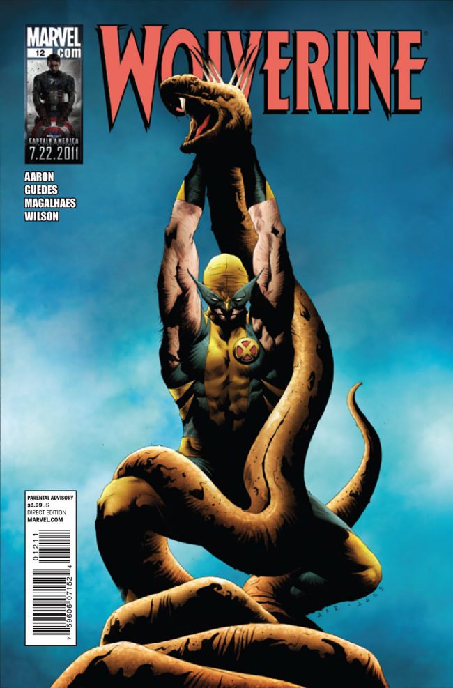
Art by Renato Guedes & Jose Wilson Magahales
Colors by Matthew Wilson
Letters by Cory Petit
Cover by Jae Lee, June Chung, Joe Quesada & Danny Miki
Size: pages
Price: 3.99
A gigantic snake wraps its coils around two bloody, naked, screaming bodies, one of whom has an upside-down pentagram on her forehead. This is part of a Satanic ritual and the gigantic snake may be possessed by the spirit of the Devil himself. Hooded figures surround the bloody ritual, and the gigantic snake begins to speak to them in a strange, ominous tone.
And on the page across from this one, there’s an ad for Sesame Street apparel: Cookie Monster booties, an Oscar the Grouch baseball cap, and look, Elmo’s there as well.
Ah the bizarre juxtapositions of reading comics in 2011.
Anyway, back to Wolverine #12.
Jason Aaron’s tenure with Logan has turned into the best run anyone’s had on the character since Larry Hama stewarded Wolverine in the ’90s. And I would even say that what Aaron’s doing now is better than the second half of Hama’s run. Aaron’s characterizations haven’t been perfect, and he’s thrown quite a few uninspired villains at us along the way, but overall…overall I can’t really ask for much more. Wolverine has been probably the most overexposed and overused character of the past 20 years. That Jason Aaron can find ways to tell “good” stories with him on a very consistent basis is amazing to me. I’m not expecting “great”. It’s Wolverine. Everything’s been done with him. You get a “great” Wolverine story like twice every decade at this point. But Aaron can give me “pretty good” on a monthly basis, and I’m down for that.
The past few issues have seemed a bit repetitive in that they follow the same format (anyone who’s read at least one of these issues will know what I mean). There’s a method to this repetition, but…is this eventual purpose worth the slight tediousness of these past three issues (a $12 value)? There’s surely a reason as to why the villains Wolvie’s been clawing through with ease have been so lame in these issues as well. But is this reason “worth it”? Eh, my guess is that it’ll probably be worth it–just barely. Could Aaron have come up with more interesting disposable villains? Probably, but the point seems to BE that these foes are intentionally generic and disposable, so… overall, the slight tedious nature of these issues’ action sequences doesn’t really bother me OR excite me.
What’s more exciting is the background of the Red Right Hand group. The real heart of these issues lies in learning what’s behind the group, who some of the members are, and what occult power they wield.
The whole thing is VERY reminiscent of the Black Glove group that Grant Morrison created for his Batman run. But I’m alright with that. I loved Morrison’s Batman, and I’m happy to see Aaron doing his own rendition.
By the way, the last time I saw the phrase “Red Right Hand” in a comic, it was in the first “Red Hood” arc in Batman & Robin #4-6, written by Grant Morrison. Morrison cribbed the phrase from John Milton (poet of “Paradise Lost”) and now Aaron has cribbed it from Morrison. I guess this is trickle-down aesthetics, but, hey, as long as a writer’s influences are good, I see no problem when said writer wears his influences on his sleeve. (Also note: I think the “Wolverine in Hell” arc had a lot of touches reminiscent of the issues of Alan Moore’s “Swamp Thing” that were set in Hell. And the Dr. Rott character Aaron created in the “Insane in the Brain” arc of Wolverine: Weapon X–he reminds me of Morrison’s Dr. Hurt character. The leader of the Red Right Hand group reminds me a bit of Dr. Hurt as well. For my tastes, these are all good things.)
Guedes’ art suits this story. It took me a while to get used to Guedes. I really didn’t like his art in Wolverine #1 last year. But the more you get into these stories, the more you see what Aaron is trying to do, and Guedes’ style really fits these themes. I mean, “Wolverine in Hell”? Wolverine vs. Satanists? You can’t have a realistic, heavily-detailed, anatomically-obsessed artist for stories like those. Guedes has a twisty, slightly misshapen way of drawing everything. It makes flashbacks look appropriately antiquated. It makes Hell and scenes of Satanic ritual look appropriately bizarre. It makes scenes of violence look oddly composed. But there’s always just enough realism to make the scenes look grounded and, thus, uncomfortable. If Guedes was a “better” artist, I don’t think the scenes would look so appropriately uncomfortable. As it is, I’m constantly faced with a sense of “So this is REALLY happening to these folks?–Yuck!” Other artists could draw these scenes more “beautifully”, but Guedes presents a sense of the grotesque which fits in very well with the haunted house of pain and debauchery that Aaron’s leading us through.
I wanted to see Daken in this issue, but I didn’t get him. I was promised Daken and the Hulk. The Hulk I got only in a flashback, and he didn’t even say anything. Too bad.
I don’t know how Aaron is going to wrap this all up next issue. But I’m very much anticipating it. I feel a bit like I did before the final issue or two of “Batman R.I.P.” came out–wondering how the author was going to tie things up in so few remaining pages, and wondering what secrets of the hero will be revealed. It’s a good feeling to have. I’ve been unsure about Jason Aaron’s Marvel U stuff, and to some extent I’m still ambivalent about him as a superhero writer, but I would definitely recommend his Wolverine stories. He’s found his footing with this character and the overall plot in this series is very compelling. I know things don’t “end-end” next issue, but I can’t wait to see what tack Aaron takes as this series reaches a major turning point.
Art: 4 - Very Good


THE ARTWORK AND STORY LINE HAS BEEN VERY INTERESTING…..BUT I’M WONDERING ON HOW THIS IS GOING TO END.
This issue didn’t work for me the same way the previous two did. The last three episodes have basically had the same structure. I’m ready for something fresh.
to quote your review, “But there’s always just enough realism to make the scenes look grounded and, thus, uncomfortable.” That’s exactly how I feel about his artwork. I too have grown to understand it and appreciate the fact of how it complements the story so well.